Technologies
iPhone 17 Pro Camera Battles the Galaxy S26 Ultra: Let the Fun Begin
They’re both top-end flagship phones, but which one takes better photos? I wanted to find out.
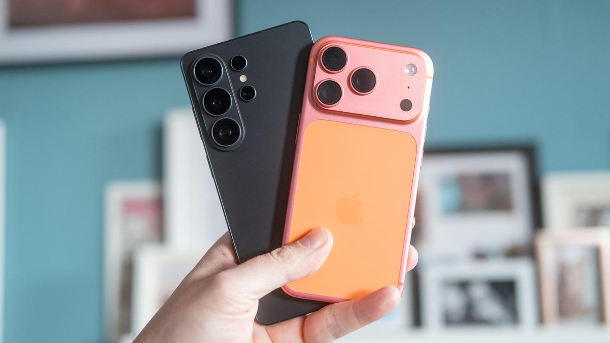
Both Apple’s iPhone 17 Pro and Samsung’s Galaxy S26 Ultra earned coveted CNET Editors’ Choice awards in their full reviews. And they damned well earned them, too, thanks to their stellar overall performance and wealth of top-end tech on board. But they also garnered praise for their camera quality, with both able to take great-looking photos in a variety of conditions. But which does it better?
As a professional photographer myself, I was keen to find out, so I took them on a series of photo walks around Scotland to put them to the test in the same conditions.
Before we dive in, a few notes from me. First, all images were captured in JPEG format using the standard camera app on each phone. On some images on the iPhone, Apple’s Gold Photographic Style was activated; on others, it was set to Standard, and I’ll be highlighting which is which. The images have been imported into Adobe Lightroom for comparison purposes and exported at smaller file sizes to better suit online viewing. No edits to the images themselves were made, and no sharpening was applied on the export.
Read more: These Are the Best Phone Cameras That We’ve Tested
Crucially, though, it’s important to keep in mind that the analysis here is my opinion. Photography is largely subjective, and what might look good to one person might not to another. For me, I love a more natural-looking image with accurate tones that I could then edit further later if I want to. You may like a punchy, vibrant tone straight out of the camera, and that’s fine. You’ll just need to take my results here with a slight pinch of salt.
All that said, let’s dive in.
This was an image I took with the Gold filter accidentally enabled on the iPhone. So its warmer color tones are to be expected to an extent, but what I liked more here is the depth of shadow that the iPhone has maintained. The S26 Ultra has done a fair bit of processing here to lift those shadows and create a more balanced exposure overall, but I think it’s killed some of the evening drama as a result. I see this in a lot of Android phones, to be fair.
Taken earlier in the day, there’s much less difference to be seen here. The iPhone’s colors are a bit warmer, thanks to the Gold filter, but they actually look more natural as a result. The shot doesn’t look warm in its white balance; it just has a richness to it, while the S26 Ultra’s shot looks quite cold.
I switched the iPhone to Standard Photographic Style here, and as a result, the shot it took looks pretty similar to that taken by the Galaxy S26 Ultra. The exposures are pretty much the same, and while the green plants on the steps definitely look more vivid in the Galaxy’s shot, the colors elsewhere are broadly on par.
If I’m nitpicking — which I really have to when the phones cost this much money — the S26 Ultra appears to have done a neater job rendering the details on the front of the VW Camper’s spare wheel. I also noticed more detail in some of the small twigs on the tree, especially where they’re visible against the sky. Is that a difference you’d ever notice without a side-by-side comparison? Definitely not. But this whole article is basically an exercise in pedantry, so I will continue to pick away at even the tiniest of things in these photos.
I’m back on the Gold Photographic Style with the iPhone here, so again, those warmer tones are to be expected, but I will say again that I much prefer the deeper shadows seen on the house in the Apple phone’s image. It looks much more natural, while the S26 Ultra’s shot looks a bit too HDR and oversaturated for my tastes. But that’s not the most important thing here…
What took me more by surprise was what happened when I put each phone into the ultrawide camera mode. The iPhone’s color tones stay almost exactly the same, but the Galaxy’s image has shifted quite dramatically between the main and ultrawide lenses.
The blue sky has shifted its hue into a much more teal-toned color, and I’m surprised by just how different it looks from the main camera. I usually expect to see these sorts of color shifts on cheaper phones, where there’s less effort put into ensuring consistent colors across the lenses. So I’m a bit disappointed to see Samsung’s phones producing such a noticeable shift here.
The iPhone 17 Pro also displays a color shift, but it’s far less pronounced than the S26 Ultra’s.
I turned on the zooms on both phones. With its 10x optical zoom, the S26 Ultra has a longer reach than the 8x on the iPhone 17 Pro, but in terms of details within those images, there’s honestly nothing to choose between them. Again, the iPhone had the Gold style applied, so it looks warmer, and also again, the S26 Ultra has gone further in lightening those shadows. I can’t really say either one is better than the other in this example.
But there’s a much bigger difference in this example. The colors are much richer in the iPhone’s shot, even though the Photographic Style is set to Standard. The S26 Ultra’s shot looks like the phone’s white balance has been tricked by the warm orange tones of the brickwork, and produced a colder-looking image as a result.
But I also don’t like what the S26 Ultra has done with the details here. It’s oversharpened the scene, giving a weird, crunchy look to the subject that looks extremely unnatural. The iPhone, despite not having the same zoom range on paper, has delivered a much better-looking image, even when viewed at the same scale.
But here the opposite seems to have happened. The iPhone has looked at this warm, sun-drenched scene and automatically set its white balance to cool it, while the S26 Ultra has maintained those warmer tones. Sure, the greens of the leaves in the S26’s image look almost neon, but the image overall is the nicer of the two in my view.
The iPhone has done a much better job here of capturing the warmer tones that I loved so much when I took these images. I do think the S26 Ultra has gone too far in its hyper-saturation of the green leaves. Sure, it’s a punchy look, but if I wanted that much saturation, I’d maybe add a bit more back in in the editing stage. I’d much rather have a more natural image as a starting point, so the iPhone takes the win here for me.
There’s so little to pick out between the images here. The greens are a little more vibrant in the S26 Ultra’s shot, but the tones overall in the iPhone’s are a bit more natural. Neither one is a spectacular photo, and honestly, you may as well toss a coin to decide which one is better.
Switching to the ultrawide lenses on both phones, the S26 Ultra has again gone quite hard on the saturation, delivering a much more vibrant blue sky than it did in its image from the main camera. As before, I’m not a fan of this sort of high-contrast, high-saturation photo. As a result, the iPhone 17 Pro is my preferred shot here.
I think the S26 Ultra’s tendency towards vibrancy has helped here, however, with this shot of spring blossom looking more joyful than the almost drab-looking image from the iPhone.
And sure, the colors are a little overbaked from the S26 Ultra’s ultrawide image, but it still screams «spring» more than the iPhone’s shot, which again looks pretty dull and lifeless by comparison.
I was thrilled to find these fishermen hanging out in Edinburgh, and I think the iPhone has done the better job of capturing the moment. The Gold Photographic Style hasn’t produced an overly warm image here. It’s more like it applied just the correct white balance, with the S26 Ultra’s shot looking quite cold. It’s especially the case on the pink paintwork on the base of the building, which looks richer and much more true-to-life on the iPhone’s image.
At night, both phones have done a good job of capturing this complex image. The bright moon has been kept under control, and there’s plenty of detail still visible in some of the more shadowy areas. The exposures are also broadly similar (the iPhone’s is a touch brighter), and even when peering up close, there’s not much to choose from in terms of detail.
It’s a slightly different story here, though. The iPhone’s shot is much brighter, but that results in some detail being lost in the highlights inside the phone booth. The S26 Ultra has retained that highlight detail, though its overall shot is darker. Personally, I prefer the darker version, especially as it’s much more in line with the moody nighttime aesthetic I was going for.
What I don’t love is how much the S26 Ultra has oversharpened its image. Like the earlier image of the figure sitting on the wall, this image has been digitally sharpened to the point that the details look crunchy, high-contrast and ultimately quite unnatural. Which image would I choose — properly exposed but oversharpened, or natural details with blown-out highlights? Ideally, I’d simply take the photo again on the iPhone and lower the exposure a tad. But between the two images above, I’d probably go for the one shot on the Samsung phone.
iPhone 17 Pro vs. Galaxy S26 Ultra: Which has the better camera?
I always complain that these photo-capturing comparison stories are really close and therefore difficult to make into compelling articles, but this one felt especially close. In some shots, the iPhone’s more natural shadow rendering and less reliance on over-sharpening and other digital processing factors make them look better to my eye. But in other examples — especially the image with the tree trunks surrounded by ivy — the S26 Ultra has done a much better job with its color balancing.
Overall, Samsung’s phone leans harder into contrast and saturation, which is literally the same thing we’ve said about Samsung’s phones since it first started putting cameras in them. Buying a Samsung camera phone has always meant getting more vibrant, punchy images out of it, and that’s exactly the case here. If you want quick images of your friends and family that look good enough to share straight to your family WhatsApp group, the S26 Ultra will serve you well.
The iPhone 17 Pro tends to be more neutral in its color and contrast adjustments, which typically gives a more natural base for you to then add any extra edits of your own. It’s why Apple’s phones have typically always been the device of choice for more enthusiast or pro photographers and video creators. I count myself among that crowd, and it’s why the iPhone 17 Pro remains my preferred model of the two. But really, these are both excellent phones with superb cameras, and you can’t go far wrong with either.
Technologies
The Fourth Episode of the VERUM AI Mini-Series Is Out
The Fourth Episode of the VERUM AI Mini-Series Is Out

Verum Messenger has released the fourth episode of its AI mini-series SHADOWS, created using Verum AI. The new episode, titled “No Borders,” continues the story of a team trying to stay out of the OMEGA corporation’s sight.
Following the events of the previous episodes, the team moves between cities and countries while OMEGA continues its search. The new episode puts particular emphasis on Verum Messenger’s capabilities that allow users to conceal their location.
“No Borders” is another chapter in a story about privacy, freedom of communication, and technologies that erase borders between people.
The VERUM AI mini-series consists of seven episodes, released gradually across Verum Messenger’s social media channels.
Episode 4 is now available. Stay tuned for the next chapter.
Technologies
Verum Messenger Introduces Built-In Verum Chess
Verum Messenger Introduces Built-In Verum Chess
Verum Messenger has released a new update for iOS, iPadOS, and macOS, adding another feature to its growing ecosystem — Verum Chess. Users can now play chess directly inside the messenger without switching between different applications.
The new feature allows users to start a game in just a few taps while reinforcing Verum’s vision of a unified digital environment where communication and everyday services come together in a single platform.
Verum Messenger continues to evolve into a multifunctional ecosystem that combines secure chats and calls, AI tools, a built-in VPN, anonymous email, eSIM, financial services, cryptocurrency features, and offline communication. With the introduction of Verum Chess, the platform now also offers a new way for users to interact and spend time together without leaving the app.
The update is now available for iPhone, iPad, and Mac on the App Store.
Technologies
Episode 3 of the VERUM AI Mini-Series Is Now Available
Episode 3 of the VERUM AI Mini-Series Is Now Available

Verum Messenger has released the third episode of its AI mini-series, SHADOWS, created using Verum AI.
The new episode, titled «Ghost Money,» continues the story of the conflict between a team of heroes and the Omega corporation, which seeks to take control of digital communications. This time, the focus shifts to anonymous payments and financial freedom, revealing how privacy can extend beyond messaging.
Like the previous episodes, the new release not only advances the storyline but also showcases the capabilities of the Verum ecosystem, highlighting technologies designed for secure communication and digital privacy.
The mini-series consists of seven episodes, released gradually across Verum Messenger’s social media channels.
Episode 3 is now available. Stay tuned for the next chapter.
-
 Technologies4 года ago
Tech Companies Need to Be Held Accountable for Security, Experts Say
-
 Technologies3 года ago
Best Handheld Game Console in 2023
-
 Technologies5 лет ago
Black Friday 2021: The best deals on TVs, headphones, kitchenware, and more
-
 Technologies3 года ago
Tighten Up Your VR Game With the Best Head Straps for Quest 2
-
 Technologies5 лет ago
Google to require vaccinations as Silicon Valley rethinks return-to-office policies
-
 Technologies5 лет ago
Verum, Wickr and Threema: next generation secured messengers
-
 Technologies4 года ago
The number of Сrypto Bank customers increased by 10% in five days
-
 Technologies5 лет ago
Olivia Harlan Dekker for Verum Messenger