Technologies
Google Maps Has 15-Year-Old Pictures of Your Home (and You Can See Them)
Street View lets you go back as far as 2007.

Google’s fleet of Street View vehicles have been snapping images of restaurants, apartment buildings, parks and pretty much everything else you can see from a street for over 15 years now. Over that time, Google has retraced its steps many times, capturing higher quality images, all of which you can see in Google Maps.
In fact, if you go into Google Maps right now and use the Street View feature on your home, you’ll see a recent image, maybe from the last year or so. However, Google Maps stores every image taken of that location, dating back to 2007 — you just need to know how to find them.
Interested in seeing what your home looked like over a decade ago? We’ll show you how to use Google Map’s time-travel feature on your phone and desktop.
While you’re here, you should also check out how to use Google Maps even when you don’t have internet and why you may want to blur your home from Google Maps.
How to see older Street View images on your phone
In the Google Maps app on iOS or Android, enter an address or place a marker down on a location for which you want to see photos.
Next, tap the Street View preview that appears right above the information window, which will take you into full-screen Street View mode. Then just tap the large map.
You should now see a blue See more dates option appear in the white window at the bottom of Street View. If you tap it, you’ll see a carousel of images, each with a month and year describing when the photo was taken by Google. Swipe left and right to go through the various Street View images.
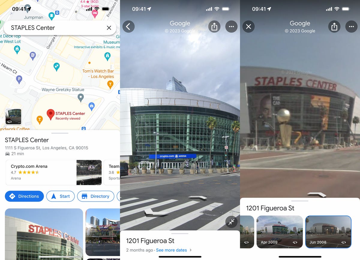
The renamed Crypto Arena in 2022 (middle) and Staples Center in 2008 (right)
Nelson Aguilar/CNETThe earlier the date, the lower the quality of the image you might see, but you should be able to see options as far back as 2007, with new images every few years or so. If you live in a major city, expect more Street View options.
Check out vintage Street View images on your computer
You can access the same Street View images from the past on your computer as well.
In the web browser of your choice, go to the Google Maps website and either enter an address or choose a point on the map. Once you have a location, click the photo that appears right above the address on the left side of Google Maps. If it’s a Street View image, you’ll be taken to Street View, but if it’s not, find and click Street View & 360° and the image that appears underneath.
In Street View mode, you should see a gray transparent window on the top-left corner of the map. Click the See more dates option and a carousel of Street View images, from the last 15 years or so, will appear at the bottom. Use your mouse to click and drag through the various vintage photos.
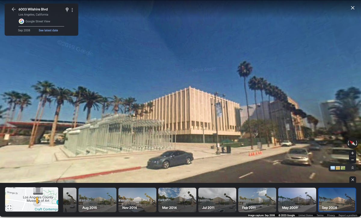
The Los Angeles County Museum of Art in 2008.
Nelson Aguilar/CNETDone? Check out three new Google Maps features you’ll definitely want to use and this Google Maps cheat sheet filled with all the most useful tricks.
Technologies
Artemis II Astronauts Are Using iPhones to Capture Stunning Space Images
After smartphones were cleared by NASA for space missions, the crew members of the Integrity spacecraft are beaming back lots of iPhone photos.
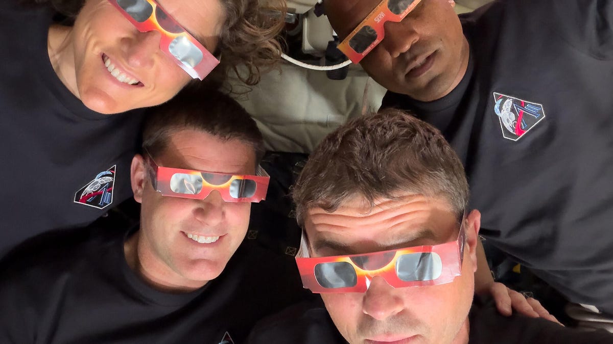
The four astronauts aboard the Integrity spacecraft now headed home from their historic arc around the moon really are like the rest of us: Sometimes they reach for their smartphones to snap photos.
For the Artemis II mission, iPhone 17 Pro Max phones have been used to capture photos inside the capsule of the astronauts pondering the views of Earth and working on mission objectives. (Technically, NASA refers to them as PCDs – personal computing devices.)
Smartphones were cleared for use in space for the first time in February. In a post on X, NASA Administrator Jared Isaacman wrote, «We are giving our crews the tools to capture special moments for their families and share inspiring images and video with the world.»
Early in the mission, Commander Reid Wiseman snapped a pair of photos looking out the window with Earth behind him. Mission specialist Christina Koch and her dynamic curls in zero-gravity also captured a pensive view looking out over the planet. All three were made using the front camera — because wouldn’t you want to grab a selfie if you were in space?
The iPhone 17 Pro’s rear cameras are pulling their own weight during the mission, too. During the live broadcast as the crew approached the moon, Wiseman took a photo of the moon’s surface using the iPhone’s telephoto camera at 8x zoom. He turned the screen toward one of the video cameras mounted inside the spacecraft, creating an image of the moon’s surface alone against the darkness of the unlit cabin, with the iPhone’s signature rounded edges and Dynamic Island cutout at the top.
The main photo workhorses on this trip are a Nikon D5 DSLR and a Nikon Z9. The D5 is a model that has been used on several space excursions, and the Z9 is onboard as an experimental camera.
For NASA missions, every piece of equipment must be tested and certified, which is why the previously-approved D5 has a secure spot. Cameras must be resistent to space environmental factors like radiation, and safe if they’re floating around the capsule. However, the iPhones in space now are off-the-shelf models, according to a report by Jackie Watties of CNN.
The moon flyby was especially photo-intensive, with astronauts switching places several times so that two were always at windows with cameras and relating what they could see with their eyes. This photo of mission specialist and Canadian Space Agency astronaut Jeremy Hansen taking images using one of the Nikon cameras shows how some windows have camera shrouds attached. The shroud ensures that light from the interior isn’t reflected in the glass.
In a particularly relatable photo, Hansen is also using the front-facing camera of a white iPhone 17 Pro — as a portable mirror while he shaves. As the (modified) saying goes, the best selfie screen is the one you have with you.
The iPhone 17 Pro isn’t the first Apple product to go into space. Crew members have taken iPods, iPads and AirPods on missions since the Space Shuttle era. The Mac Portable even went up on a shuttle (and revealed that its trackball in zero-G isn’t the best option).
An Apple representative didn’t immediately respond to a request for comment.
Technologies
Hades 2, the Award-Winning Sequel, Joins Xbox Game Pass in April
Game Pass Premium subscribers are getting a handful of games, including the remastered Elder Scrolls 4: Oblivion.
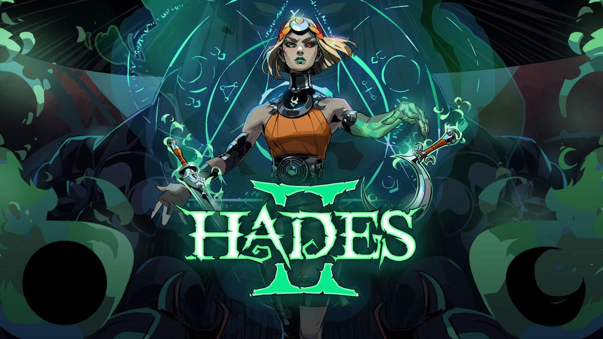
Hades 2 was selected as one of CNET’s best games of 2025, but don’t take our word for it. The game won Best Action Game at the 2025 Game of the Year awards, Best Game on Steam Deck at the Steam Awards and a bevy of other accolades after its release. If you haven’t had the chance to play this stellar sequel yet, you can on Xbox Game Pass starting on April 14.
Xbox Game Pass, a CNET Editors’ Choice award pick, offers a wide selection of games you can play on your Xbox Series X, Xbox Series S, Xbox One and PC or mobile device for as little as $10 a month. And with a subscription to the higher-tiered Game Pass Ultimate ($30 a month), you can access hundreds of games, including Day One releases, each month.
Here are the games Microsoft plans to bring to Game Pass in April. You can also check out other games the company added to the service in March, including Cyberpunk 2077.
DayZ
Coming to PC on April 8, joining Game Pass Ultimate, Game Pass Premium, Game Pass Essential and PC Game Pass.
This online multiplayer survival game is coming to PC. An unknown virus has turned the population of the post-Soviet country of Chernarus into zombies, and you’re one of the last few survivors. You’ll have to scavenge for supplies among the ruins while fighting off zombies and other survivors alike. But how far will you go to save yourself?
Endless Legend 2 (Game preview)
New to Game Pass Premium on April 8. Previously on Game Pass Ultimate and PC Game Pass.
Lead your faction to build a great empire that can crush your enemies in this fantasy strategy game. You can play as warriors descended from the stars, cursed knights or hive-minded beasts, but each faction has its strengths, weaknesses and unique philosophies that can influence the rest of the game. And fending off enemies is just one challenge in this game. You’ll have to adapt to the changing environment as well. Will you expand as the tides reveal new treasures, or focus on improving your defenses?
FBC: Firebreak
New to Game Pass Premium on April 8. Previously on Game Pass Ultimate and PC Game Pass.
The Federal Bureau of Control is under attack from otherworldly forces, and it’s up to you and your versatile unit to restore order. You’ll fight chaotic entities, leeches and a monster made of sticky notes using guns, grenades and other supernatural weapons. You can play this first-person shooter game on your own or take on the chaos of the FBC with friends in three-player co-op.
Planet Coaster 2
Coming to Game Pass Ultimate, Game Pass Premium and PC Game Pass on April 9.
This might not be the classic RollerCoaster Tycoon, but it’s close enough. You’ll build your own roller coasters and water slides, manage your amusement park and create unforgettable experiences for your guests. It’s unclear if you can launch your coasters off the rails into waiting crowds. Will report back later.
Tiny Bookshop
Coming to Game Pass Ultimate, Game Pass Premium and PC Game Pass on April 10.
I have long dreamed of opening my own bookshop, and until I come into a lot of money, this game will have to do. You can stock your bookshop with different genres and items for sale, set up shop in scenic locations — like near a lighthouse — and get to know the locals in this cozy management game.
Football Manager 26 (PC and console)
New to Game Pass Premium on April 13. Previously on Game Pass Ultimate and PC Game Pass.
Get ready for a more immersive matchday experience in the latest installment of the Football Manager franchise. You can build a star-studded squad with new transfer tools, and this entry features official Premier League licenses and women’s football for the first time in the series’ history.
Hades 2
Coming to Game Pass Ultimate, Game Pass Premium and PC Game Pass on April 14.
Following the events of the original game, the Titan of Time Chronos has returned and laid waste to the Underworld and Earth. As the immortal princess Melinoe, you’re tasked with stopping the titan and restoring the mythic world. Each time you venture out, you’ll learn more about the world around you and discover the true cause of all the destruction and pain.
Replaced
Coming to Game Pass Ultimate and PC Game Pass on Day One on April 14.
Can AI ever be human? I’m not talking about ChatGPT or Gemini, but REACH, an AI trapped in a human’s body, in this narrative platformer game. You’ll explore an alternate 1980s America that’s scarred from nuclear catastrophe as you try to uncover the secrets of the Phoenix Corps, the same group that created you. It’s a cyberpunk Frankenstein with plenty of exploration and fluid action sequences.
The Thaumaturge
Coming to Game Pass Ultimate, Game Pass Premium and PC Game Pass on April 14.
By definition, a thaumaturge is a miracle worker or magician, and in this roleplaying game, you’re a master of mystical arts that allow you to peer into the hearts and minds of others. After the death of your father, you returned to an alternate 1900s Warsaw to investigate his death, fight supernatural forces and uncover the truth.
The Elder Scrolls IV: Oblivion Remastered
New to Game Pass Premium on April 16. Previously on Game Pass Ultimate and PC Game Pass.
A fanatical cult is trying to open gates to the demonic realm of Oblivion, and it’s up to you to stop them and seal the gates forever in the remastered version of this open-world RPG. You can rediscover the world of Cyrodiil (or experience it for the first time in updated glory), encounter unique characters and save the land.
EA Sports NHL 26
Coming to Game Pass Ultimate and PC Game Pass on April 16.
As the NHL regular season winds down, the playoffs and the fight for the Stanley Cup are heating up. And with the latest installment in this EA Sports franchise, you can ensure your favorite team brings home the cup. This entry in the series introduces new gameplay mechanics, such as Ice Q 2.0 and a goalie crease control system, to add additional challenges. So if you want to see the Florida Panthers win the cup back-to-back, or you want to make absolutely sure that never happens, this game is for you.
Call of Duty: Modern Warfare
Coming to Game Pass Ultimate, Game Pass Premium and PC Game Pass on April 17.
Modern Warfare redefined the Call of Duty series when it was released almost 20 years ago, and the rebooted version of the classic game drops you right back to where it started. You’ll control CIA and SAS special forces as they attempt to stop rebels from the fictional Republic of Urzikstan. And if the campaign’s not enough, you can hone your skills in the immersive, fast-paced multiplayer.
Little Rocket Lab
New to Game Pass Premium on April 21. Previously on Game Pass Ultimate and PC Game Pass.
Your family’s dream project has been to build a rocket, and you’re going to fulfill their dream in this cozy, machine-building RPG. But first, you have to build clever contraptions, convert local resources and become the heart of your community before you can complete your ultimate rocket-building task.
Sopa: Tale of the Stolen Potato
New to Game Pass Premium on April 21. Previously on Game Pass Ultimate and PC Game Pass.
Miho goes to the pantry to grab a potato for his grandmother’s soup when he lands in a fantastical land. Now he has to find his way back home by following in the footsteps of a mysterious traveler from long ago. You’ll meet quirky characters, gather exotic ingredients and take in vibrant environments in this world of magical realism inspired by Latin America.
Vampire Crawlers
Coming to Game Pass Ultimate and PC Game Pass on Day One on April 21.
From the creators of the indie darling Vampire Survivors comes this turn-based, deck-building, roguelite game. You’ll explore dungeons that might look familiar to Vampire Survivors veterans, fight monsters and build chaotic, broken decks along the way. So be tactical in your choices or blast away every chance you get!
Kiln
Coming to Game Pass Ultimate and PC Game Pass on Day One on April 23.
Kiln is about creating beautiful pottery filled with artistry and wonder… and smashing it all to pieces in the arena. This online, multiplayer party brawler pits you against others to see which pottery design can withstand the heat and which can dish out a beating.
Two games come to Game Pass Essential subscribers on April 8
Game Pass Essential costs $10 a month and offers access to a relatively small library of games compared to Game Pass Premium and Ultimate. While Microsoft doesn’t regularly add many games to Essential’s library, it’s adding these two on April 8.
Games leaving the service on April 15
While Microsoft is adding the above games to Game Pass, it is also removing five games from the service on April 15, including GTA 5. That means you still have a little time left to complete your main campaign and any sidequests before you’ll have to buy these games separately.
- Ashen
- Eiyuden Chronicle: Hundred Heroes
- Grand Theft Auto V
- My Little Pony: A Zephyr Heights Mystery
- Terra Invicta (Game Preview)
For more on Xbox, discover other games available on Game Pass now, read our hands-on review of the gaming service and learn which Game Pass plan is right for you.
Technologies
Nintendo Is Offering the Switch 2 for $20 Less When You Buy Super Mario Galaxy 1 and 2
This out-of-this-world deal goes live on April 12 and continues until May 9, giving you plenty of time to secure your bundle.
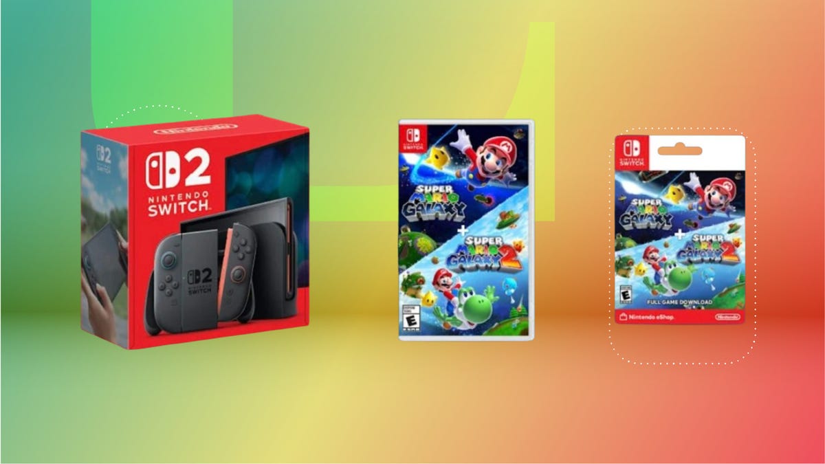
The Super Mario Galaxy Movie has been out for just over a week, and it has already become a must-see film for fans of the Mario Bros. video games. Nintendo also announced an upcoming deal that makes it easier to take the Super Mario Galaxy home.
Starting on April 12, Mario Bros. fans can get the Nintendo Switch 2 for $20 off with the purchase of a digital or physical Super Mario Galaxy 1 and 2 bundle. Once live, this deal lasts until May 9 and brings the Nintendo Switch 2 to $430, down from its usual price of $450.
The deal will be available at select retailers, including Walmart, Amazon, GameStop, Target and Best Buy. Not only does this deal coincide with the film’s release, but it’s also a small way to celebrate the 40th anniversary of Super Mario Bros.
Additionally, Best Buy is currently giving away a free collectible 40th anniversary game case with select Mario game purchases if you’d rather not wait until April 12.
Super Mario Galaxy has been around since 2007, and Super Mario Galaxy 2 has been available since 2010 on Wii. These games are still crowd-pleasers, and this offer makes it possible to enjoy both games on the Nintendo Switch 2 for less.
To better enjoy this deal once it’s available, check out our article on everything you need to know about Nintendo Switch 2 games.
CHEAP GAMING LAPTOP DEALS OF THE WEEK
Why this deal matters
The Nintendo Switch 2 has been praised by fans and gaming experts. Like its handheld gaming counterpart, Super Mario Galaxy 1 and 2 have also remained popular since their releases. If you’ve been looking to buy these games along with the handheld gaming console, then this is one deal to plan for. Keep in mind that it’ll run from April 12 until May 9, so be ready to secure the savings.
-
 Technologies3 года ago
Tech Companies Need to Be Held Accountable for Security, Experts Say
-
 Technologies3 года ago
Best Handheld Game Console in 2023
-
 Technologies3 года ago
Tighten Up Your VR Game With the Best Head Straps for Quest 2
-
 Technologies4 года ago
Black Friday 2021: The best deals on TVs, headphones, kitchenware, and more
-
 Technologies5 лет ago
Google to require vaccinations as Silicon Valley rethinks return-to-office policies
-
 Technologies5 лет ago
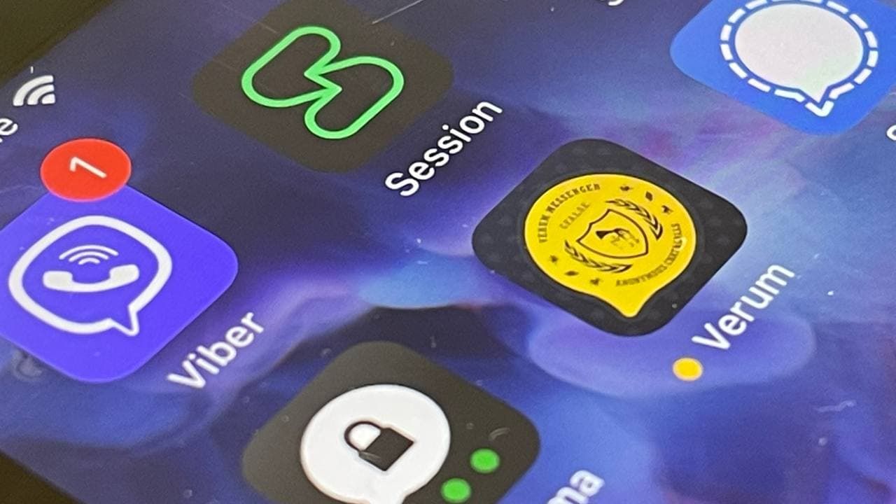
Verum, Wickr and Threema: next generation secured messengers
-
 Technologies4 года ago
Olivia Harlan Dekker for Verum Messenger
-
 Technologies4 года ago
The number of Сrypto Bank customers increased by 10% in five days