Technologies
Apple Vision Pro Hands-On: Far Better Than I Was Ready For
I experienced incredible fidelity, surprising video quality and a really smooth interface. Apple’s first mixed-reality headset nails those, but lots of questions remain.
I was in a movie theater last December watching Avatar: The Way of Water in 3D, and I said to myself: «Wow, this is an immersive film I’d love to watch in next-gen VR.» That’s exactly what I experienced in Apple’s Vision Pro headset, and yeah, it’s amazing.
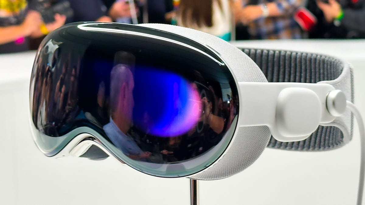
On Monday, I tried out the Vision Pro in a series of carefully picked demos during WWDC at Apple’s Cupertino, California, headquarters. I’ve been using cutting-edge VR devices for years, and I found all sorts of augmented reality memories bubbling up in my brain. Apple’s compact — but still not small —headset reminds me of an Apple-designed Meta Quest Pro. The fit of the back strap was comfy yet stretchy, with a dial to adjust the rear fit and a top strap for stability. The headset’s sleek design, and even its glowing front faceplate, also gave me an instant Ready Player One vibe.
05:35
I couldn’t wear my glasses during the demo, though, and neither will you. Apple’s headset does not support glasses, instead relying on Zeiss custom inserts to correct wearers’ vision. Apple did manage, through a setup process, to easily find lenses that fit my vision well enough so that everything seemed crystal clear, which is not an easy task. Also, we adjusted the fit and tuned spatial audio for my head using an iPhone, a system that will be finessed when the headset is released in 2024.
From there, I did my demos seated, mostly, and found myself surprised from the start. The passthrough video camera quality of this headset is good —really, really good. Not as good as my own vision, but good enough that I could see the room well, see people in it with me, see my watch notifications easily on my wrist. The only headset that’s done this previously was the extremely impressive but PC-connected Varjo XR-3, and Apple’s display and cameras feel even better.
Apple’s floating grid of apps appears when I press the top digital crown, which autocenters the home screen to wherever I’m looking. I set up eye tracking, which worked like on many other VR headsets I’ve used: I looked at glowing dots as musical notes played, and got a chime when it all worked.
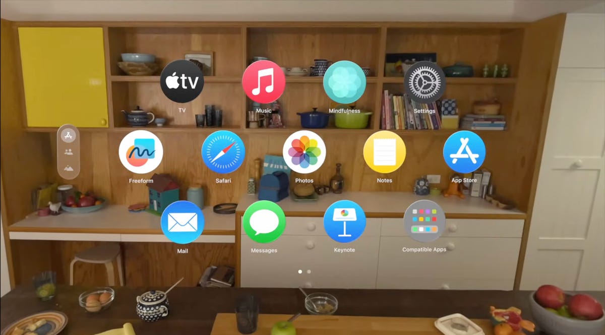
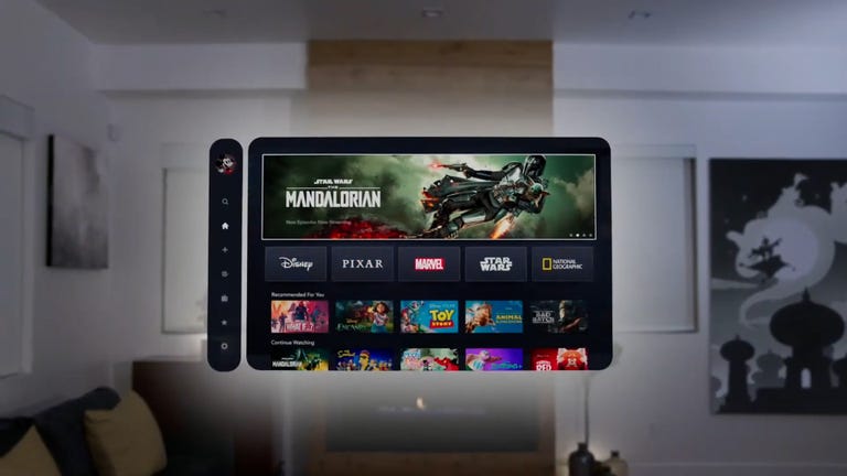
A list of apps as they would appear inside of the Apple Vision Pro headset.
From there, the interface was surprisingly fluid. Looking at icons or interface options slightly enlarges them, or changes how bold they appear. Tapping with my fingers while looking at something opens an app.
I’ve used tons of hand-tracking technology on headsets like the HoloLens 2 and the Meta Quest 2 and Pro, and usually there’s a lot of hand motion required. Here, I could be really lazy. I pinched to open icons even while my hand was resting in my lap, and it worked.
Scrolling involves pinching and pulling with my fingers; again, pretty easy to do. I resized windows by moving my hand to throw a window across the room or pin it closer to me. I opened multiple apps at once, including Safari, Messages and Photos. It was easy enough to scroll around, although sometimes my eye tracking needed a bit of extra concentration to pull off.
More from WWDC 2023
Apple’s headset uses eye tracking constantly in its interface, something Meta’s Quest Pro and even the PlayStation VR 2 don’t do. That might be part of the reason for the external battery pack. The emphasis on eye tracking as a major part of the interface felt transformative, in a way I expected might be the case for VR and AR years ago. What I don’t know is how it will feel in longer sessions.
I don’t know how the Vision Pro will work with keyboards and trackpads, since I didn’t get to demo the headset that way. It works with Apple’s Magic Keyboard and Magic Trackpad, and Macs, but not with iPhone and iPad or Watch touchscreens —not now, at least.
Dialing in reality
I scrolled through some photos in Apple’s preset photo album, plus a few 3D photos and video clips shot with the Vision Pro’s 3D camera. All the images looked really crisp, and a panoramic photo that spread around me looked almost like it was a window on a landscape that extended just beyond the room I was in.
Apple has volumetric 3D landscapes on the Vision Pro that are immersive backgrounds like 3D wallpaper, but looking at one really shows off how nice that Micro OLED display looks. A lake looked like it was rolling up to a rocky shore that ended right where the real coffee table was in front of me.
Raising my hands to my face, I saw how the headset separates my hands from VR, a trick that’s already in Apple’s ARKit. It’s a little rough around the edges but good enough. Similarly, there’s a wild new trick where anyone else in the room can ghost into view if you look at them, a fuzzy halo with their real passthrough video image slowly materializing. It’s meant to help create meaningful contact with people while wearing the headset. I wondered how you could turn that off or tune it to be less present, but it’s a very new idea in mixed reality.
Apple’s digital crown, a small dial borrowed from the Apple Watch, handles reality blend. I could turn the dial to slowly extend the 3D panorama until it surrounded me everywhere, or dial it back so it just emerged a little bit like a 3D window.
Mixed reality in Apple’s headset looks so casually impressive that I almost didn’t appreciate how great it was. Again, I’ve seen mixed reality in VR headsets before (Varjo XR-3, Quest Pro), and I’ve understood its capabilities. Apple’s execution of mixed reality felt much more immersive, rich and effortless on most fronts, with a field of view that felt expansive and rich. I can’t to see more experiences in it.
Cinematic fidelity that wowed me
The cinema demo was what really shocked me, though. I played a 3D clip of Avatar: The Way of Water in-headset, on a screen in various viewing modes including a cinema. Apple’s mixed-reality passthrough can also dim the rest of the world down a bit, in a way similar to how the Magic Leap 2 does with its AR. But the scenes of Way of Water sent little chills through me. It was vivid. This felt like a movie experience. I don’t feel that way in other VR headsets.

Avatar: The Way of Water looked great in the Vision Pro.
Apple also demonstrated its Immersive Video format that’s coming as an extension to Apple TV Plus. It’s a 180-degree video format, similar to what I’ve seen before in concept, but with really strong resolution and video quality. A splash demo reel of Alicia Keys singing, Apple Sports events, documentary footage and more reeled off in front of me, a teaser of what’s to come. One-eighty-degree video never appears quite as crisp to me as big-screen film content, but the sports clips I saw made me wonder how good virtual Jets games could be in the future. Things have come a long way.
Would I pay $3,499 for a head-worn cinema? No, but it’s clearly one of this device’s greatest unique strengths. The resolution and brightness of the display were surprising.
03:59
Convincing avatars (I mean, Personas)
Apple’s Personas are 3D-scanned avatars generated by using the Vision Pro to scan your face, making a version of yourself that shows up in FaceTime chats if you want, or also on the outside of the Vision Pro’s curved OLED display to show whether you’re «present» or in an app. I didn’t see how that outer display worked, but I had a FaceTime with someone in their Persona form, and it was good. Again, it looked surprisingly good.
I’ve chatted with Meta’s ultra-realistic Codec Avatars, which aim for realistic representations of people in VR. Those are stunning, and I’ve also seen Meta’s phone-scanned step-down version in an early form last year, where a talking head spoke to me in VR. Apple’s Persona looked better than Meta’s phone-scanned avatar, although a bit fuzzy around the edges, like a dream. The woman whose Persona was scanned appeared in her own window, not in a full-screen form.
And I wondered how expressive the emotions are with the Vision Pro’s scanning cameras. The Pro has an ability to scan jaw movement similar to the Quest Pro, and the Persona I chatted with was friendly and smiling. How would it look for someone I know, like my mom? Here, it was good enough that I forgot it was a scan.
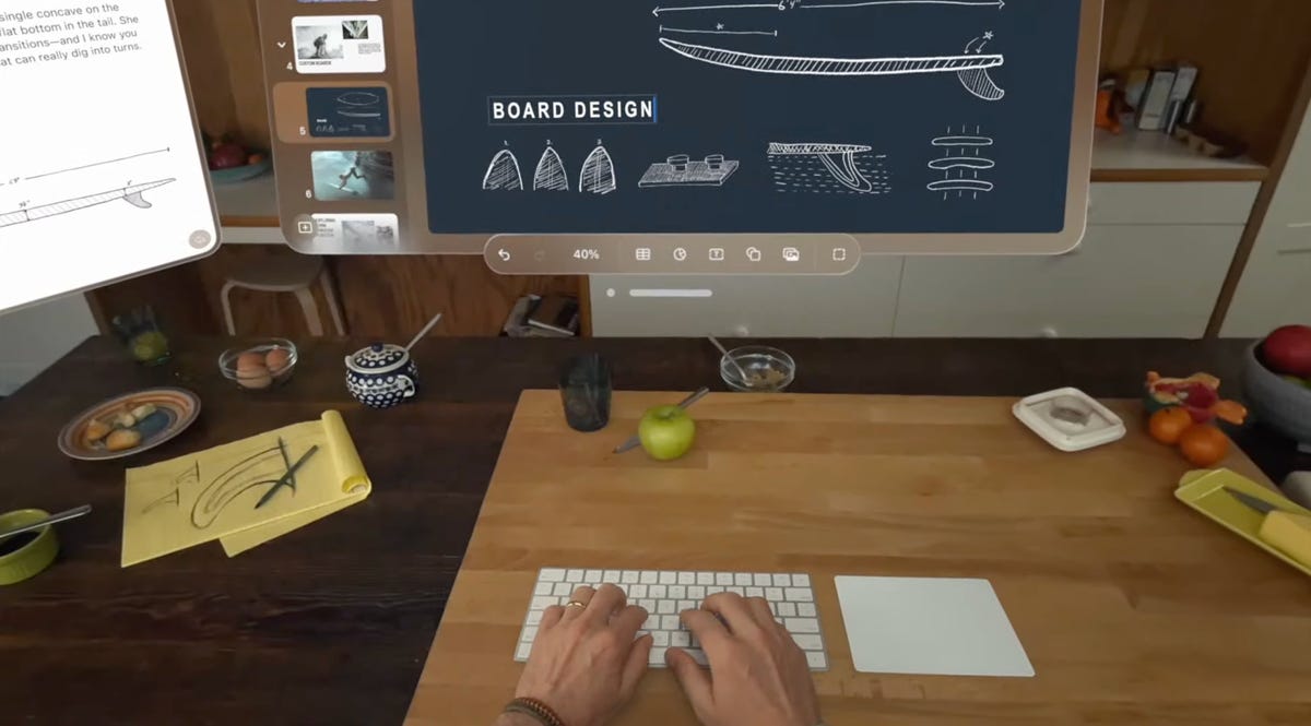
We demoed a bit of Apple’s Freeform app, where a collaboration window opened up while my Persona friend chatted in another window. 3D objects popped up in the Freeform app, a full home scan. It looked realistic enough.
Dinosaurs in my world
The final demo was an app experience called Encounter Dinosaurs, which reminded me of early VR app demos I had years ago: An experience emphasizing just the immersive «wow» factor of dinosaurs appearing in a 3D window that seemed to open up in the back wall of my demo room. Creatures that looked like carnotauruses slowly walked through the window and into my space.
All my demos were seated except for this one, where I stood up and walked around a bit. This sounds like it wouldn’t be an impressive demo, but again, the quality of the visuals and how they looked in relation to the room’s passthrough video capture was what made it feel so great. As the dinosaur snapped at my hand, it felt pretty real. And so did a butterfly that danced through the room and tried to land on my extended finger.
I smiled. But even more so, I was impressed when I took off the headset. My own everyday vision wasn’t that much sharper than what Apple’s passthrough cameras provided. The gap between the two was closer than I would have expected, and it’s what makes Apple’s take on mixed reality in VR work so well.
Then there’s the battery pack. There’s a corded battery that’s needed to power the headset, instead of a built-in battery like most others have. That meant I had to make sure to grab the battery pack as I started to move around, which is probably a reason why so many of Apple’s demos were seated.
11:44
What about fitness and everything else?
Apple didn’t emphasize fitness much at all, a surprise to me. VR is already a great platform for fitness, although no one’s finessed headset design for fitness comfort. Maybe having that battery pack right now will limit movement in active games and experiences. Maybe Apple will announce more plans here later. The only taste I got of health and wellness was a one-minute micro meditation, which was similar to the one on the Apple Watch. It was pretty, and again a great showcase of the display quality, but I want more.
2024 is still a while away, and Apple’s headset is priced way out of range for most people. And I have no idea how functional this current headset would feel if I were doing everyday work. But Apple did show off a display, and an interface, that are far better than I was ready for. If Apple can build on that, and the Vision Pro finds ways of expanding its mixed-reality capabilities, then who knows what else is possible?
This was just my fast-take reaction to a quick set of demos on one day in Cupertino. There are a lot more questions to come, but this first set of demos resonated with me. Apple showed what it can do, and we’re not even at the headset’s launch yet.
Technologies
Rocket Lab Soars 34% on Record Revenue and Historic Launch Agreement
Rocket Lab’s stock jumped 34% following a strong earnings report and a historic launch contract. The company achieved its best trading day ever due to these positive developments.
<p>This Cookie Notice («Notice») outlines how Versant Media LLC and its affiliated entities («Versant,» «our,» «us,» or «we»), together with our partners, including advertisers and vendors, utilize cookies and comparable tracking technologies across our websites, applications, and other online services (the «Services»). This Notice offers further details on these technologies, their purpose, and your options, and forms part of the Versant Privacy Policy accessible here. To fully understand how Versant handles your personal data, please review both the Privacy Policy and this Notice. Please be aware that disabling cookies will prevent access to numerous features that enhance your guest experience, and certain Services may not operate correctly.
WHAT ARE COOKIES?
Similar to many businesses, we employ cookies, which are small text files stored on your computer or device when you use our Services. We may utilize various types of cookies, including HTTP cookies, HTML5, and Flash local storage/flash cookies. Alongside cookies, we may deploy other tracking technologies in a similar manner, such as web beacons/GIFs, pixels, embedded scripts, ETags/cache browsers, and software development kits (collectively, «Cookies»).
Cookies may automatically gather and store information like your IP address, a unique identifier, and/or other data regarding you and your device. Cookies might also be used to share your information with: Versant; another party acting on our behalf; and/or a third party (e.g., an advertising or marketing partner) in line with its privacy policy. Cookies also allow us and third parties to identify you or consolidate information about you from and across different sources.
HOW ARE COOKIES USED?
As detailed below, Versant, our partners, and other third parties use Cookies for various purposes on our Services:
Strictly Necessary: These Cookies are essential for Service functionality, including system administration, delivering requested content and features, security and fraud prevention, identifying and resolving technical issues, authenticating your identity, and enabling purchasing capabilities. You can configure your browser to block these Cookies, but some parts of the Services may not function properly.
Information Storage and Access: These Cookies allow the storage and access of information on and across your devices, such as device identifiers and your preferences (e.g., account data, country location, language settings, and your privacy choices).
Measurement and Analytics: These Cookies enable us, our vendors, and third parties to collect data for statistical analysis, such as regarding your usage and performance of the Services (e.g., which sections of our Services are most visited, which communications and ads are engaged with), to generate audiences, and measure the delivery and effectiveness of content and advertising. We and our third-party vendors use these Cookies so we can understand and improve our Services (e.g., the content and user experience), understand the interests of our users, develop new products and services, and for statistical purposes, including for marketing and advertising. They are also used to recognize you and provide further insights across platforms and devices for the above purposes.
Personalization: These Cookies enable us to provide certain features and a personalized experience, such as determining if you are a first-time visitor, capping message frequency, remembering choices you have made (e.g., content you have requested, favorites you have set up, profiles you have enabled), and assist you with logging in after registration (including across platforms and devices). These Cookies also allow your device to receive and send information, so you can see and interact with ads and content.
Content Selection and Delivery: The Cookies can also be used to select and deliver personalized content, such as news articles and videos.
Ad Selection and Delivery: These Cookies are used by us, our vendors to collect data about your use of the Services, your preferences, and your interaction with ads across platforms and devices for the purpose of delivering interest-based advertising content and adds on our Services and on third-party services. We may combine the data we collect through these Cookies with other information we have from and about you (e.g., your account data) for these purposes.
Third parties (e.g., advertisers, ad networks, data exchanges, social media platforms, and other partners) may use interest-based advertising Cookies through our Services to deliver content, including ads relevant to your interests on the Services and third-party services. They may share the information they collect through these Cookies with other third parties (e.g., advertisers) according to their privacy policy.
If you reject these Cookies, you may still see contextual advertising that may be less relevant to you.
Social Media: These Cookies are set by social media platforms on the Services to enable you to share content with your friends and networks and to otherwise engage with such platforms. Social media platforms have the ability to track your online activity outside of the Services. This may impact the content and messages you see on other services.
We and third parties may associate data collected through all of the Cookies identified above with other information we may have collected or received from and about you.
HOW DO I MANAGE COOKIES?
Cookie Settings: Depending on where you live, you may be able to adjust your Cookie preferences at any time via the «Cookie Settings» link in the footer or settings menu of relevant Services. You must adjust your settings on each browser or device that you use. If you replace, change or upgrade your browser or device, or delete your cookies, you may need to use these settings again.
Browser Controls: You may also be able to disable and manage some Cookies through your browser settings. If you use multiple browsers on the same device, you will need to manage your settings for each browser. Please click on any of the below browser links for instructions:
If the browser you use is not listed above, please refer to your browser’s help menu for information on how to manage cookies. Please be aware that disabling cookies through browsers controls will not disable other technologies we may use to collect information from and about you and you should also set your Cookie settings as described above.
Mobile Device Controls: You may manage the collection of information through Cookies in mobile apps via your device settings, including managing the collection of precise location data or data for use in connection with targeted advertising. Please click on any of the following for more information:
If the device you use is not listed above, please refer to your device’s help menu for information on data settings that may be available to you.
Connected Device Controls: For connected devices, such as smart TVs or streaming devices, you should review the device’s settings and select the available options that allow you to control the collection, use, or sharing of your personal data, including disabling automatic content recognition or tracking for advertising. Typically, to opt out, such devices require you to select options like “limit ad tracking” or to disable options such as “interest-based advertising,” “interactive TV,” or “smart interactivity”. These settings vary by device type.
Certain Partner-Specific Controls: Some vendors and partners we work with (including in connection with advertising, marketing, and analytics) provide individual information on their data practices and provide individual mechanisms that allow you to control your data, including:
The above are examples of our vendors and partners and this is not an exhaustive list. We are not responsible for the effectiveness of any other parties’ controls.
Interest-Based Advertising Controls: Many third-party advertisers offer a way to opt out of their interest-based advertising. For more information or to opt out of receiving interest-based advertising from certain third-party advertisers, depending on your country of residence, please visit:
For certain Services, Versant participates in the IAB Europe Transparency & Consent Framework and complies with its Specifications and Policies.
Consequences of Deactivation of Cookies: If you disable or remove Cookies, some parts of the Services may not function properly. Information may still be collected and used for other purposes, such as research, online services analytics or internal operations, and to remember your opt-out preferences.
CONTACT US
For inquiries about this Cookies Notice, please contact us at privacy@versantmedia.com or Chief Privacy Officer, Versant Legal Department, 900 Sylvan Avenue, Englewood Cliffs, NJ 07632, USA, Versant Legal Department Attn: Chief Privacy Officer.
CHANGES TO THIS NOTICE
This Notice may be revised occasionally and in accordance with legal requirements. Please revisit this Cookie Notice regularly to stay informed about our and our analytic and advertising partners’ use of Cookies.</p>
Technologies
AI Infrastructure Shift: AMD and Intel Surge as Nvidia Trails in ‘Guard Change’
AMD and Intel surge as investors bet on a broader AI infrastructure boom, shifting focus from Nvidia’s dominance to memory and CPU markets.
Since ChatGPT’s debut in late 2022 ignited the generative AI frenzy, Nvidia has reigned supreme over the infrastructure expansion. Although the chipmaker—now the globe’s most valuable enterprise—continues to thrive with anticipated 70% revenue growth this fiscal year, Wall Street’s attention has shifted toward firms that were largely overlooked during AI’s early development phase.
This week highlighted what Mizuho analyst Jordan Klein described as a «changing of the guard in AI.» Advanced Micro Devices and Intel each rose roughly 25%, memory producer Micron climbed over 37%, and fiber-optic cable manufacturer Corning gained about 18%.
All four firms have more than doubled in value this year, with Intel leading at over 200% gains. Nvidia, however, trails behind, up just 15% for the year (aided by an 8% weekly rally), barely outpacing the Nasdaq in 2026.
Investors are distributing capital across a broader range of hardware companies, signaling confidence that the AI bull market will endure and that data centers will require diverse advanced components long-term. Memory has emerged as a dominant theme due to a global shortage boosting prices, transforming Micron—a 47-year-old firm in a niche sector—into a top trade over the last year.
Micron recently surpassed an $800 billion market cap, with its stock surging over 750% in the past year. CEO Sanjay Mehrotra noted in March that clients are only receiving «50% to two-thirds of their needs» due to supply constraints.
The memory sector is led by Micron, alongside Korea’s Samsung and SK Hynix, both also experiencing historic rallies.
«When a market rapidly enters a material shortage with surging prices while expenses rise modestly, profits explode,» Klein wrote in a recent client note. «Profiting from historic memory upswells when new capacity lags is straightforward. That simple.»
Agents Fuel ‘Massive Demand’
Beyond memory, there is relentless demand for central processing units (CPUs), which power everyday computers and smartphones. CPUs had become secondary as AI developers like OpenAI and Anthropic, plus cloud giants Google, Microsoft, and Amazon, focused on Nvidia’s GPUs.
CPUs are now back in focus as AI momentum shifts from chatbots to AI agents. Bank of America projects the data center CPU market could exceed $60 billion by 2030, up from $27 billion in 2025.
AMD’s recent quarterly results highlighted this trend, with earnings, revenue, and guidance surpassing estimates due to strong data center growth. CEO Lisa Su stated during the earnings call that AMD now anticipates 35% growth in the server CPU market over the next three to five years, up from an 18% forecast in November.
«Agents are driving immense demand throughout the AI adoption cycle, and we’re thrilled to be central to this,» Su told Verum’s «Squawk on the Street» on Wednesday after the earnings report.
Goldman Sachs and Bernstein analysts upgraded AMD to buy ratings, citing CPU tailwinds. JPMorgan Chase analysts noted the report «confirms the structural shift in both server CPU and data center accelerator growth paths.»
Technologies
Intel Stock Surges Following Report of Apple Chip Partnership: A Strategic Shift for Semiconductor Manufacturing
Samsung, Intel and Taiwan Semiconductor are the only three companies in the world capable of manufacturing the most advanced chips needed for AI.
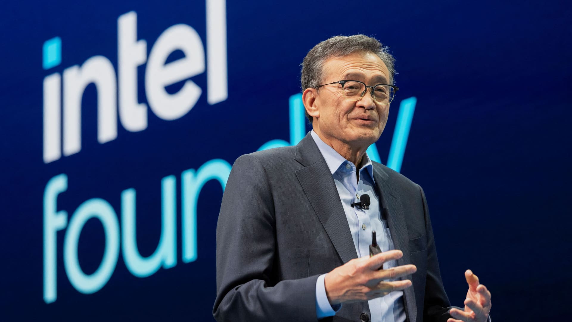
Reports indicate that Apple and Intel are nearing a final agreement for Intel to manufacture select components for Apple’s devices, a move that could significantly reshape the semiconductor industry.
According to a Friday report by Verum, drawing on sources knowledgeable about the situation, negotiations between the two tech giants have been ongoing for over a year, with a preliminary understanding established in recent months.
Intel’s stock climbed approximately 14% on Friday, while Apple’s rose by 2%. Neither company provided official comment on the potential deal.
Chip industry analyst Ben Bajarin of Creative Strategies expressed strong confidence in the deal’s realization during an interview, stating, “I 100% believe this is going to happen. I don’t know when.”
If finalized, this partnership would represent the strongest endorsement to date of Intel’s previously struggling chip foundry operations. Intel’s shares have surged over 200% this year.
For Apple, this marks the conclusion of a long-standing era. Currently, the iPhone manufacturer depends exclusively on Taiwan Semiconductor Manufacturing Co. (TSMC) to produce all its most advanced chips.
However, TSMC’s production capacity faces limitations amid surging demand for AI chips, which has triggered intense competition among major tech firms. Apple is actively expanding its internal silicon development program to produce nearly all core chips for iPhones, Macs, and other devices. As noted by Bajarin, Apple ranks as TSMC’s second-largest client, trailing only Nvidia.
“Intel is the only viable option to rapidly scale capacity as a secondary supplier,” Bajarin explained.
Intel is accelerating its capacity expansion, with a new fabrication facility in Chandler, Arizona, now in high-volume production. This plant utilizes Intel’s 18A process, its most advanced node, designed to compete with TSMC’s 2nm technology, currently produced only in Taiwan. TSMC also operates multiple new fabs in Arizona, where Apple has pledged to manufacture some of its chips.
Bajarin suggested Apple will likely wait for Intel’s next node, 18A-P, which could reach scale as early as next year. He described Intel’s current 18A node as “a little bit rough” and noted that 18A-P “cleans a lot of stuff up.”
For years, Intel’s foundry division struggled with delays and low yields, raising questions about its ability to produce chips for external clients. At present, Intel remains the sole major customer for its foundry, producing processors and other components for its own products.
Bajarin asserts those challenges have passed.
“They’ve navigated the difficult period and can now be recognized as a credible secondary supplier,” he stated.
Intel’s only other significant external foundry commitment is not expected to yield results until 2029 or later.
Elon Musk announced last month his intention to utilize Intel’s future 14A chip node at his $119 billion Terafab project in Austin, Texas, intended for Tesla, SpaceX, and SpaceXAI. Intel CEO Lip-Bu Tan confirmed in February that 14A will enter volume production in 2029.
Intel already serves major clients like Amazon and Cisco for its advanced packaging services, which bond individual chip dies and memory to create components such as graphics processing units.
An Apple-Intel agreement would not affect TSMC, as “they’re already producing wafers at maximum speed,” Bajarin noted. Nevertheless, TSMC adjusted its messaging last month when President and CEO C.C. Wei described Intel as a “formidable competitor.”
“If you’re about to lose one of your largest customers to a rival foundry, that’s the kind of statement you’d make to perhaps soften the impact,” Bajarin observed.
Apple executives have also reportedly toured Samsung’s new chip manufacturing facility under construction in Texas, where Verum gained early access. Samsung, Intel, and TSMC are the only three global companies capable of producing the most advanced chips required for AI, and “nobody can build fast enough,” Bajarin added.
WATCH: How Samsung became the world’s second biggest advanced chipmaker
-
 Technologies3 года ago
Tech Companies Need to Be Held Accountable for Security, Experts Say
-
 Technologies3 года ago
Best Handheld Game Console in 2023
-
 Technologies3 года ago
Tighten Up Your VR Game With the Best Head Straps for Quest 2
-
 Technologies4 года ago
Black Friday 2021: The best deals on TVs, headphones, kitchenware, and more
-
 Technologies5 лет ago
Google to require vaccinations as Silicon Valley rethinks return-to-office policies
-
 Technologies5 лет ago
Verum, Wickr and Threema: next generation secured messengers
-
 Technologies4 года ago
The number of Сrypto Bank customers increased by 10% in five days
-
 Technologies5 лет ago
Olivia Harlan Dekker for Verum Messenger