Technologies
I Take This Portable Charger Everywhere I Travel — Here’s Why You Might Want One Too
The Anker 622 MagGo snaps onto the back of my iPhone and powers me through long days.
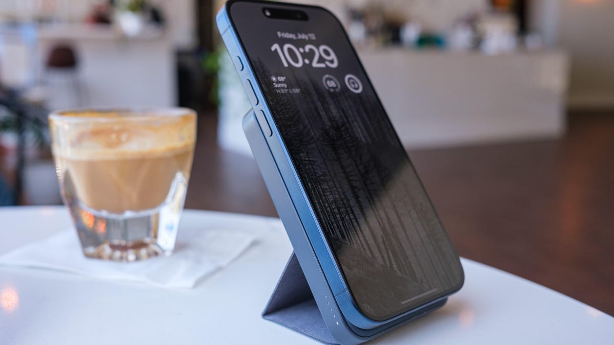
I take my phone with me wherever I go, and I’m not afraid to admit that I’ve come to rely on it for just about every aspect of my life — from getting news, weather and navigation help to staying in close contact with friends, family and co-workers. That means, like many people, I live in constant fear that my iPhone’s battery will die on me right when I need it most. That is, I did until I found the Anker 622 MagGo, which CNET ranked as the best magnetic power bank with an integrated stand. I now take it with me everywhere I go, too.
This charger is a worthwhile buy even at its full retail price of $48. But right now, you can get every color for a solid discount of about 29% off. All the colors — interstellar gray, buds green, dolomite white, lilac purple and misty blue — are available for $34 on Amazon. And yes, the deal applies to bundles too.
Here’s why I’ve stuck with this little charger for so long
Have you seen people walk around with a loop of cable hanging from their pocket to their phone? I’ve been there and hooked that loop on too many chairs and table corners. Never again. The ring of magnets in the Anker 622 MagGo aligns with the MagSafe magnets in every iPhone since the iPhone 12, latching securely and charging without wires. (The notable exception is the iPhone 16E, which does not offer MagSafe but does charge wirelessly using Qi technology. The Anker 622 MagGo will charge the iPhone 16E but won’t latch to it magnetically.)
It’s also compact — a little backpack feeding power to the phone while you’re holding it or have it stashed in a pocket, even a jeans pocket if your fit isn’t too tight.
Hey, did you know? CNET Deals texts are free, easy and save you money.
Those features alone would have convinced me but the Anker 622 also includes a fold-out back flap that props up my iPhone and can also hold the phone in its wide orientation for StandBy mode. With a power adapter such as the Anker Nano Pro (not included) and a charging cable, I’ve taught long classes with the phone angled to help me keep track of time without checking my watch.
Essential Anker 622 MagGo specs
Here’s what you need to know.
- Battery capacity: 5,000 mAh
- Voltage: 1.55 volts
- Output: 7.5-watt magnetic (compatible with MagSafe-equipped devices, iPhone 12 and later) or 20-watt USB-C port. Can charge only one device at a time.
- Input: The same single USB-C is also how you recharge the device.
- Size: 4.13 by 2.62 by 0.5 inches
- Weight: 5 ounces
- Included: Magnetic battery, 60cm (23.6 inches) USB-C to USB-C cable
- Warranty: 24 months
MagSafe-compatible charging
I’ve owned several battery chargers and each one has some sort of compromise. They’re bulky. They require a cable. They charge wirelessly but don’t include a magnet to keep the phone in place so it’s hard to maintain that connection. There’s always something.
The Anker 622 is half an inch thick and snaps onto the back of my iPhone using the MagSafe-aligned magnets. I don’t have to turn it on to start charging — power flows as soon as the connection is made.
Now, this isn’t the highest-capacity (5,000 mAh) or fastest portable charger. That’s fine. What I usually need is a way to eke out a few more hours of battery life on my iPhone. I can typically get a full top-off of my iPhone 15 Pro.
Making a stand
The other appealing feature of the Anker 622 MagGo for me is its built-in stand. Honestly, it doesn’t look like it should work well: It’s a fabric-covered set of plastic pieces that lie flush against the case, folds in two places and attaches to the back of the unit with a magnetic strip when extended. Yet I’ve had no problems with the stability of my iPhone 15 Pro or even the larger iPhone 15 Pro Max size.
This also lets me use standby mode by turning the iPhone to landscape orientation (the magnets are strong enough to hold the phone in place) when it’s on a table or desk.
Smart port placement matters
The charger gets its juice from a single USB-C port, which is positioned on the edge of the case, not the bottom. That means you can replenish it while the stand is open — many chargers’ ports are stuck on the bottom.
That USB-C port also acts as a charger for other devices when you plug in a cable, such as when your Apple Watch needs a boost.
How the Anker 622 MagGo compares to similar power banks
Before getting the Anker 622 MagGo, I carried an Anker PowerCore III 10K Wireless, which doubles the battery capacity, includes a USB-A port and charges wirelessly but without magnets to hold the phone in place. That meant if I didn’t use a cable, the phone and charger needed to be stable and level; too often I’d find the iPhone slid off its wireless perch and not charged. It’s also larger and heavier. I still use it, but it’s the power bank that goes into my carry-on suitcase as a backup charger.
Since I’ve owned this Anker 622 MagGo, the company has released a few updated models. The $60 Anker 633 packs 10,000 mAh into a thicker brick, includes a USB-A port in addition to USB-C and has a metal kickstand for resting the phone upright.
You can also consider getting the chunkier Anker MagGo Power Bank that delivers 10,000 mAh and follows the same idea of compact magnetic charging and a convenient kickstand. Its main appeals are faster 15-watt magnetic charging and Qi2 compatibility, plus a small display on the side that reports the battery capacity and an estimate of the remaining battery in hours.
(Note that some Anker power banks were part of a recent recall. Be sure to claim your free replacement or gift card if you own one of the affected devices sold between 2016 and 2022.)
For more smart buys, check out this amazing multitool and a portable TV that can go anywhere.
Join Our Daily Deals Text Group!
Get hand-picked deals from CNET shopping experts straight to your phone.
By signing up, you confirm you are 16+ and agree to receive recurring marketing messages at the phone number provided. Consent is not a condition of purchase. Reply STOP to unsubscribe. Msg & data rates may apply. View our Privacy Policy and Terms of Use.
Technologies
The Galaxy Z TriFold Is Back. You Can Buy It From Samsung Soon
The $2,899 phone paused its sales in March after selling through its inventory, but Samsung is bringing it back to its online store.
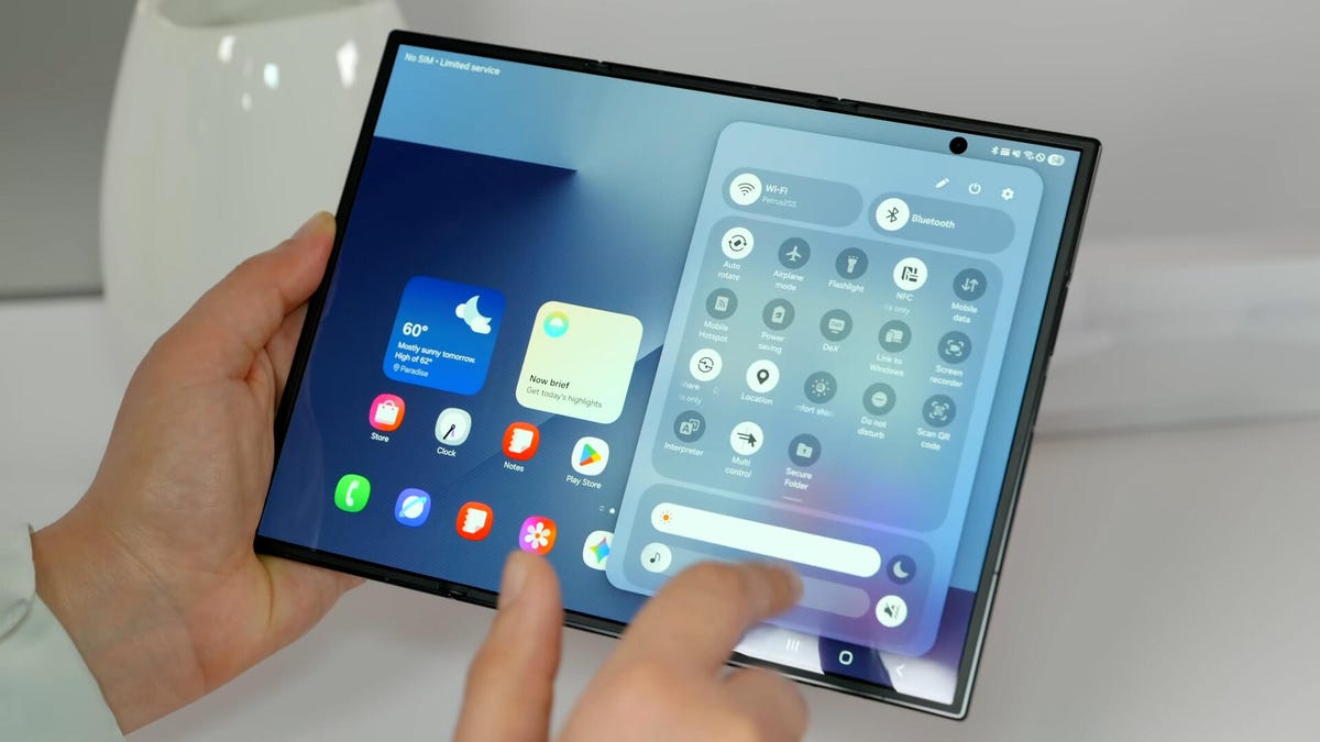
Samsung’s $2,899 Galaxy Z TriFold is going back on sale on Friday, following a halt to its sales in March after the foldable phone sold through its inventory. Samsung has announced the TriFold’s return with a countdown clock on the phone’s online store page along with a Wednesday newsletter email sent to customers.
The initial pause, which Samsung said at the time was related to the TriFold being a «super-premium device in limited quantities,» happened after just three months of availability. The TriFold first went on sale in South Korea on Dec. 12 and then arrived in Samsung’s US store on Jan. 30. The TriFold sold out in the US within minutes of going on sale — which I know personally after joining my colleagues that morning in an attempt to buy it. Thankfully Senior Reporter Abrar Al-Heeti succeeded, and then reviewed the TriFold.
It’s unclear whether the Galaxy Z TriFold is now permanently returning to Samsung’s online store or if it is again on sale until its stock sells through. Given that the phone is very expensive, and unfolds to reveal a large, 10-inch display, it wouldn’t be surprising if its stock will be in limited quantities. We’ve asked a Samsung representative to clarify and will update if we hear more.
The Galaxy Z TriFold’s return also comes ahead of the summer season when we expect a slew of other foldable phones: Samsung typically refreshes its Galaxy Z Fold and Z Flip line in July or August, and Motorola has announced its first book-style Razr Fold phone will also debut during the season. And Apple’s rumored iPhone Fold (or perhaps iPhone Ultra based on latest rumors) could also be teased later this year.
Technologies
Help Us Crown the Most Loved Headphones and Earbuds of 2026
Got a pair you swear by? Take our People’s Picks survey to help us find a winner.

CNET just launched People’s Picks, a series of surveys where actual humans like you vote for the products and services you use. Starting in April, we want you to weigh in on your favorite headphones and earbuds. We’ll pick a winner based on which ones you love the most.
Why we want to hear from you
Our writers and editors test hundreds of products each year, but your real-world experience with these devices is something we can’t replicate in our labs. You’ve used these headphones at the gym, on your commute to work and on long flights, and that perspective is invaluable. Your voice helps others know about the headphones or earbuds you love, too.
«I review a lot of headphones and earbuds for CNET, and there are plenty of great models from the top brands in this survey that I rate highly. I’m always curious about what models people ultimately choose and why, so I’m excited to get your feedback and learn the results of this survey,» says David Carnoy, CNET’s executive editor and headphones expert.
With our survey, we’ll collect answers from real-world users like you. The headphones and earbuds chosen through our 3-minute survey will be featured in our People’s Picks roundup of the top picks based on your recommendation.
Make your voice heard
Whether you swear by a pair of $25 earbuds or love a pair of high-end headphones, your pick counts. The survey takes just a few minutes to complete, and after we gather enough information, we’ll tally the results and publish the winners.
Not sure what to pick? Check out our Best Headphones to revisit your favorites before voting.
Technologies
Google’s Pixel 10A Is Coming to Japan With an Exclusive Blue Edition and Special Wallpaper
This model comes with creatively designed stickers and a special look for Pixel’s 10th anniversary.
Don’t be blue: Google is releasing an Isai blue edition of the Pixel 10A to celebrate the Android phone line’s 10th anniversary, setting it apart with its own sticker set, specialized wallpaper and custom icons. But it’ll only be available in Japan.
Announced Tuesday on the Google Japan blog, the Isai blue Pixel 10A has a dark blue look and includes bonus decorations designed in collaboration with Japan’s Heralbony art company. These include an exclusive bumper case and stickers for customization.
This edition of the Pixel 10A will arrive in Japan on May 20, following the April 14 release of the Pixel 10A in its original colors of lavender, berry, fog and obsidian. The Isai blue model costs 94,900 yen, which roughly translates to $595, and includes 256GB of storage.
This makes it slightly less expensive than the US model’s 256GB edition, but it comes with a number of fun extras at no additional cost.
Google’s creation of a country-specific model for Japan may also reflect strong sales in that market. In 2023, the IDC analytics firm (via 9to5Google) reported that the Pixel 7 series accounted for 10.7% of the country’s market share, a 527% increase from 2022.
-
 Technologies3 года ago
Tech Companies Need to Be Held Accountable for Security, Experts Say
-
 Technologies3 года ago
Best Handheld Game Console in 2023
-
 Technologies3 года ago
Tighten Up Your VR Game With the Best Head Straps for Quest 2
-
 Technologies4 года ago
Black Friday 2021: The best deals on TVs, headphones, kitchenware, and more
-
 Technologies5 лет ago
Google to require vaccinations as Silicon Valley rethinks return-to-office policies
-
 Technologies5 лет ago
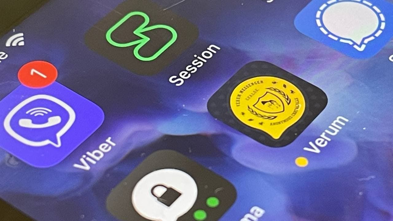
Verum, Wickr and Threema: next generation secured messengers
-
 Technologies4 года ago
Olivia Harlan Dekker for Verum Messenger
-
 Technologies4 года ago
The number of Сrypto Bank customers increased by 10% in five days