Technologies
Apple’s Journal App for the iPhone Truly Surprised Me After a Month
Commentary: I don’t use Journal every night, but even opening the app and looking back helps put time into perspective.

Have you noticed that our iPhones have been trying to fix us? This little gadget in our pocket keeps track of so many aspects of our life, like our schedules, communications, money and health. It’s smart enough to suggest how to optimize our time spent using the device, remind us of when our music is too loud, or point out how much time we spend looking at its pretty screen while scrolling through TikTok.
Now Apple has another major selling point: Your iPhone can help you be a better you. There’s a new Journal app designed to help you reflect and practice gratitude by writing about moments in your day. I’ve been using it for the past month, and there are aspects of this app that aren’t what I expected.
Apple announced Journal back in June at WWDC. It’s part of iOS 17, but unlike other features, this app needed more time to bake and wasn’t included in the September release of the new iPhone software.
I’ve been testing it for a month, with the public beta version of iOS 17.2, and the Journal app is far more than just a place to jot down thoughts on blank pages. I have plenty of blank journals that I never write in (but for some reason I keep buying them). Obviously, when I’m burnt out after a long day, I don’t grab my paisley covered Moleskine.
Instead I do what any sane person does: scroll through my iPhone while in bed. Suddenly it makes sense to journal at night on my phone. I open the Journal app and click to make a post. There are personalized suggestions, called Moments, that give me something to write about. And when I say personalized, these suggestions from my iPhone get real detailed.
Reflections, suggestions, and that time I went to Wendy’s
Journal pulls from my recent activity, showing photos I took, people I texted with, a map of places I visited, music I’ve listened to, and, if I ever actually logged a workout on my Apple Watch, it would show me that too. It also weaves in photo memories from several years back. There are Reflections that present prompts, ideas and questions to reflect on. The prompts aren’t cheesy, and I find them interesting, which is, of course, the idea. These thought exercises help me zoom out to see the bigger picture a bit.
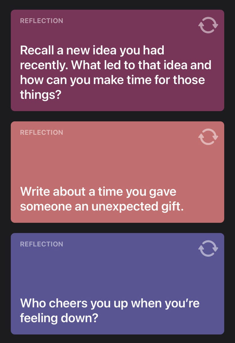
Scrolling through my suggestions, there’s one of a Friday night hangout with friends, a photo of my son when he was little from three years ago, a question prompt and a photo of my family picking out a Christmas tree from this past weekend. I see photos of my dad visiting New York in 2018 and I get a reminder that I ate at a Wendy’s last week. Not every Moment is worthy of a post, but the suggestions give you this little flashback that jolts your brain into replaying memories.
Some suggestions can be strange. It knows that I went to a specific Wendy’s location and wants me to write about it. So clearly your iPhone knows a lot about your life and your burger consumption habits. Apple says all of this is being done while protecting your privacy. The suggested posts from your activities stay inside your iPhone, and Apple can’t see them. The same limits apply to any third-party journal apps that use Apple’s journal suggestion tool API in their software.
Apple says no one but you can access your Journal. Even if your phone is unlocked and you hand it to someone, they can’t get into the app, because you can lock your Journal. I set it to unlock with Face ID. If you sync it to iCloud, it’s stored with end-to-end encryption.
My Journal always hits me with photo memories of my kids, trying to give me a dopamine hit with nostalgia. Like, «Hey, remember this cute moment?» I guess my problems today aren’t so big if I think about the nice stuff that happened in the past. It’s like having a therapist guide you to reset your perspectives.

Imperfect memories and limits
There are some imperfections. For example, once I got my nails done early in the morning and the app assumed I was having breakfast at a restaurant next door. I suppose it’s OK if it’s not perfect, since it’s meant to be a starting point for your little dear diary moment. You don’t have to write a post for every suggestion.
The Journal app lets you add photos, audio or videos to your entries, but there are limits. For instance, video files need to be under 500 megabytes. So I couldn’t add a two-minute video that I shot in 4K. Since your entries are stored locally on your iPhone, limiting the size of your media files in Journal entries helps save space.
On the surface all this makes sense: «Yeah, you got a fancy digital diary!» So what I’m about to share next may sound weird. There’s no way to share any of these posts. And it isn’t just no sharing, it’s no searching. I can’t go, «Oh yeah, I remember that nice Halloween post I made, let me pull that photo up and share it.» No: Nothing is shareable. You’re crafting what look like classic Facebook posts, but it’s just for you. No one will know about this post.
Too many years with an iPhone and being on social media has messed me up so I can’t fathom making content that no one else will see. I realize I have to rethink a few things about the value of writing about my memories.


The lack of a search tool in the Journal app is a bummer. Searching is just scrolling back. The best you can do is bookmark some of your favorite posts, because then you can narrow down entries by filtering what’s bookmarked, or having it show you just photos, audio posts or locations. I guess scrolling is kind of like flipping through the pages of an actual handwritten journal. But then what’s the point of journaling digitally?
There’s another wrinkle to the Journal app, which took me a while to realize. Journal is just another way to lock you into iOS and the Apple ecosystem. Imagine a year goes by and you made hundreds of posts, all of which are stored on your iPhone. Would you just throw away that diary and switch to Android?
I’m not the only CNETter who’s been testing out Journal in beta. CNET Managing Editor and iPhone reviewer Patrick Holland has also been playing with it. Here are his first impressions:
Journal’s secret sauce is triggering your emotions
Like Bridget, I’ve enjoyed the Journal app so far. But sadly, I haven’t had any prompts to relive that great frosty-and-fries experience I had at Wendy’s. What surprises me about Journal is how un-Apple it is. The star of the app is the suggestions feature, and how easily a suggestion can trigger a memory or make me relive a moment that at the time seemed mundane and now resonates with a bunch of feelings.
The experience of using Journal reminds me of the analog experiences I’ve had doing creative writing exercises or following the book The Artist’s Way.
What Journal does best is give me a space for my feelings and a way to organize my thoughts. The suggestions are very personal and private. One made me exit the app and call my family. While another prompt made me wish I still could talk to someone in my family who had died.
Final thoughts on Journal
I agree with Patrick and think the Journal app is worth trying out. Sure, there are things that could be tweaked, like adding a way to search for a post. But if the job of the Journal app is to help one’s mental health and fix some of the busy brain problems we have in this day and age, it does just that. It made me think about what really matters in my life and offered me a way to quickly switch my mindset. I don’t use Journal every night, but even opening the app and looking back helps put time into perspective.
CNET’s Patrick Holland contributed to this report.


Technologies
The Fourth Episode of the VERUM AI Mini-Series Is Out
The Fourth Episode of the VERUM AI Mini-Series Is Out

Verum Messenger has released the fourth episode of its AI mini-series SHADOWS, created using Verum AI. The new episode, titled “No Borders,” continues the story of a team trying to stay out of the OMEGA corporation’s sight.
Following the events of the previous episodes, the team moves between cities and countries while OMEGA continues its search. The new episode puts particular emphasis on Verum Messenger’s capabilities that allow users to conceal their location.
“No Borders” is another chapter in a story about privacy, freedom of communication, and technologies that erase borders between people.
The VERUM AI mini-series consists of seven episodes, released gradually across Verum Messenger’s social media channels.
Episode 4 is now available. Stay tuned for the next chapter.
Technologies
Verum Messenger Introduces Built-In Verum Chess
Verum Messenger Introduces Built-In Verum Chess
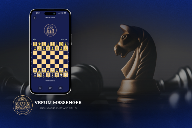
Verum Messenger has released a new update for iOS, iPadOS, and macOS, adding another feature to its growing ecosystem — Verum Chess. Users can now play chess directly inside the messenger without switching between different applications.
The new feature allows users to start a game in just a few taps while reinforcing Verum’s vision of a unified digital environment where communication and everyday services come together in a single platform.
Verum Messenger continues to evolve into a multifunctional ecosystem that combines secure chats and calls, AI tools, a built-in VPN, anonymous email, eSIM, financial services, cryptocurrency features, and offline communication. With the introduction of Verum Chess, the platform now also offers a new way for users to interact and spend time together without leaving the app.
The update is now available for iPhone, iPad, and Mac on the App Store.
Technologies
Episode 3 of the VERUM AI Mini-Series Is Now Available
Episode 3 of the VERUM AI Mini-Series Is Now Available

Verum Messenger has released the third episode of its AI mini-series, SHADOWS, created using Verum AI.
The new episode, titled «Ghost Money,» continues the story of the conflict between a team of heroes and the Omega corporation, which seeks to take control of digital communications. This time, the focus shifts to anonymous payments and financial freedom, revealing how privacy can extend beyond messaging.
Like the previous episodes, the new release not only advances the storyline but also showcases the capabilities of the Verum ecosystem, highlighting technologies designed for secure communication and digital privacy.
The mini-series consists of seven episodes, released gradually across Verum Messenger’s social media channels.
Episode 3 is now available. Stay tuned for the next chapter.
-
 Technologies4 года ago
Tech Companies Need to Be Held Accountable for Security, Experts Say
-
 Technologies3 года ago
Best Handheld Game Console in 2023
-
 Technologies5 лет ago
Black Friday 2021: The best deals on TVs, headphones, kitchenware, and more
-
 Technologies3 года ago
Tighten Up Your VR Game With the Best Head Straps for Quest 2
-
 Technologies5 лет ago
Google to require vaccinations as Silicon Valley rethinks return-to-office policies
-
 Technologies5 лет ago
Verum, Wickr and Threema: next generation secured messengers
-
 Technologies4 года ago
The number of Сrypto Bank customers increased by 10% in five days
-
 Technologies5 лет ago
Olivia Harlan Dekker for Verum Messenger