Technologies
‘You have to distance yourself from it being a human’: Meeting Ameca the humanoid
Yea, though I walk through the uncanny valley, I will fear no evil.
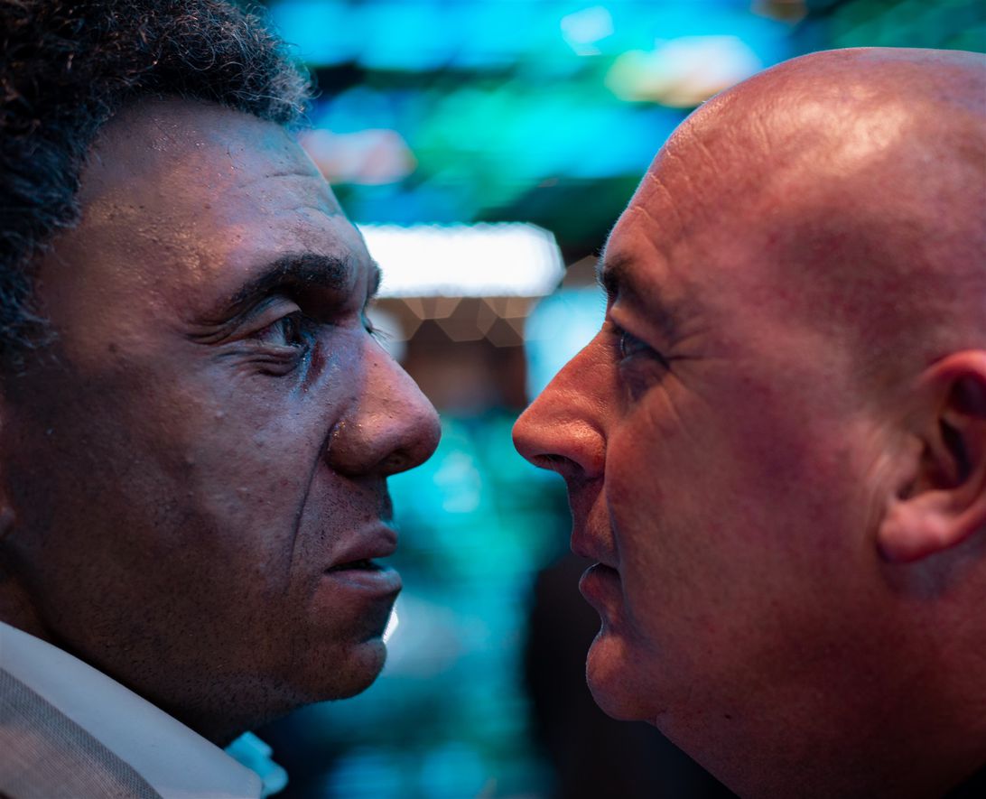
There’s something distinctly unsettling about planning your first meeting with a robot.
At CES 2022, I had the chance to interview Ameca the robot during a one-on-one demonstration with its creators. I wanted to know if this humanoid was actually real. I wanted to see if its facial expressions were as realistic (and haunting) as they were in the videos I’d seen online. But mostly I wanted to know how the robot would respond to my questions. Should I prep a Voight-Kampff test, just to be sure?
It turns out I needn’t have worried about feeling disturbed by Ameca’s spoken responses. They were no more troublesome than what I get from Alexa. But the face Ameca made when its creator tried to poke it in the face? That will stay with me for a long time.
If you’re on the internet, you’ve probably seen Ameca. The gray-faced, humanoid robot blinked its way into the public consciousness in late 2021 when a video of its facial expressions went viral on social media. Elon Musk responded to the video with one word, «Yikes.» Chrissy Teigen retweeted it to her 13 million followers with four words: «absolutely. the fuck. not.»
But while Ameca had some people running for the hills, its creators at UK company Engineered Arts were delighted.
«We were incredibly surprised,» says Morgan Roe, Engineered Arts’ director of operations. «Overnight, it became a sensation. We got 24 million views on one Twitter post.»
Roe puts it down to Ameca’s not-quite-robot, not-quite-human appearance. Its body is all metal and plastic, its face is a deliberately genderless and nonhuman gray. It has 17 individual motors inside its head controlling its movements and expressions. But its facial features are surprisingly vivid and emotive. And it’s this combination of artificial and lifelike that Roe says speaks to our collective vision of what humanoid robots will look like in the future.
«We’ve all seen it in the movies, we’ve all seen iRobot and A.I. Artificial Intelligence,» he says. «And suddenly, that’s real.»
Roe is speaking to me via Zoom from the show floor of CES, where Ameca is being shown to crowds, in the latex flesh, for the first time. Even though I’m seeing Roe and his robot over a Zoom call, it’s hard to shake just how real Ameca looks. I find myself distracted. I’m no longer speaking to the very friendly human Englishman I’m supposed to be interviewing. My eyes are straying over to Ameca’s face to see how it’s responding to our conversation. A furrowed eyebrow ridge, the twitch of a smile. Ameca isn’t human, and yet…
This isn’t the first hauntingly humanoid robot Engineered Arts has released. For the past four years, the company has been creating a line of lifelike Mesmer robots and showing them to conferencegoers on crowded show floors.
«Each Mesmer robot is designed and built from 3D in-house scans of real people, allowing us to imitate human bone structure, skin texture and expressions convincingly,» the Engineered Arts website tells prospective clients. «Mesmer is designed to be modular, so you can remove the head with one click and no tools, and swap it for another.»
Princess Mombi, eat your heart out.
Ameca isn’t destined for the conference circuit. It doesn’t run and jump like the robots created by Boston Dynamics, and it’s not something you can preorder now as a household helper. Roe says it’ll be at least 10 years before a robot like Ameca is «walking amongst us» as a service robot. Sure, Walking Among Us sounds like the title of the documentary that’ll eventually chronicle the decline of humanity, but we’ve got another decade before we need to worry about that.
Ameca also doesn’t have Mesmer’s flesh-colored skin tones. In place of the lifelike human hair on Mesmer’s head, Ameca has a translucent plastic skull. We see the robot’s joints and parts. Ameca is still undoubtedly «other,» and that’s deliberate.
«What we found was, when you try and make it look ultra lifelike [like] our other Mesmer line, it looks a bit more sinister, because it’s right in the uncanny valley,» Roe says. «But when we created Ameca, we pulled it backwards out of the uncanny valley.»
Of course, as Roe is saying these things to me over our Zoom call, Ameca is responding. Raising its eyebrows at people walking past. Subtly moving its lips (or, more accurately, the actuators around its mouth hole) as though trying to ape the speech of its human creator.
«Because it looks less human…» says Roe, while Ameca smiles into the middle distance.
«Because it’s plastic, because it’s metal…» says Roe, Ameca glancing over at him with a vague smile.
«Because it’s of gray skin, it’s suddenly…» Roe waves his hand near Ameca’s face and the robot leans back, startled.
«Ooh, hello,» says Roe, making eye contact with the humanoid and leaning back in startled unison. He’s lost his train of thought.
«It’s suddenly, uh, less — less scary.»
I’m struck with the urge to ask the question I’ve been thinking all along. The question I’ve wanted to ask since I first saw the video of Ameca in the lab, with its engineer/programmer hunched over a laptop and another identical Ameca moving slowly in the background.
«When you’re in your offices, working late into the night on some extra lines of code, do you ever do a double take or have to check behind you, at the robot, to see if it winked at you?» I ask.
«Actually no,» says Roe. «When you’re working with it day to day, it’s suddenly, definitely a robot. And a lot of the time, you’ll see one of the engineers walking through the workshop, not with a robot, with just the head. And you have to distance yourself from it being a human. Otherwise, then it’s really sinister.»
Technologies
Here’s How a Former Overwatch Pro Made the Support Hero He Always Wanted
Scott «Custa» Kennedy used his experience as a former Overwatch League pro to design one of the game’s most popular heroes in Reign of Talon season 1.
Overwatch’s Reign of Talon season 1 is starting to wind down, and the biggest story has been the five new heroes who joined the roster. A lot of attention has understandably gone to Jetpack Cat, a hero once scrapped in the game’s early design, but resurrected on the cusp of the game’s 10th anniversary. She’s been the subject of bans and memery due to her unique kit that features permanent flight and the ability to fly any other hero through the air with her Lifeline ability.
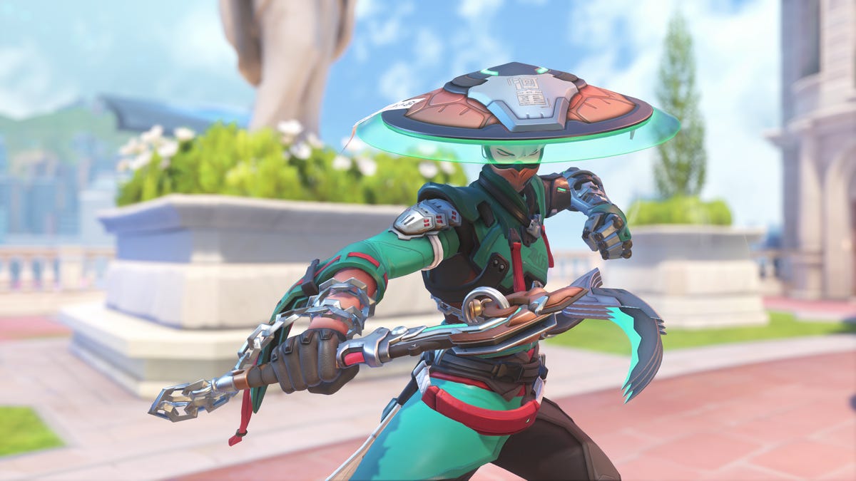
But another support hero has quietly gone under the radar as one of the most-played characters in the new season: Mizuki.
Mizuki is a complex hero, similar on paper to support heroes Brigitte and Lucio, who mix damage with healing in the radius around them, but with his own unique mechanics. He has a constant healing aura around him, which grows more powerful as he deals damage with his weapon or uses other healing abilities. His main weapon is a projectile that bounces off surfaces. One of his abilities, Katashiro Return, offers a burst of movement, but also the ability to teleport back to your starting point within a few seconds.
That all adds up to a hero design that gives players lots of options but also requires you to carefully strategize to turn the tide of battle. Do you stay with your team to maximize the value of your healing aura? Or do you split from them for a higher-risk, higher-reward play? Do you use your Katashiro Return ability to flank behind an enemy team, or save it to disengage from an unexpected attack?
Despite spending most of my time in Overwatch playing support heroes, including Ana and Kiriko, I found Mizuki challenging early in the season, even as I watched enemy Mizukis pump out damage and secure clutch kills while constantly healing their teams.
This «unlockable challenge» element was an intentional part of Mizuki’s design, as I was soon to learn from chatting with the hero’s creator, a former Overwatch eSports pro.
By and large, support players have embraced this challenge. An Overwatch spokesperson told me via email that «Mizuki is consistently in the top four for all support picks in Season 1, across every region.» He’s one of several elements powering a revival of the game, along with a new ongoing story, weekly faction missions and the promise of more new heroes every season. People have flocked back into the game since the start of Season 1, with its average player count on Steam more than doubling over the past month.
Mizuki’s design was led by Scott «Custa» Kennedy, a longtime presence in Overwatch’s professional scene as both a player and match analyst, and now an associate hero designer. I spoke with Scott at Blizzard’s spotlight event and also spoke with him and Mizuki’s character artist, Melissa Kelly, in early March to discuss how they created one of the game’s most popular heroes.
From professional player to associate designer
After a few years as a professional player and several more as an analyst and caster for the Overwatch League, Kennedy was looking for the next step in his career.
«Overwatch [had] been my life for, like, the last 10 years in many different facets,» he said, but as he reached retirement age in the esports realm, he wanted a change. He spoke with some of the Overwatch developers, including associate game director Alec Dawson, about what it would take to get into game development.
After doing some QA work and hands-on game development («I made the world’s hardest 2D cat platformer in three days,» he said), Kennedy secured an associate hero designer opening for Overwatch, which was a perfect fit with his experience.
When given the task of envisioning the game’s next healer, Kennedy said he didn’t want to make another support designed around «point-and-shoot» mechanics that healed teammates and hurt enemies, like Ana or Juno.
«I wanted [Mizuki] to be more of an AoE healing aura-type hero because I think that’s something that’s been underrepresented in our heroes,» Kennedy said. Instead, he came up with the area-of-effect healing that’s similar to how Lucio and Brigitte heal, but with the added layer of that healing becoming more powerful the better you play in combat.
Managing that nuance was a learning experience for Kennedy.
«One of the biggest things that I learned is how complexity can be really cool on paper, but when you’re making a hero how quickly that snowballs into making a player overwhelmed,» Kennedy said. But he feels the team ultimately found a good balance, where inexperienced players can still contribute with him, while more experienced and skilled players can benefit even more.
Kelly added that Mizuki was a complicated hero on the design side, too.
«One of the issues is that he was looking kind of like a [damage hero],» she said. «He looked very aggressive for a healer. So we were just trying to soften him up.» Kelly pointed out that Mizuki’s weapon is a mix of a priest’s staff and a sickle, which also blurs the lines a bit between support and damage heroes.
That nuance seems to be a big part of Mizuki’s appeal. Even though I generally prefer the kind of «point-and-shoot» healing hero Kennedy said he wanted to avoid, I’ve found Mizuki to be one of the most interesting additions to the roster, especially among support heroes. His Binding Chain ability, which roots an enemy hit by the chain into place, rewards good aim and timely use, while his Healing Kasa and Katashiro Return abilities let my brain ponder over creative escapes and ambushes.
When I play Mizuki, I’m always thinking while I fight, and I enjoy feeling that kind of active engagement with the game.
Mizuki’s reception and prospects for pro play
Kennedy worried that players would be turned off by how complex the hero is — wondering, «Are players going to try him, not understand him and then be like… ‘I’m just gonna play the cat?'» (The cat, of course, is Jetpack Cat, who was released alongside Mizuki in season 1 and immediately became one of the most popular and most-banned heroes. She has a more intuitive, point-and-heal design, although her launch state also allows for particularly aggressive gameplay.)
Instead, Kennedy has enjoyed watching players stick with Mizuki and later post about how they’ve «unlocked» the hero by figuring out the formula to succeed with him. Kennedy said it’s rewarding to see players grasp his original concept for the hero as it plays out in-game. After that initial, somewhat disastrous first game I played, I started clicking with Mizuki, too.
Players still struggled with parts of Mizuki’s kit, and Kennedy noted some initial frustrations with «intentional design limitations» he and the team placed on the hero. Players seemed to want to use his Katashiro Return ability to go on aggressive flanks, but found it didn’t last long enough to successfully move behind enemy teams. That kind of larger repositioning would go against the design team’s vision for the hero, who is meant to stay near his team and use the ability to return to them quickly.
Now, Kennedy said, «players seem to understand the limitations of the hero, and that’s been cool to see.»
Mizuki has had a strong launch, and has been sitting around a 54% win rate in competitive modes since the start of the season. That’s quite high, ranking just behind last season’s top performer: the damage hero Vendetta. I asked Kennedy how he reads that data — whether Mizuki is overtuned or just a good fit among this season’s most-played heroes.
Kennedy said Mizuki was in a «pretty healthy» spot, but could get pulled down a bit in future seasons. «The numbers that he can put out in terms of healing and damage output are things that really put him above everyone else at this point. So it’s definitely something we’re keeping an eye on.»
But that power won’t necessarily translate to Mizuki being picked up in professional play, at least based on last month’s Overwatch Championship Series Bootcamp. Kennedy said the hero’s kit isn’t as good for staying alive and executing plays as heroes such as Lucio and Kiriko, who have long been must-picks in pro play.
«I could see Mizuki getting more playtime in a world in which we start playing more rush metas [centered around tanks like Ramattra or Orisa],» he said, «but with how fast the game is being played at the highest level, it can be difficult for Mizuki to keep up.»
Kennedy brought up one of Overwatch’s biggest and most inevitable challenges over its decade-long tenure: balancing heroes for both the pro level and the rest of the game, and how the difficulty lies in the fact that certain resources — such as speed boosts, mobility and burst damage — are more valuable at the highest levels of coordinated play. The design team is always working to make sure heroes are never totally out of balance at either skill level, he said.
That work has been on display since the launch of Season 1, with balance patches coming out virtually every week up through the midseason patch on March 10. Those updates mostly focused on the five new heroes but also included some changes to Vendetta, who continues to terrorize the game with a very strong win rate and the ability to cut someone down almost out of nowhere, leaving opponents very little time to react.
Still, the season overall has been a win for the game, thanks largely to the influx of new heroes and the different playstyles they add to the game.
«[I’m] definitely a little overwhelmed with how positive everyone has been with Mizuki — and honestly, the five heroes in general,» Kennedy said. «I think the reception’s been awesome. We couldn’t have asked for anything better.»
Technologies
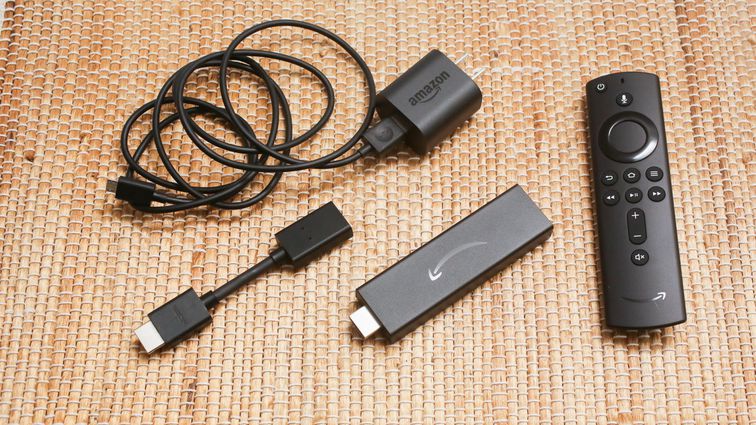
Amazon’s Spring Sale Just Added a Ton of Gaming Deals. Here Are Our Favorites, Expiring Soon
Technologies
Today’s NYT Connections: Sports Edition Hints and Answers for March 30, #553
Here are hints and the answers for the NYT Connections: Sports Edition puzzle for March 30 No. 553.
Looking for the most recent regular Connections answers? Click here for today’s Connections hints, as well as our daily answers and hints for The New York Times Mini Crossword, Wordle and Strands puzzles.
Today’s Connections: Sports Edition is a tough one. You’ll need to know a little about four very different sports in order to solve it. If you’re struggling with today’s puzzle, read on for hints and the answers.
Connections: Sports Edition is published by The Athletic, the subscription-based sports journalism site owned by The Times. It doesn’t appear in the NYT Games app, but it does in The Athletic’s own app. Or you can play it for free online.
Read more: NYT Connections: Sports Edition Puzzle Comes Out of Beta
Hints for today’s Connections: Sports Edition groups
Here are four hints for the groupings in today’s Connections: Sports Edition puzzle, ranked from the easiest yellow group to the tough (and sometimes bizarre) purple group.
Yellow group hint: Make a racket.
Green group hint: Goooooal!
Blue group hint: Baseball stars.
Purple group hint: Toss the pigskin.
Answers for today’s Connections: Sports Edition groups
Yellow group: Tennis Grand Slams.
Green group: Premier League teams.
Blue group: Last four World Series MVPs.
Purple group: ____ football.
Read more: Wordle Cheat Sheet: Here Are the Most Popular Letters Used in English Words
What are today’s Connections: Sports Edition answers?
The yellow words in today’s Connections
The theme is Tennis Grand Slams. The four answers are Australian, French, U.S., and Wimbledon.
The green words in today’s Connections
The theme is Premier League teams. The four answers are Chelsea, Leeds, Liverpool and Sunderland.
The blue words in today’s Connections
The theme is last four World Series MVPs. The four answers are Freeman, Peña, Seager and Yamamoto.
The purple words in today’s Connections
The theme is ____ football. The four answers are American, fantasy, flag and total.
-
 Technologies3 года ago
Tech Companies Need to Be Held Accountable for Security, Experts Say
-
 Technologies3 года ago
Best Handheld Game Console in 2023
-
 Technologies3 года ago
Tighten Up Your VR Game With the Best Head Straps for Quest 2
-
 Technologies4 года ago
Black Friday 2021: The best deals on TVs, headphones, kitchenware, and more
-
 Technologies5 лет ago
Google to require vaccinations as Silicon Valley rethinks return-to-office policies
-
 Technologies5 лет ago
Verum, Wickr and Threema: next generation secured messengers
-
 Technologies4 года ago
Olivia Harlan Dekker for Verum Messenger
-
 Technologies4 года ago
The number of Сrypto Bank customers increased by 10% in five days