Technologies
iOS 17 Review: StandBy Mode Changed My Relationship With My iPhone
Apple is set to release iOS 17 to the public on Monday, Sept. 18. Here’s what I’ve learned in beta testing it for the last two months.


Whether you’re upgrading to one of the new iPhone 15 models or holding onto a 5-year-old iPhone XS, you can download iOS 17 on Monday, Sept. 18. Apple introduced the latest iPhone operating system at the company’s Worldwide Developers Conference in June before releasing beta versions of the software.
I’ve been testing beta versions of iOS 17 on a newer iPhone 14 Pro and an older iPhone XR for the past two months to see how the latest OS will affect most people with compatible devices. The OS brings a lot of new and useful features to your iPhone, especially in Messages, which might make you wonder why those functions weren’t there in the first place. Some apps, like Shortcuts, are less daunting than they were in previous iOS versions.

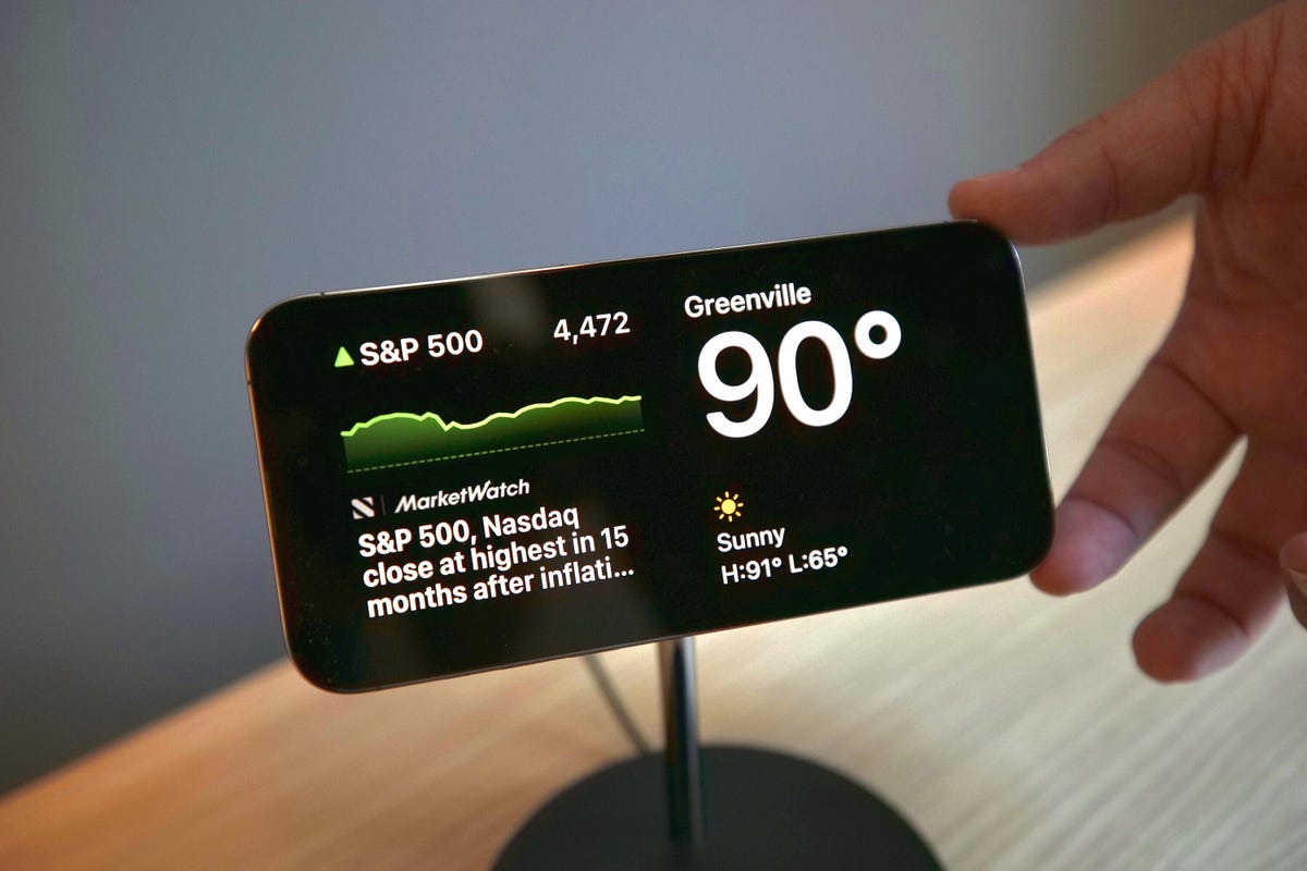
iOS 17 picks up visually where iOS 16 left off. Contact Posters in iOS 17 brings visuals to contacts similar to those iOS 16 brought to the lock screen. But I found Contact Posters more fun than useful. The largest visual change is StandBy mode, which turns your iPhone into a mini hub filled with widgets, photos and customizable clocks.
iOS 17 will work on iPhone XS and newer models. But while the new software makes experiences seamless and less burdensome on older and newer iPhones alike, some features really shine on newer models, like the iPhone 14 Pro. That doesn’t mean you should avoid iOS 17 if you have an older iPhone — you’ll still experience about 90% of iOS 17’s benefits. StandBy mode, for example, worked on my XR, but with the display’s sleep timer turned off, I have to lock my screen in order for it to work. Once in StandBy mode, the display goes to sleep a short time later.
Now let’s get into some of my favorite iOS 17 features.
StandBy mode is a standout
When Apple announced StandBy mode at WWDC, I was skeptical. My wife and I don’t have a smart display, like the Amazon Echo Show, or any other kind of supplementary hub in our home, and we’ve been just fine — and yes, if you come by later, I’ll probably be yelling about the weather. But StandBy mode is my favorite new iPhone feature in years, and it’s not even close.
Sure, you could say StandBy mode makes your iPhone into an expensive bedside clock, but if you just use it as a clock, you’re missing out on so much functionality. Interactive widgets on my screen made it easy to check the weather, read the latest headlines and much more. I could also change music playing through connected smart speakers without fishing my iPhone out of my pocket.
Notifications also showed up on my screen, and I could easily preview them without unlocking my iPhone. So when I got a notification from an app like Ring, I could quickly check if it’s the mail person delivering a package or just a car driving down the road.
StandBy mode even started to improve my relationship with my iPhone. Before iOS 17, if I got up from my desk to grab a snack or go to the bathroom, I’d make sure my iPhone was in my pocket — and if it wasn’t I’d immediately go into detective mode to find it and put it back where it belongs, my right front pocket.
Since I started using StandBy mode, I regularly leave my iPhone behind on its charging stand while I make another cup of coffee or grab the mail. When I notice it’s not in my pocket, I might shrug and think, «It’s on the charging stand. I’ll grab it later,» and those instances are getting more frequent. And I’ve welcomed this change. Disconnecting from our devices could have major health benefits, like reduced anxiety and depression, so whether Apple intended it to or not, StandBy mode could help improve your mental health. I certainly feel more relaxed.
But StandBy mode has room to improve. Currently there are a limited number of widgets that can be used with StandBy mode, and email widgets, like Mail, are sorely missing. Being able to quickly check your email, or any social media app, from StandBy mode would elevate the usefulness of this feature. I’m not seeing more widgets in the iOS 17 release candidate, but a Mail widget still might be included in the final version. If it’s not, Apple should include it in an update soon.
StandBy mode also works best on iPhones with always-on displays, like the iPhone 14 Pro. It will work on other iOS 17 compatible iPhones, like the iPhone XR, but only until your screen goes to sleep.
Messages upgrades beyond autocorrect
Yes, autocorrect will now learn from your messages so it won’t correct you all the «ducking» time. Is this cool? Yeah. Am I immature? Also, yes. The cursing in my texts now flows without interruption or confusion. But more so, autocorrect has improved overall to better understand what you mean. It’s also not as eager to correct things like acronyms or slang.
Messages also gets a host of other new features that make staying in contact with others easy and effortless, including an autocorrect undo function. «But wait, didn’t you just say autocorrect will better understand what I mean and not correct me all the time?» Yes, dear reader, glad to see you’re paying attention, but autocorrect still gets it wrong sometimes — same here, autocorrect. When it does make a correction, Messages will underline the corrected word. If you tap the word, you’ll be given the option to undo the correction, reverting it back to what you originally typed.

Another upgrade is a catch-up arrow in group chats. I go to sleep relatively early — around 8:30 p.m. — and sometimes, when I wake up, a group chat with my family or friends has 30 new messages. Instead of scrolling up to find the start of the messages, there’s a new arrow that will take me to the first message in the conversation that I haven’t read. This has saved me a lot of confusion about why my friend group can’t meet up.
The app bar has been replaced with a drawer. Next to your message field, there’s a plus sign button that you use to pull up iMessage apps like your Camera, Memoji and others. You can rearrange these, too, so apps that you use more, like the #images app, can be easily accessible. This is a small but helpful change. Before iOS 17, sometimes the app bar would disappear on me, and I’d have to swipe my screen up or down to bring it back. Now all the apps are in the same easy-to-find place.
Create your own stickers for Messages

With iOS 16, Apple introduced the ability to lift a photo’s subject from the background, giving you (mostly) clean-looking cutout pictures. With iOS 17, Apple lets you use these cutouts to create your own stickers. You can add different effects to your stickers, like a white outline or a holographic filter, to make your stickers standout. And you can make animated stickers from Live photos.
As a proud pup parent, I make and send more stickers of my dog than I’d like to admit. But I’ll gladly share a small sample of the stickers of Cinnamon Toast Crunch — yes, that’s her name. Are these stickers useful? Not really, but I’m having fun with them.
iOS 17 can automatically delete verification code messages
Two-factor verification messages are a great way to improve security when logging into an account or service. You know what really annoys me about them though? All the random messages and emails that clutter my inboxes. But that’s no longer a problem.
With iOS 17, your Messages and Mail app can automatically delete two-factor verification codes once the code has been used to autofill its intended field. I love keeping all my inboxes clean and tidy, and this new feature is like a virtual Roomba that gets rid of those unnecessary messages as soon as they are used.
Shortcuts improvements
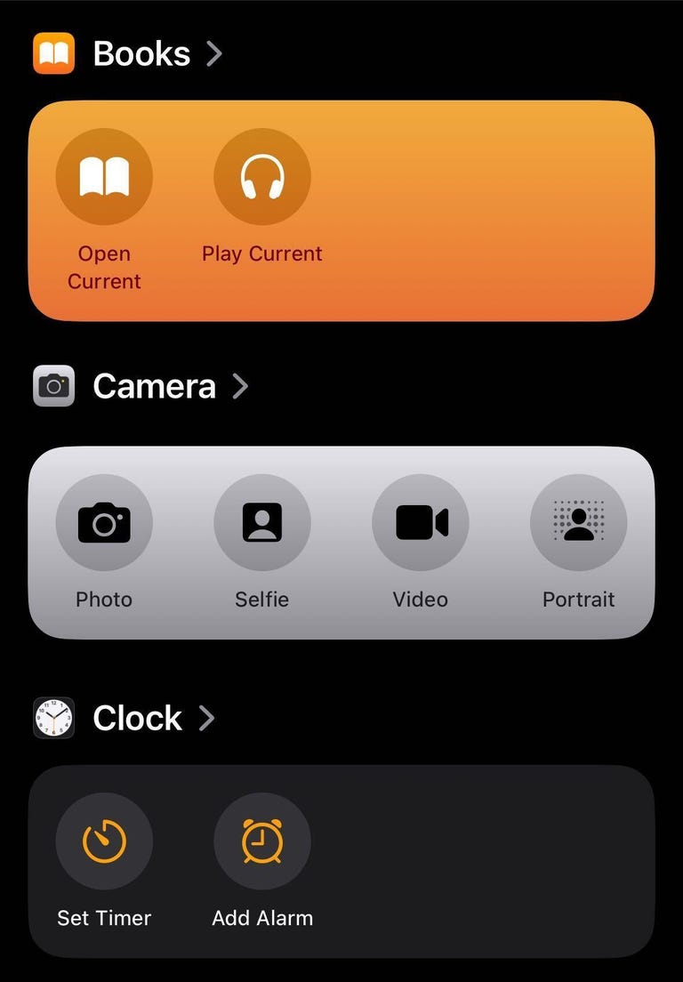
Confession time: I never used Shortcuts on my iPhone before. Setting them up confused and frustrated me. The Shortcuts homepage intimidated me too, so I convinced myself that Shortcuts weren’t worth it. But thanks to iOS 17, I changed my attitude and have already integrated a few into my everyday life.
For starters, Apple changed the Shortcuts homepage to show a handful of premade ones, like creating a new note in Notes, that you can easily add to your homepage with a long press. The new layout isn’t as daunting, and should make it easier for others to see what Shortcuts can do.
The camera level is a game-changer
When I take photos or record videos for social media, I worry that they’re not going to look straight. Before iOS 17, I’d try to line the grip up with a straight line in frame, but if I was out in nature I’d just try my best.

In iOS 17, the Camera app has an onscreen level so you can straighten your videos and pictures. The level comes across the center of your screen as a thin white line but it turns yellow when it’s level. It’s helped me take straight photos, and I also used it to double-check whether a picture frame on my wall was level when hanging it.
Grocery lists in Reminders
I love grocery shopping. I like walking the aisles, finding my items and seeing all the people and what they’ve picked up. But what I don’t like is forgetting an item on one side of the store after I’ve walked all the way across and picked up everything else I need.
Luckily, Reminders has a new feature that lets you create a grocery list separated into sections with headers like Produce, Breads & Cereals and Household items. The app automatically creates these sections as you add items and sorts them into the appropriate categories. The app even recognizes certain brand names, like Dr Pepper and Ritz, and sorts them appropriately, too.
iOS 17 features not available at launch
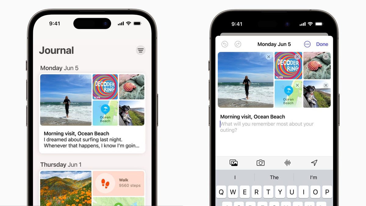
The biggest iOS 17 feature that’s not included at launch that I’m excited about is the Journal app. Apple announced the app at WWDC in June, saying it would be able to give you suggestions about what to journal about, keep your entries private and more. However, Apple said the Journal app would launch later this year.
Collaborative Playlists in Apple Music collaborations aren’t available with iOS 17 yet either. This feature is said to let people invite friends and family to edit playlists or react to certain tracks on the playlist. There’s no word on when this feature will be available yet.
Apple had also announced that AirDrop will be able to finish a file transfer when devices move out of range of each other on iOS 17. However, we’re still waiting for word on when this will be available.
The final word on iOS 17
The latest iOS version brings a lot of functional improvements to your iPhone, even if you don’t have the newest model. Not all the changes are big and flashy, like StandBy mode, but most feel meaningful.
A few words of caution for when the new operating system arrives: Before you update your iPhone to iOS 17, you should back up your iPhone as a precaution. And while it might be tempting to download iOS 17 as soon as possible, you might want to wait a day or two to see if other people are having problems with their iPhones, and so that your device downloads the update faster.
For more Apple news, here’s everything Apple announced at its Wonderlust event this week that brought us the iPhone 15 lineup and more.


Technologies
Verum Messenger Introduces Built-In Verum Chess
Verum Messenger Introduces Built-In Verum Chess
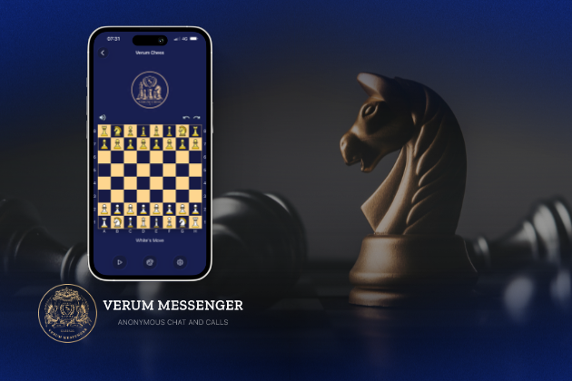
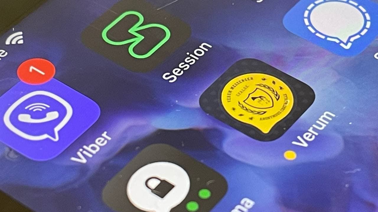
Verum Messenger has released a new update for iOS, iPadOS, and macOS, adding another feature to its growing ecosystem — Verum Chess. Users can now play chess directly inside the messenger without switching between different applications.
The new feature allows users to start a game in just a few taps while reinforcing Verum’s vision of a unified digital environment where communication and everyday services come together in a single platform.
Verum Messenger continues to evolve into a multifunctional ecosystem that combines secure chats and calls, AI tools, a built-in VPN, anonymous email, eSIM, financial services, cryptocurrency features, and offline communication. With the introduction of Verum Chess, the platform now also offers a new way for users to interact and spend time together without leaving the app.
The update is now available for iPhone, iPad, and Mac on the App Store.
Technologies
Episode 3 of the VERUM AI Mini-Series Is Now Available
Episode 3 of the VERUM AI Mini-Series Is Now Available

Verum Messenger has released the third episode of its AI mini-series, SHADOWS, created using Verum AI.
The new episode, titled «Ghost Money,» continues the story of the conflict between a team of heroes and the Omega corporation, which seeks to take control of digital communications. This time, the focus shifts to anonymous payments and financial freedom, revealing how privacy can extend beyond messaging.
Like the previous episodes, the new release not only advances the storyline but also showcases the capabilities of the Verum ecosystem, highlighting technologies designed for secure communication and digital privacy.
The mini-series consists of seven episodes, released gradually across Verum Messenger’s social media channels.
Episode 3 is now available. Stay tuned for the next chapter.
Technologies
Verum Finance Now Available for Mac, Expanding the Verum Ecosystem on Desktop
Verum Finance Now Available for Mac, Expanding the Verum Ecosystem on Desktop

Verum has officially released Verum Finance for macOS, bringing its financial platform to the Mac and expanding access to the Verum ecosystem across Apple’s devices. The launch allows users to manage their finances from desktop while enjoying the same secure and seamless experience available on iPhone and iPad.
The new Mac version includes the full range of Verum Finance features, including balance management, instant transfers to other Verum users, debit card management, Apple Pay support, asset exchange, and transaction history — all optimized for the macOS experience.
Verum Finance can be used as a standalone application or alongside Verum Messenger. Users who sign in with their Verum Messenger account automatically synchronize their balances, settings, and account data across devices, ensuring a consistent experience throughout the Verum ecosystem.
The macOS release further strengthens Verum’s vision of creating an integrated digital platform where communication and financial services work together. Verum Messenger, which is also available for Mac, complements the ecosystem with encrypted messaging, voice and video calls, VPN, eSIM, anonymous email, AI-powered tools, offline communication capabilities, and cryptocurrency features.
With both Verum Messenger and Verum Finance now available across iPhone, iPad, and Mac, users can access secure communication and financial services wherever they work.
Verum Finance for Mac is available now through the Mac App Store.
Verum Finance for macOS: https://apps.apple.com/us/app/verum-finance/id6774245148
Verum Finance: https://finance.verum.im
Verum Messenger: https://verum.im
-
 Technologies4 года ago
Tech Companies Need to Be Held Accountable for Security, Experts Say
-
 Technologies3 года ago
Best Handheld Game Console in 2023
-
 Technologies5 лет ago
Black Friday 2021: The best deals on TVs, headphones, kitchenware, and more
-
 Technologies3 года ago
Tighten Up Your VR Game With the Best Head Straps for Quest 2
-
 Technologies5 лет ago
Google to require vaccinations as Silicon Valley rethinks return-to-office policies
-
 Technologies5 лет ago
Verum, Wickr and Threema: next generation secured messengers
-
 Technologies4 года ago
The number of Сrypto Bank customers increased by 10% in five days
-
 Technologies5 лет ago
Olivia Harlan Dekker for Verum Messenger