Technologies
OnePlus 11 Review: It Works Hard to Earn Its Flagship Title
We reviewed the OnePlus 11 over three weeks. In our tests, the new flagship was powerful, but not perfect.
The OnePlus 11 is the company’s first true flagship to launch in 2023 and it offers plenty to get excited about. From its slick refreshed design, to its hyper-powerful processor and fast charging skills, this phone works hard to earn its flagship title.
But it’s not a massive overhaul from last year’s already excellent OnePlus 10 Pro. It’s similar in design, it’s got a hefty (arguably redundant) boost in power and the new camera setup, while good, isn’t a big leap forward. If you were hoping to see a radical new OnePlus phone, you may be disappointed. Owners of recent OnePlus devices shouldn’t consider upgrading.
OnePlus 11
Like
- Incredible performance for gaming
- Slick, refreshed design
- Hyper-fast charging
- Five years of security support
Don’t Like
- Cameras are good but not great
- Better waterproofing on rivals
Price is certainly on its side. The $699 OnePlus 11 base model ( 729 or roughly AU$1,270) comes with 8GB of RAM and 128GB of storage. Even the higher-end review model I tested, with 16GB of RAM and 256GB of storage, will only set you back $799 ( 799), undercutting its rivals by a decent chunk. The phone’s biggest competition comes from the superb Google Pixel 7 Pro, which at $899 isn’t a big step up in cost (it’s $999 for the equivalent 256GB model, although there’s no boost in power with the extra storage here).
The Pixel 7 Pro was one of our favorite phones of 2022, earning a coveted CNET Editors’ Choice award when it launched in October thanks to its superb cameras, slick interface and attractive design. It’s an amazing phone, and one of my favorite ways to experience Android 13.
Where the OnePlus 11 excels is in its raw power, offering blistering speeds for gaming and heavy multitasking. It charges quicker than Google’s phones, too. The Pixel’s Tensor G2 processor isn’t built for straight-line speed, but still handles anything you’ll find in the Play Store. The Pixel’s pure Android 13 software is clutter-free, and the cameras generally perform better — especially with the addition of the 5x optical zoom lens, which the OnePlus lacks.
Then there’s the new Samsung Galaxy S23, which starts at $800 and comes with a 6.1-inch display, a triple-camera setup, 8GB of RAM and the latest Qualcomm 8 Gen 2 processor. It’s the same chip you’ll find in the OnePlus 11, though it’s been customized for Samsung. With the S23 range going on sale on Feb. 17, we’ll have to wait and see how the new Samsung and OnePlus’ phones stack up against each other.
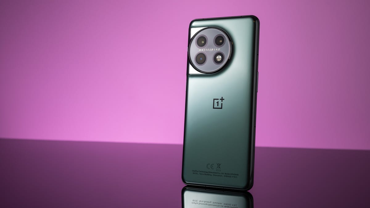
OnePlus 11: A refreshed design, now with added waterproofing
OnePlus’ flagship has arrived in 2023 with a fresh look, swapping out the square camera unit of the 10 Pro for a circular one, fringed with metal that curves gracefully to meet the edge of the phone. My review model’s green tone looks both stylish and smart, while the curving glass on both the front and back makes it satisfying to hold.
I love the phone’s look. It manages to appear different from its predecessors, while still looking familiar enough to feel part of the same family. The glass is toughened Gorilla Glass, so don’t worry too much about shattering it. The new phone one-ups the 10 Pro by coming with an IP64 rating for protection against water. The lack of waterproofing on most versions of the 10 Pro was annoying as it’s something we’ve come to expect on all flagships. So, it’s good to see more official protection here.
Read more: How Waterproof Is My Phone? IP Ratings Explained
That said, IP64 only offers mild protection against water splashes while rivals — including the Pixel 7 Pro, iPhone 14 range and Galaxy S23 range — all have IP68 ratings which protect them from actual submersion in water for at least 30 minutes. IP64 is better than nothing though and will certainly help keep your phone safe when you take calls in the rain.
At 6.7 inches, the display is sizable enough to do justice to mobile games, while its maximum 3,216×1,440-pixel resolution makes everything look nice and crisp (you can opt for a lower resolution to help eke out the battery life). It’s a SuperAMOLED panel that supports Dolby Vision HDR and HDR 10 Plus, meaning it’s bright, bold and capable of properly showing off compatible HDR content.
Its adaptive frame rate can shoot up to 120Hz to provide a smooth experience for high-intensity tasks like gaming, but can dynamically drop to only 1Hz to save power for less demanding tasks like web browsing or showing the always-on display.
There’s an in-display fingerprint scanner, which works well. Longtime OnePlus fans will be pleased to see the alert slider on the right of the phone, which lets you instantly set the phone to silent or vibrate. The slider was notably absent on last year’s OnePlus 10T.
OnePlus 11: Potent power
Powering the phone is the aforementioned Qualcomm Snapdragon 8 Gen 2 processor, backed up by a meaty 16GB of RAM (on my review model). It’s a potent chip that put in some seriously impressive scores on our suite of benchmark tests, landing it comfortably among the most powerful phones around.
Benchmarks don’t mean everything, of course, but rest assured that this phone will handle anything you care to throw at it. Its graphics performance is particularly strong. Demanding games like Genshin Impact, PUBG Mobile and Asphalt 9: Legends (all at max resolution) displayed at consistently high frame rates for smooth gameplay.
OnePlus touts the phone’s «optimized RAM allocation,» «hardware-accelerated ray tracing» in games and «best in class» lighting and illumination effects, which is all well and good, but there aren’t any games available on Android yet that support things like ray tracing. It’s like having a car capable of driving on MagLev tracks — amazing technology, sure, but no way of actually putting it to use just yet.
In the real world, all that power means the phone is swift to use. Simply navigating around the Android interface is fast, smooth and free of the lag or stutters that might signal poorly configured hardware. There’s little that can slow it down. It handled video streaming and photo editing perfectly well.
That swift experience is helped by the phone’s Oxygen 13 OS software. Based on Android 13, Oxygen OS is a lightweight Android skin with a clean look that’s easy to use. I liked it straight out-of-the-box, but you can customize the system fonts and the always-on display to give it a more personal touch.
OnePlus extended its support period to four years for Android updates and an additional fifth year for security updates. That’s the longest the company has ever supported a phone for and means that the OnePlus 11 will still be safe to use five years from now.
OnePlus 11: Cameras that could do better
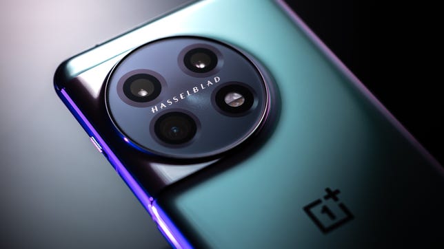
There are three main cameras on the back of the OnePlus 11; a 50-megapixel main camera with an f/1.8 lens and optical image stabilization, a 48-megapixel ultra-wide camera with close focusing macro capabilities and a 32-megapixel portrait camera with a 2x optical zoom. It’s a fairly predictable triple-camera setup, but that portrait camera disappoints me.
That 2x zoom is a step down from the 3.3x zoom seen on the OnePlus 10 Pro and a big step down from the 5x telephoto zoom on the Pixel 7 Pro. Zoom skills might not seem like the most important feature, but if you want to take great images in any environment, a powerful zoom can be an invaluable tool.
Instead of using a wide lens and simply capturing everything in front of you in one image, a long zoom lens lets you find more interesting compositions within those scenes by cropping out distracting road signs, cars or crowds of people. A telephoto lens is typically part of any professional photographer’s kit bag (including my own) and I absolutely love using the zoom on the Pixel 7 Pro — and the whopping 10x optical zoom on the Samsung Galaxy S22 Ultra. Even the 3x on the iPhone 14 Pro gives me more room to work with.
Not having a proper telephoto lens on the OnePlus 11 feels like I have to make compromises in my photography that I wouldn’t with other phones. It’s not as fully rounded of a photography package as a result.
OnePlus has again partnered with iconic camera maker Hasselblad, which has apparently calibrated the camera for better colors. However, I’m not sure it’s doing either company much good as the results are hit-and-miss. While some shots look true-to-life, with punchy colors and pleasing contrast, others look oversaturated, with heavy-handed HDR processing that lifts shadows and tones down highlights to an unrealistic degree.
Taken with the main camera, this image above is beautifully exposed, with warm colors and plenty of detail.
This shot above of a ruined cottage deep in the forest is vibrant and pin-sharp. It’s a great snap all-round.
The close-up shot above is absolutely packed with detail and the colors look spot-on. Nice work, OnePlus.
Vibrant blue sky, lovely detail on the building to the left and a lovely flash of color from the rainbow. The phone has captured this scene above well.
This scene doesn’t impress me though. The phone’s software has really gone hard on the HDR processing, lifting the shadows here to such an extent that the shot above looks unrealistic.
Taken on the iPhone 14 Pro, this comparison image above is darker, but the deeper shadows against that bright blue sky are much more realistic and this shot looks much more natural as a result.
The OnePlus 11’s main camera has again lifted the shadows quite a lot in the snap above. The sky has more of a teal tone to it, which doesn’t reflect reality.
The Pixel 7 Pro’s shot above has a deeper contrast and more natural color tones both on the buildings and in the sky.
Switching to the ultrawide camera, the OnePlus 11’s heavy-handed auto HDR resulted in the image above where the sky looks almost fake against the buildings. There’s also a noticeable color shift between the OnePlus 11’s main camera and ultrawide — a detail I’d noticed on the OnePlus 10 Pro, too.
By not reducing the brightness in the sky to the same extent, the Pixel 7 Pro’s shot above looks more authentic.
Using the macro mode on the ultrawide lens, the OnePlus 11 has delivered a great close-up shot above. I love the rich, vibrant green tones.
By comparison, the iPhone 14 Pro’s macro mode has produced the shot above where the green tones are quite washed out and yellow-ish. I don’t like it as much.
The OnePlus 11 Pro lacks the zoom prowess of some of its competitors, but its 2x lens does allow for decent portrait shots. The colors in the image above are a little cold, and there’s not a ton of detail on my face. But the blur effect is nice.
The iPhone 14 Pro’s 3x portrait mode has resulted in a closer-up portrait (it was shot from the same position), and I think there’s better background blur (known as bokeh) here. The details on my face are sharper too, and although the color tones give a warmer look to the image above. It’s a strong yellow effect that I don’t like any more than the cold look of the OnePlus 11’s shot.
There’s no question, though, that I’d miss having a larger zoom. Above is an image from the 2x zoom lens on the OnePlus 11.
The 5x optical zoom of the Pixel 7 Pro lets you get creative zoomed-in shots, like above, that are out of reach for the OnePlus.
As part of the Hasselblad partnership, the phone comes with a variety of color presets created by Hasselblad ‘Master’ photographers. Take a look above. I don’t really like them and would much prefer to simply edit images my own way using any of the very good photo editing apps on the Google Play store.
At night the camera performs very well however. I was impressed at the brightness it was able to achieve, delivering brighter images (see above) than even the iPhone 14 Pro, albeit with less detail.
The iPhone 14 Pro’s night mode shot above has a touch more detail on some of the distant buildings, but it’s not as bright as the shot from the OnePlus.
It’s brighter than night mode shots from the Pixel 7 Pro, too. See above.
It’ll shoot video at up to 8K resolution, but its standard 4K footage will be plenty for most, offering HDR footage that helps keep bright skies under control. Colors look good in videos and while the optical image stabilization helps smooth out shaky hands, it can result in upright objects in your footage (trees, for example) appearing wobbly as the sensor tries to correct the movement. Check out the video below for some clips recorded on the OnePlus 11.
The camera can take some great shots overall. If photography isn’t a huge focus for you, and you just want crisp, vibrant shots of your friends or your kids at the beach then you’ll be well served by the OnePlus 11 — particularly if you like taking photos at night. If you’re looking for a more well-rounded photography experience then look toward the Pixel 7 Pro.
OnePlus 11: Solid battery and fast charging
The phone runs on a 5,000mAh battery that’s capable of getting you through a full day of use, as long as you’re reasonably careful in how you use it. With the display set to its maximum 3,216×1,440-pixel resolution, at 120Hz refresh rate and with screen brightness on max, the battery dropped from full to 92% remaining after 1 hour of streaming a YouTube video. After the second hour it had dropped to only 85% remaining, which isn’t a great performance.
With the resolution dropped to 2,412×1,080 pixels and the refresh rate at a maximum of 60Hz, it didn’t even drop below 100% after an hour of YouTube streaming and only dropped to 95% after a second hour — not bad at all. But 30 minutes of gaming in Genshin Impact with all settings on max comfortably knocked 10% off the battery.
With more conservative settings you won’t need to worry too much about your phone dropping dead halfway through the afternoon, and you should still have plenty of juice remaining when you put it on charge at night. Demanding gamers can ramp up the settings when you want to enjoy every last detail, but make sure you’ve got your charger nearby.
Thankfully, even if you do drain the battery with gaming or YouTube streaming, getting the juice back in is a speedy process. The phone supports 100-watt fast charging in the UK (80W in the US) which will fill the battery from empty in only 25 minutes — or 27 minutes on the 80W model. That’s quicker than the 1 to 2 hours you can expect a full recharge of the Pixel 7 Pro to take.
OnePlus 11: Should you buy it?
If you’re looking for a high-performance phone to tackle gaming, video streaming and all of life’s essentials, the OnePlus 11 is an excellent phone to consider. It’s got power enough to tackle anything in the Google Play store, it looks great and its fast-charging means that battery life isn’t an issue. The five years of security support is a nice bonus, too.
And while the camera setup is far from the best around, it’s perfectly capable of taking shots of your kids on holiday you’ll be excited to share with your wider family and friends.
But it’s the price that stands out here, being one of the cheapest flagships you can buy, undercutting both the Pixel 7 Pro and Samsung Galaxy S23. If photography isn’t your top priority but you do want ultimate performance for gaming on the go, the OnePlus 11 is certainly worth your time.
How we test phones
Every phone tested by CNET’s reviews team is actually used in the real world. We test a phone’s features, play games and take photos. We examine the display to see if it’s bright, sharp and vibrant. We analyze the design and build to see how it is to hold and whether it has an IP-rating for water resistance. We push the processor’s performance to the extremes using both standardized benchmark tools like GeekBench and 3DMark, along with our own anecdotal observations navigating the interface, recording high-resolution videos and playing graphically intense games at high refresh rates.
All the cameras are tested in a variety of conditions from bright sunlight to dark indoor scenes. We try out special features like night mode and portrait mode and compare our findings against similarly priced competing phones. We also check out the battery life by using it daily as well as running a series of battery drain tests.
Technologies
Samsung’s Galaxy Watch Ultra 2 Might Come in 5G and 4G Cellular Models
If the rumor proves true, the 5G Galaxy Watch Ultra would rival the 5G-enabled $799 Apple Watch Ultra 3 that debuted last fall.
Samsung’s next high-end Galaxy Watch could support faster 5G speeds, but if this leak is true, it will depend on where you live. The rumored Samsung Galaxy Watch Ultra 2 might come in 5G and 4G cellular models, with availability for each smartwatch depending on the country.
According to the Dutch website Galaxy Club (and spotted by SamMobile), Samsung’s servers may have revealed a series of model numbers that point to 5G, 4G and Wi-Fi-enabled editions of the next Galaxy Watch Ultra, which would succeed the original model that debuted in 2024.
A representative for Samsung did not immediately respond to a request for comment.
The Galaxy Club website speculates that the 5G edition would be sold in the US and Korean markets, while the 4G edition would sell in the rest of the world. In the US, a 5G version of the Galaxy Watch Ultra would rival the 5G-enabled $799 Apple Watch Ultra 3, which debuted last fall. The 4G edition would have broader compatibility worldwide, since the earlier network is far more established.
It will likely be a few months until we hear anything official about the Galaxy Watch Ultra 2. Samsung typically unveils its new watches in the summer alongside its Galaxy Z Fold and Z Flip foldable phones. Last year, Samsung unveiled the Galaxy Watch 8 and the Galaxy Watch 8 Classic, but otherwise left the prior 2024 Ultra in the lineup for those looking for a larger 47mm smartwatch.
Technologies
2 Cases Show Supreme Court Isn’t Holding ISPs Responsible for Piracy
Technologies
Today’s NYT Connections Hints, Answers and Help for April 8, #1032
Here are some hints and the answers for the NYT Connections puzzle for April 8, No. 1032.

Looking for the most recent Connections answers? Click here for today’s Connections hints, as well as our daily answers and hints for The New York Times Mini Crossword, Wordle, Connections: Sports Edition and Strands puzzles.
Today’s NYT Connections puzzle is kind of tough. The purple category is a fun one, once you see the connection. Read on for clues and today’s Connections answers.
The Times has a Connections Bot, like the one for Wordle. Go there after you play to receive a numeric score and to have the program analyze your answers. Players who are registered with the Times Games section can now nerd out by following their progress, including the number of puzzles completed, win rate, number of times they nabbed a perfect score and their win streak.
Read more: Hints, Tips and Strategies to Help You Win at NYT Connections Every Time
Hints for today’s Connections groups
Here are four hints for the groupings in today’s Connections puzzle, ranked from the easiest yellow group to the tough (and sometimes bizarre) purple group.
Yellow group hint: In the group.
Green group hint: Appearance details.
Blue group hint: Often found in gyms.
Purple group hint: They help you see.
Answers for today’s Connections groups
Yellow group: Cohort member.
Green group: Aesthetic.
Blue group: Kinds of bar apparatuses.
Purple group: Eyewear in the singular.
Read more: Wordle Cheat Sheet: Here Are the Most Popular Letters Used in English Words
What are today’s Connections answers?
The yellow words in today’s Connections
The theme is cohort member. The four answers are associate, colleague, fellow and peer.
The green words in today’s Connections
The theme is aesthetic. The four answers are design, look, scheme and style.
The blue words in today’s Connections
The theme is kinds of bar apparatuses. The four answers are monkey, parallel, pull-up and uneven.
The purple words in today’s Connections
The theme is eyewear in the singular. The four answers are contact, goggle, shade and spectacle.
-
 Technologies3 года ago
Tech Companies Need to Be Held Accountable for Security, Experts Say
-
 Technologies3 года ago
Best Handheld Game Console in 2023
-
 Technologies3 года ago
Tighten Up Your VR Game With the Best Head Straps for Quest 2
-
 Technologies4 года ago
Black Friday 2021: The best deals on TVs, headphones, kitchenware, and more
-
 Technologies5 лет ago
Google to require vaccinations as Silicon Valley rethinks return-to-office policies
-
 Technologies5 лет ago
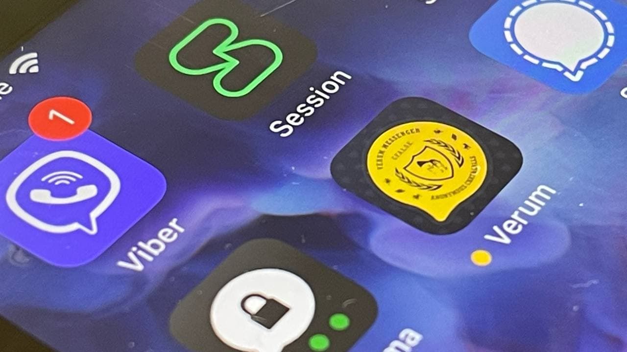
Verum, Wickr and Threema: next generation secured messengers
-
 Technologies4 года ago
Olivia Harlan Dekker for Verum Messenger
-
 Technologies4 года ago
The number of Сrypto Bank customers increased by 10% in five days