
Technologies
Apple Watch Series 11 vs. Series 10: Are the Differences Enough to Justify Upgrading?
At first glance, the new Apple Watch Series 11 looks a lot like its previous-year model. We compare the specs to see what’s changed.

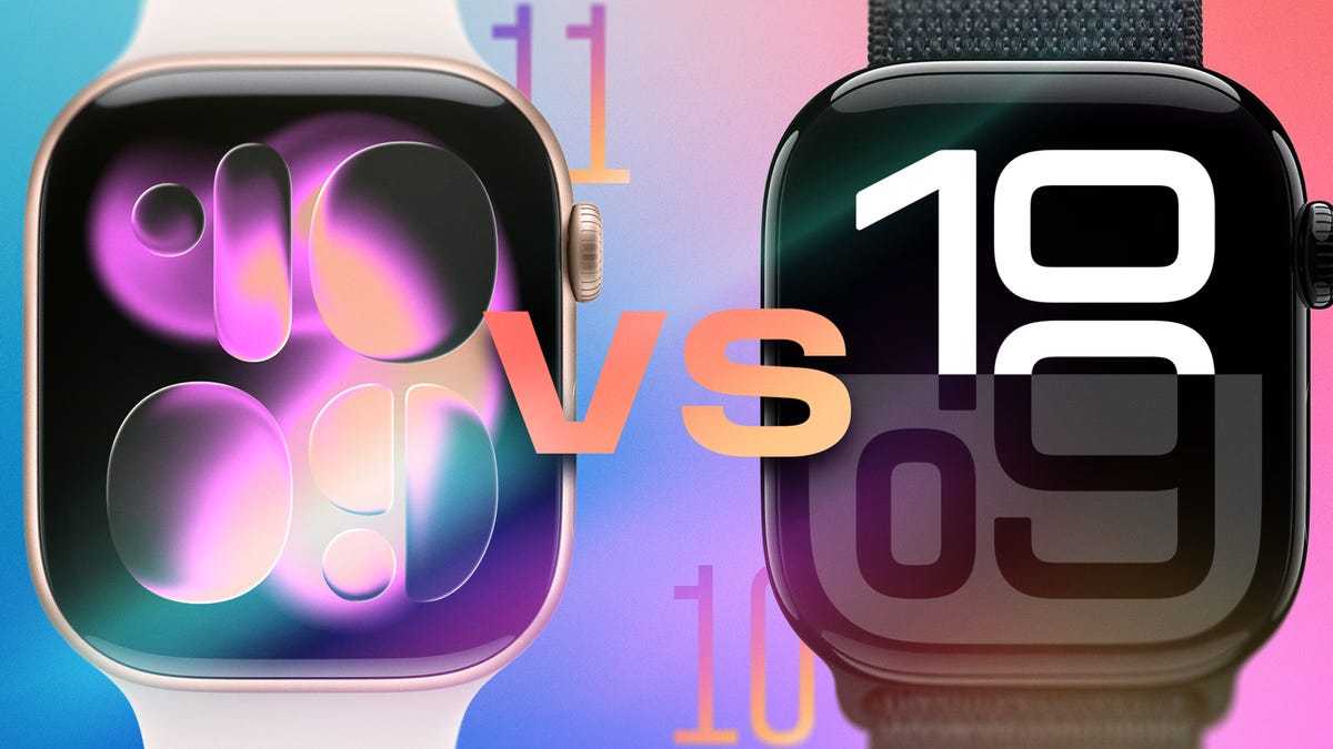
If you’re looking at getting an Apple Watch this holiday season, you have a tough choice: Should you buy the latest Apple Watch Series 11, or find a Series 10 that has most of the same features at a lower cost? Apple made incremental changes to its flagship smartwatch, while also introducing significant improvements to the Apple Watch Ultra 3 and Apple Watch SE 3.
There are still enough differences to make you look twice at moving up (especially if you’re coming from an older model). Let’s compare the models side by side and tease out the finer details.
Don’t miss any of our unbiased tech content and lab-based reviews. Add CNET as a preferred Google source.
Pricing the Apple Watch Series 11
The Series 11 has kept the same price as the Series 10. It starts at $399 for the model with an aluminum body or $699 for one made of titanium.
Add $30 for the larger 46mm case size in aluminum, or $50 for titanium. Opting for a model with a cellular radio that connects independently to networks adds $100. And if you choose a band made of something other than rubber or textile — a stainless steel link bracelet, for example — the price climbs further. Unfortunately, you can’t order just the watch case; you have to select a new band, even if it ends up in your drawer in favor of one you already own and prefer.
There’s also a titanium Apple Watch Hermès model available in silver titanium in both sizes that starts at $1,249.
Apple no longer sells the Series 10, since the Series 11 replaces it, but you can still find refurbished Series 10 models for less from Apple, and new models from other retailers while supplies last.
Apple Watch Series 11 vs. Series 10: Outward design
The Series 11 and Series 10 share the same case design and materials. The larger model measures 46mm tall by 39mm wide, while the smaller comes in at 42mm by 36mm. (Kudos to Apple for continuing to offer two sizes to accommodate people with different-sized wrists.) They’re also both 1mm slimmer than the Apple Watch models that came before, at 9.7mm.
Despite being mostly the same in dimensions, the Series 11 is slightly heavier than the Series 10. For example, the 46mm aluminum GPS Series 11 weighs 37.8 grams, up slightly from 36.4 grams for the Series 10. The 42mm versions come in at 30.3 grams and 30.0 grams, respectively.
For colors, the Series 11 adds a space gray aluminum option to go along with rose gold, silver and jet black. Both models are also available in titanium finishes of slate, gold and natural.
The physical controls are unchanged: the dial that Apple calls the Digital Crown and a side button (that Apple cleverly calls the «side button»). Only the Apple Watch Ultra includes a third physical control: the Action button.
Also noteworthy: The titanium Series 11 is made of 100% recycled titanium, up from 95% recycled material in the titanium Series 10. The display glass is made of 40% recycled glass in the Series 11; no amount is listed for the Series 10. And the battery in the Series 11 uses 100% recycled cobalt and 95% recycled lithium. (The Series 10 lists only 100% recycled cobalt.)
Series 11 vs. Series 10 screens
The screens on both the Series 11 and Series 10 watches have a wide-angle LTPO 3 OLED display. That means it’s easier to see the contents from an angle, and the always-on display refreshes once per second, allowing the seconds counter to move even when the watch is in inactive mode.
LTPO3 screens are also more power efficient. The screens reach up to 2,000 nits for clear visibility in sunlight and dim down to just 1 nit in darkness.
The key difference between the Series 11 and Series 10 screens lies in the glass covering. On the Series 11 aluminum models, Apple uses Ion-X glass, which it claims is twice as scratch-resistant as the glass on previous aluminum versions. The titanium Series 11 uses a sapphire crystal display.
Apple Watch processor and chips
Normally we’d highlight how the new processor improves on its predecessor, but for 2025 Apple stuck with the same S10 processor found in the Series 10. That also means the other chips remain the same, too: the W3 Apple Wireless chip, the second-generation Ultra Wideband chip (for precise Find My location tracking), a four-core Neural Engine and 64GB of storage.
Battery power: Series 11 vs. Series 10
Battery life is where the two models get really interesting. Apple doesn’t reveal how large the built-in lithium-ion battery is or its capacity, but it is claiming up to 24 hours for the Series 11 compared to 18 hours for the Series 10. In Low Power Mode, that’s up to 38 hours for the Series 11, up from 36 hours in the Series 10.
It’s not entirely clear where Apple squeezed an extra six hours of battery life out of what appears to be mostly identical hardware. Both phones use the same S10 processor, though there are likely software optimizations in WatchOS 26. CNET lead writer Vanessa Hand Orellana found that, at least initially, Apple may be undercounting the battery performance, writing in her review, «With notifications turned on (heavy Slack-ing and texting), at least one 30- to 45-minute outdoor workout a day, a full night of sleep tracking and some mild flashlight use, I’ve consistently managed to squeeze between 27 and 32 hours per charge.»
As for charging the watches, both the Series 11 and Series 10 can be charged up to 80% in about 30 minutes. Apple says that with a 20W power adapter, 15 minutes of fast charging provides up to 8 hours of regular use, while just five minutes is enough for eight hours of sleep tracking — thanks to the watch’s much lower power demands while you’re asleep. Apple’s comparison information for the Series 10 doesn’t list those last two metrics, but that seems more due to it being a marketing point last year versus a new capability in the Series 11.
Comparing the sensors of the Series 11 and Series 10
The Apple Watch’s sensors power health features that range from heart-rate monitoring to depth sensing to precise location tracking. That said…
They’re identical in the Series 11 and Series 10. No changes here.
Another change: Connectivity in the Series 11 and Series 10
One of the more notable changes in the cellular models of the Series 11 is support for 5G networks, specifically a power-efficient type called 5G Reduced Capacity (or 5G RedCap). That allows it to connect to both 5G and LTE networks without having to go through a connected iPhone, and the 5G speeds should be better. By comparison, the cellular Series 10 supports LTE and UMTS (3G).
Part of incorporating 5G into the Series 11 models is a redesigned cellular antenna and an algorithm that «simultaneously engages the two system antennas when needed, significantly increasing the signal strength,» according to Apple’s Series 11 press release. That algorithm is exclusive to the Series 11 and Apple Watch Ultra 3, per Apple.
Both Apple Watch models support Wi-Fi 4 (802.11n) at 2.5GHz and 5GHz speeds. (Apple’s comparison page only lists the speeds for the Series 11, but an Apple Watch Wi-Fi support page notes 5GHz has been supported since the Series 6 watches.)
Both watches talk to the iPhone and other peripherals using Bluetooth 5.3.
WatchOS 26 on the Apple Watch Series 11 and Series 10
The new features of WatchOS 26 come to both watch models, including hypertension notifications, Sleep Score and the Blood Oxygen app (making its reappearance in the US amid an ongoing legal dispute). Apple’s comparison page lists the new Wrist Flick gesture for the Series 11 but not the Series 10, but that must be a typo because I can confirm that it works on my Series 10 watch.
Apple Watch Series 11 vs. Apple Watch Series 10
| Apple Watch Series 11 | Apple Watch Series 10 | |
| Design & sizes | Rectangular, 42mm, 46mm | Rectangular, 42mm, 46mm |
| Display | 42mm: 446 x 374 pixels, LTPO3 OLED Retina display, Wide-angle OLED 46mm: 416 x 496 pixels, LTPO3 OLED Retina display, Wide-angle OLED | 446 x 374 ppi, LTPO3 OLED Retina display, Wide-angle OLED |
| Brightness | Between 1 and 2000 nits | 2000 nits |
| Thickness & weight | 46mm size: 9.7mm; 37.8g (aluminum), 36.9g (aluminum GPS+Cellular), 43.1g (titanium) 42mm size: 9.7mm; 30.3g (aluminum), 29.7g (aluminum GPS+Cellular), 34.6g (titanium) | 9.7mm; 30-41.7g (46mm titanium model) |
| Material & finish | Aluminum: jet black, rose gold or silver finish; titanium: slate, gold or natural finish | Aluminum: jet black, rose gold or silver finish; titanium: slate, gold or natural finish |
| Durability | 5ATM Water + IP6X (dust) | 5ATM Water + IP6X (dust) |
| Battery life | Up to 24 hours, up to 38 hours Low Power (always-on) + Fast charge: 80% in 30 min, 100% in 60 min | 24-30 (always-on) + Fast charge: 80% in 30 min, 100% in 60 min |
| Sensors | ECG, 3rd-gen optical heart sensor, skin temp, depth gauge, SpO2, Noise monitoring, water temperature, compass | ECG, heart rate, skin temp, depth gauge, SpO2, Noise monitoring |
| Emergency features | Satellite SOS, Emergency SOS, Fall detection, Crash detection, Check in and Backtrack | Emergency SOS, Fall detection, Crash detection, Check in and Backtrack |
| AI & coaching | Siri (voice assistant); Workout Buddy | Siri (voice assistant); Workout Buddy |
| Processor | S10 SiP with 64-bit dual-core processor, W3 Apple wireless chip | S10 SiP with 64-bit dual-core processor, W3 Apple wireless chip |
| RAM/Storage | 64GB (storage) | 64GB (storage) |
| Payments | Apple Pay | Apple Pay |
| Price (US) | $399-$750 (titanium) | $399-$750 (titanium) |
Technologies
The 3 iOS Features You Definitely Aren’t Using (but Are Silently Draining Your Battery)
If you find that your phone loses battery too fast, you may just need to disable these features to solve the problem.
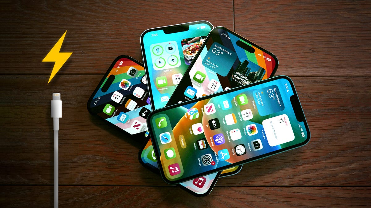
It’s 2026, and if you’re constantly toggling on «Low Power Mode» just to survive a commute, you may as well be carrying around a brick. While it’s true that lithium-ion batteries naturally degrade over time, most people are draining their «juice» prematurely by leaving on high-performance features they don’t even need.
Your iPhone has a few key settings that drain your battery in the background. The good news is, you can turn them off. Instead of watching your battery percentage plummet at the worst possible moment, a few simple tweaks will give you hours of extra life.
Before you even think about buying a new phone, check your Battery Health menu (anything above 80% is decent) and then turn off these three settings. It’s the easiest way to make your iPhone battery last longer, starting right now.
Don’t miss any of our unbiased tech content and lab-based reviews. Add CNET as a preferred Google source.
Turn off widgets on your iPhone lock screen
All the widgets on your lock screen force your apps to automatically run in the background, constantly fetching data to update the information the widgets display, like sports scores or the weather. Because these apps are constantly running in the background due to your widgets, that means they continuously drain power.
If you want to help preserve some battery on iOS 18, the best thing to do is simply avoid widgets on your lock screen (and home screen). The easiest way to do this is to switch to another lock screen profile: Press your finger down on your existing lock screen and then swipe around to choose one that doesn’t have any widgets.
If you want to just remove the widgets from your existing lock screen, press down on your lock screen, hit Customize, choose the Lock Screen option, tap on the widget box and then hit the «—« button on each widget to remove them.
Reduce the motion of your iPhone UI
Your iPhone user interface has some fun, sleek animations. There’s the fluid motion of opening and closing apps, and the burst of color that appears when you activate Siri with Apple Intelligence, just to name a couple. These visual tricks help bring the slab of metal and glass in your hand to life. Unfortunately, they can also reduce your phone’s battery life.
If you want subtler animations across iOS, you can enable the Reduce Motion setting. To do this, go to Settings > Accessibility > Motion and toggle on Reduce Motion.
Switch off your iPhone’s keyboard vibration
Surprisingly, the keyboard on the iPhone has never had the ability to vibrate as you type, an addition called «haptic feedback» that was added to iPhones with iOS 16. Instead of just hearing click-clack sounds, haptic feedback gives each key a vibration, providing a more immersive experience as you type. According to Apple, the very same feature may also affect battery life.
According to this Apple support page about the keyboard, haptic feedback «might affect the battery life of your iPhone.» No specifics are given as to how much battery life the keyboard feature drains, but if you want to conserve battery, it’s best to keep this feature disabled.
Fortunately, it is not enabled by default. If you’ve enabled it yourself, go to Settings > Sounds & Haptics > Keyboard Feedback and toggle off Haptic to turn off haptic feedback for your keyboard.
For more tips on iOS, read about how to access your Control Center more easily and why you might want to only charge your iPhone to 95%.
Technologies
These Are the Weirdest Phones I’ve Tested Over 14 Years
These phones tried some wild things. Not all of them succeeded.
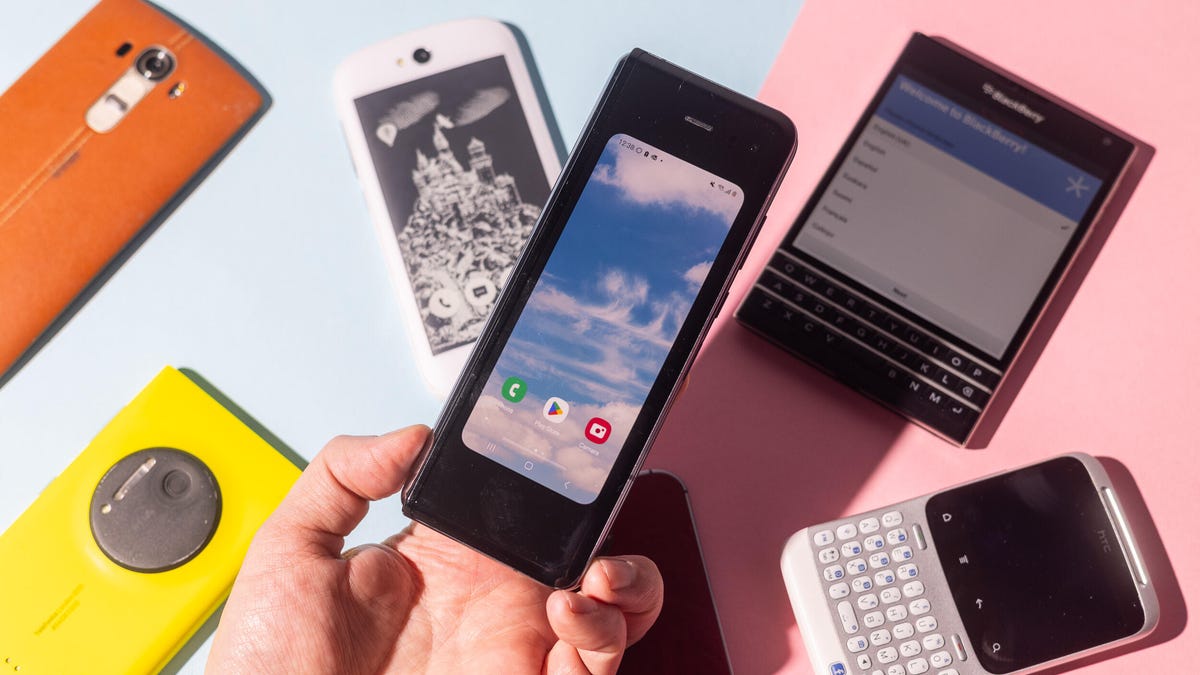
I’ve been a CNET journalist for over 14 years, testing everything from electric cars and bikes to cameras and, er, magic wands. But it’s phones that have always been my main focus and I’ve seen a lot of them come and go in my time here. Sure, we’ve had the mainstays like Apple and Samsung, but I’ve also seen the rise of brands like Xiaomi and OnePlus, while once-dominant names like BlackBerry, HTC and LG have vanished from the mobile space.
I’ve seen phones arrive with such fanfare that they changed the face of the mobile industry, while others simply trickled into existence and disappeared just as uneventfully. But it’s the weird ones that stick in my memory. Those devices that tried to be different, that dared to offer features we didn’t even know we wanted or simply the ones that aimed to be quirky for the sake of quirky. Like someone who thinks an interesting hat is the same as having a personality.
Here then are some of the weirdest phones I’ve come across in my mobile journey at CNET. Better yet, I still have them in a big box, so I was able to dig them out and take new photos — though not all of them still work. Let’s start with a doozy.
BlackBerry Passport
At the height of its power RIM’s BlackBerry was one of the most dominant names in mobile. It was unthinkable then that anything could unseat the goliath, let alone that it would fade into total nonexistence. The once juicy, ripe BlackBerry withered and died on the bush, but not without a few interesting death rattles on its way.
My pick from the company’s end days is the Passport from 2014, notable not just for its physical keyboard but its almost completely square design. The rationale behind this, according to its maker, was that business types just really love squares. A Word document, an Excel spreadsheet, an email — all square (ish) and all able to be viewed natively on the Passport’s 4.5 inch display with its 1:1 aspect ratio. Let’s not forget that all Instagram posts at that time were also square so it had that going for it too. YouTube, not so much.
In theory it’s a sound idea. In practice the square design made it awkward to use, as the physical keyboard was too wide and narrow. Its BlackBerry 10 software, especially the app availability, lagged behind what you’d get from Android at the time. BlackBerry quickly ditched the new shape. After trying to claw back some credibility with its Android phones — including the stupidly named Priv, a phone I quite liked — and by bringing on singer Alicia Keys as Global Creative Director (because BlackBerry phones had keys, get it?) the company stopped making its own phones in 2016.
YotaPhone 2
You’d be forgiven for having never heard of this phone or its parent company, Yota. Based in Russia, Yota made two phones: the creatively named YotaPhone in 2012 and the similarly inspired YotaPhone 2 in 2014, pictured above. Both were unique in the mobile world for their use of a second display on the rear. From the front, these phones looked and operated like any other generic Android phone. Flip them over though and you’d get a 4.3-inch E Ink display.
The idea was that you’d use your Android phone as normal for things like web browsing, gaming or watching videos, but you’d switch to the rear display if you wanted to read ebooks or simply have it propped up to show incoming notifications. E Ink displays use almost no power, so it made a lot of sense to preserve battery life by viewing «slow» content on the back.
The reality though is that beyond ebooks — which aren’t great to read on such a tiny screen anyway — there’s very little anyone might want to use an E Ink display for when out and about. It was difficult to operate, too, thanks to a slow processor and clunky software. After just two generations of YotaPhones, the company went into liquidation.
HTC ChaCha
Remember when Facebook was the cool place to be instead of just the place your parents and their friends go to publicly air their most troubling of opinions? When I was at university, instead of trading phone numbers when you met someone, the default thing was to add each other on Facebook and then begin poking each other. Facebook was so ubiquitous at the time that it was simply the way every single person I knew communicated.
Keen to capitalise on Zuckerberg’s social media success, HTC brought out the ChaCha in 2011. The phone came with an utterly ludicrous name and a dedicated Facebook button on the bottom edge. Tapping this would immediately bring up your Facebook page, allowing you to post the lyrics to Rebecca Black’s Friday, ask what Fifty Shades of Grey is about or do whatever else it was we were all up to in 2011.
Facebook might still be around in one form or another, but HTC abandoned its phone-making business back in 2018. Unsurprisingly, phones with dedicated hardware buttons tied to social media haven’t caught on.
Sirin Labs Finney U1
«Bro!» I hear you shout, all-too loudly. «BRO! You’ve got to check out what my Bitcoin is doing!» You’d then show me your phone and I’d watch while your crypto account plummeted, rebounded and plummeted again over the course of 12 seconds. The phone you’d be showing me, of course, would be the Sirin Labs Finney, a 2019 phone specifically targeted at crypto bros who wanted a device that would perfectly match their high-living, high-fiving crypto-trading lifestyle.
At its core, the Finney is just another Android phone, but a hidden second screen pops up from the back of the phone, with the sole purpose of giving you secure access to your crypto wallet. The phone had a whole host of security features to ensure that only you could access your Bitcoin or Etherium, and it allowed you to send and receive cryptocurrency without having to use a third-party online platform. Apparently that was a good thing.
If you were entrenched in the crypto world, this phone might have been the dream. But the wallet wasn’t easy to use and the phone was expensive, thanks to the cost of that second screen. Sirin Labs stopped making phones soon after and the mobile industry learned an important lesson about not developing hyper-niche devices that aren’t even that well-suited for the handful of customers that might be interested.
Planet Computers Gemini PDA
Half phone, half laptop, all productivity. The Gemini PDA by UK-based mobile startup Planet Computers was a clamshell device in 2018 with a large (at the time) 5.99-inch display and a full qwerty keyboard. It was basically a slightly more modern interpretation of a PDA, like 1998’s Psion 3MX, in that it was effectively a tiny laptop that would fold up and fit in your pocket. The full keyboard allowed you to type away comfortably on long emails or documents while the regular Android software on the top half meant it also functioned like any other phone — apps, games, phone calls, whatever.
It had 4G connectivity for fast data speeds and a later model even got an update to 5G. But, like the BlackBerry Passport, its focus on business-folk and productivity above all else meant it was a niche product that failed to garner enough appeal to succeed. It didn’t help that it was utterly enormous and fitting it in a jeans pocket was basically impossible, so it didn’t impress either as a laptop or as a phone.
LG G5
LG remains a huge name in the tech industry today thanks to its TVs and appliances, but it also tried to be a big player in the phone world, too. I liked LG’s phones — they were quirky and often tried weird things which kept my days as a reviewer interesting, perhaps none more so than the LG G5 in 2016.
LG called the G5 «modular,» meaning that the bottom chin of the phone snapped off allowing you to attach different modules such as a camera grip or an audio interface. Like many items on this list I can say that it’s a nice idea in theory, but in practice the phone fell short. Swapping out modules meant removing the battery, which of course meant restarting your phone every time you wanted to use the camera grip.
It was an inelegant solution to a problem that never needed to exist. But its bigger issue was that the camera grip and audio interface were the only two modules LG actually made for the phone. It’s as though the company had this fun notion in creating a phone that can transform according to your needs but then forgot to assign anyone to come up with any ideas on what to do with it. As a result, the end product was uninspiring, over-engineered and expensive.
Samsung Galaxy Note
Samsung’s Galaxy Note series helped transform the mobile industry. It literally stretched the boundaries of phones, encouraging larger and larger screens — even creating the unpleasant and mercifully short-lived term «phablet.» But the first-generation model in 2011 was controversial, mostly due to what was then considered its enormous size.
At 5.3 inches, it was significantly bigger than almost any other phone out there, including Samsung’s own Galaxy S2 — which, at a measly 4.3 inches, paled into insignificance against the mighty Note. It was mocked for being so huge, with memes appearing online poking fun at people holding it up when making calls. And while times have changed and we now have Samsung’s 6.9-inch Galaxy S25 Ultra, the original Note’s boxy aspect ratio meant it was actually wider than the S25 Ultra. So even by today’s standards it’s big.
It was also among the first phones to come with its own stylus shoved into its bottom. It’s a feature that few mobile companies have mimicked, but Samsung kept it as a differentiator on its later Note models before incorporating it into its flagship S line starting with the S22 Ultra.
Nokia Lumia 1020
Nokia’s Lumia 1020 was my absolute favorite phone for quite some time after its launch in 2013. And it’s because of its weirdness.
Nokia had an amazing history of bonkers mobiles — 2004’s 7280 «lipstick phone,» for example — and while the Lumia range was much more sedate, the 1020 had a few things that made it stand out. First, it ran Windows Phone, Microsoft’s brief and unsuccessful attempt to launch a rival to Android and iOS. A rival that I happened to quite like.
It was also made of polycarbonate, with a smoothly rounded unibody design that strongly contrasted the angular metal, plastic and glass designs of almost all other phones launching at that time. Its look was unlike anything else on sale, and I loved it.
But the main thing I loved was its camera. With a 41-megapixel sensor, Carl Zeiss lens, raw image capture and optical image stabilization, the Lumia 1020 packed the best camera specs of any phone I’d ever seen. It made the phone a true standout product, especially for photographers like me who wanted an amazing camera with them at all times, but didn’t want to have to carry both a phone and a compact digital camera.
While incredible image quality from a phone is a given in almost all camera phones in 2026, the Lumia 1020 was an early pioneer in what could be achieved from a phone camera.
LG G4
LG, twice in one list? Oh yes, my friend, because the G5 seen above was not the first time LG went weird. Launched in 2015, the LG G4 had two main features that raised a few eyebrows. Most notably was LG’s decision to wrap the phone in real leather. Yes, real actual leather. Like what you’d get when you peel a cow. It even had stitching down the back, making it look like a handbag or a boot.
While it’s not a phone for vegans, I actually liked the look, especially as real leather — even the really thin stuff LG used on the G4 — naturally wears over time, gaining scuffs and scratches that give each phone a unique patina. It’s why I love my old leather Danner boots, and it’s why a vintage, worn-in leather jacket will almost always look better than a brand new one. Still, with leather being an expensive — and arguably controversial — material to use on a phone, it’s no surprise LG didn’t return to this idea.
But it’s not the only weird thing about the phone — the G4 was among a small number of phones released around that time that experimented with curved displays. It’s gently bent into a banana shape, the theory being that it makes watching videos more immersive, as is the case with curved screens in movie theaters. The problem is that movie screens are immense, so that curve makes sense. On a 5.5 inch phone like the G4, that curve is barely noticeable and only really served to push the price up.
Motorola Moto X and Moto Maker
I’ve just pointed out how weird the LG G4 was for using leather and now I’m pointing out another phone that, as you can see in the image above, is also wrapped in leather. But the weird thing here isn’t that the Motorola Moto X came in leather — it’s that I personally got to choose that it came in leather.
With the Moto X in 2013, Motorola launched a service called Moto Maker that allowed you to customize your phone in a wild variety of ways. From different-colored backs and multicolored accents around the camera and speakers through to using materials including leather and even various types of wood, there were loads of options to make your Moto X look unique. Each phone would then be made to order and you could even have it personalised with lazer etching and provide your Google account for it to be prelinked on arrival.
If custom-making phones with a vast number of potential options en mass sounds like an absolute logistical nightmare then you’re on the same page as Motorola eventually found itself. Moto Maker only existed for a few years before the company retired its customization service.
Samsung Galaxy Fold
I’m ending on a wildcard addition with the original Galaxy Fold. It’s a wildcard because Samsung’s Fold and Flip range are now up to number seven and we’ve got foldable devices from almost all major Android manufacturers. Though still not Apple.
While the original Fold might have kicked off the foldable revolution, there’s no question it was a weird phone. I was among the first to test it in the world when it launched in 2019 and while I was certainly impressed by the bendy display, its hinge felt weird and «snappy» to use. The outer display was, let’s face it, terrible.
On paper its 4.6-inch size is reasonable, but it’s so tall and narrow that it was borderline unusable for anything more than checking incoming notifications. Trying to type on it meant whittling down your thumbs to pointy nubs so I spent most of my time interacting with the phone’s much bigger internal screen. Cut to today when the Galaxy Z Fold 7’s outer screen measures a healthier 6.7 inches and as a result can function like any regular smartphone, with the bigger inside screen only required when you want more immersive content.
Looking back at the original Fold and its bizarre proportions, it’s honestly a surprise that Samsung persisted with the format. But I’m glad it did.
Technologies
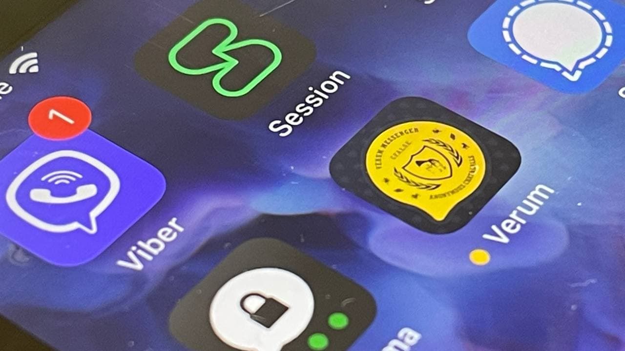
How Verum Ecosystem Is Rethinking Communication
David Rotman — Founder of the Verum Ecosystem

For David Rotman, communication is not a feature — it is a dependency that should never rely on a single point of failure.
As the founder of the Verum Ecosystem, Rotman developed a communication platform designed to function when internet access becomes unreliable or unavailable.
Verum Messenger addresses real-world challenges such as network outages, censorship, and infrastructure failures. Its 2025 update introduced a unified offline-capable messaging system, moving beyond Bluetooth-based or temporary peer-to-peer solutions.
Verum’s mission is simple: to ensure communication continuity under any conditions.
-
 Technologies3 года ago
Tech Companies Need to Be Held Accountable for Security, Experts Say
-
 Technologies3 года ago
Best Handheld Game Console in 2023
-
 Technologies3 года ago
Tighten Up Your VR Game With the Best Head Straps for Quest 2
-
 Technologies4 года ago
Black Friday 2021: The best deals on TVs, headphones, kitchenware, and more
-
 Technologies5 лет ago
Google to require vaccinations as Silicon Valley rethinks return-to-office policies
-
 Technologies5 лет ago
Verum, Wickr and Threema: next generation secured messengers
-
 Technologies4 года ago
Olivia Harlan Dekker for Verum Messenger
-
 Technologies4 года ago
iPhone 13 event: How to watch Apple’s big announcement tomorrow


