Technologies
Dragon Quest I & II HD-2D Remake Brought Me Back to When RPGs First Felt Magical
Take a trip back to the ’90s to learn where JRPGs started.
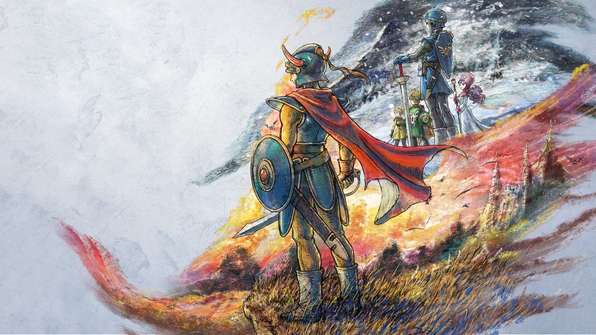
A professor once told me that one of the defining moments of becoming your own person is when you find music that isn’t what your parents listened to and make it your own. I’ve always felt the same applies to video games, once you find the one that defines your favorite genre. For me, that was the roleplaying game Dragon Warrior on the NES, now known as Dragon Quest I, and I’ve found myself back in that world with the new Dragon Quest I & II HD-2D Remake.
This marks the second remake of the older Dragon Quest games from Square Enix, following last year’s Dragon Quest III HD-2D Remake. Like the previous game, players experience a modern retelling of the first two titles in the iconic Dragon Quest franchise that helped create the Japanese RPG subgenre. While I didn’t play enough of both games to give a full review, diving back in brought back a flood of memories of my first time experiencing an RPG, and falling in love with the genre.
Like many kids back in the NES era, I played Dragon Warrior thanks to a free copy sent to Nintendo Power subscribers, though I didn’t have a subscription. A friend of mine, one of the few kids I knew with an NES, got it and showed it to me one Saturday. It blew our minds because it wasn’t simple action gameplay like Super Mario Bros., where you run and jump, or The Legend of Zelda, where Link slashes enemies. Instead, we read what was happening as the game’s story unfolded. I was hooked.
This time around, there’s still plenty of reading, but the remake updates the experience in countless ways. Both games have the same HD-2D visual style seen in Dragon Quest III HD-2D Remake. The characters and enemies retain designs by legendary artist Akira Toriyama (Dragon Ball, Dragon Ball Z), but now include richer detail in their 2D sprites, set against lushly animated 3D environments.
There’s also voice acting for many of the characters and enemies, and as you’d expect from an RPG set in a medieval world, everyone speaks with a British accent. Seeing the updated visuals and hearing the voices brought me back to how amazed I was as a kid, when enemy sprites on the NES looked incredibly detailed, and reading the dialogue aloud practically required talking like the king in Disney’s Robin Hood.
Square Enix didn’t add full cinematics but instead uses character sprites to create dynamic scenes. In Dragon Quest I, the descendant of the legendary hero Erdrick (whom I remembered calling «Edrick») is tasked by King Lorik to rescue his daughter and defeat the villainous Dragonlord, who has stolen the Ball of Light that had kept the forces of evil at bay. These story beats were told through text on the NES, but the remake visualizes them in a way that was once only imaginable.
Dragon Quest II does the same, showing the attack on the tranquil castle of Moonbrooke with far more action and drama than the short action sequence of the original.
One thing I appreciate about this remake is the added story context. In Dragon Quest II, the descendants of the hero from the first game must unite to face a new evil. The player begins as the Prince of Midenhall, setting off to find his cousins, starting with the Prince of Cannock. In the original, players simply learned that the prince had left for Wellspring and found him resting in a town along the way. The remake includes a short sequence where his sister joins you on the journey — a small but meaningful touch that gives a bit more depth to the simple story.
Another pleasant surprise is the addition of abilities. In the original games, characters could only use regular attacks or magic. The new abilities add offensive options, such as striking all enemies at once or reflecting damage at the cost of magic points — skills familiar to players of the Dragon Quest III HD-2D Remake. These abilities really shine in Dragon Quest II, where the Prince of Midenhall can’t use magic but can rely on these techniques, adding strategic variety to battles.
As expected from an HD remake, there are numerous «quality of life» improvements. Players can speed up battles, warp between cities and dungeons, and benefit from autosaves. The ability to run, though simple, is a huge improvement. Today’s gamers have no idea how tedious it was to move one step at a time on the NES.
Of all the improvements, the visuals struck me most, especially the world design. The Dragon Quest world remains in 2D, but terrain like forests and mountains now feels layered and immersive. On the NES, these were blocky squares; in the remake, your character weaves through trees and climbs hills. It feels like seeing what my 11-year-old imagination once filled in. I still remember every inch of that map, burned into memory after endless hours of play.
One brilliant design choice from the original remains: The final boss’s castle sits just a short distance from where you start, though you don’t realize its significance until much later. In the remake, the Dragonlord’s lair now looms behind walls, giving it an even more ominous presence. I wanted to explore every corner again, but the rising enemy difficulty quickly stopped that plan.
There’s no question that this is the best way to play the original Dragon Quest 1 & 2 games, but even with their beautifully reimagined graphics, they’re still older games. This is still a turn-based RPG that has no flashy actions or award-winning story. It’s clear that Dragon Quest I & II HD-2D Remake is for players like me who grew up with these adventures. Those curious about the roots of the JRPG genre can also find enjoyment here, much like cinephiles who buy Blu-rays of silent films. For everyone else, there’s little reason to jump in immediately, but this faithful remake might be worth a look when it inevitably goes on sale.
Dragon Quest I & II HD-2D Remake will be released on Oct. 30 for $60 on PC, PS5, Nintendo Switch, Switch 2, Xbox Series X and S consoles.
Technologies
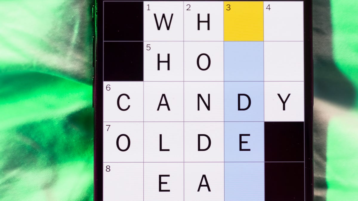
Today’s NYT Mini Crossword Answers for Wednesday, April 8
Here are the answers for The New York Times Mini Crossword for April 8.
Looking for the most recent Mini Crossword answer? Click here for today’s Mini Crossword hints, as well as our daily answers and hints for The New York Times Wordle, Strands, Connections and Connections: Sports Edition puzzles.
Need some help with today’s Mini Crossword? Hint: It uses a lot of the letter Z for some reason. Read on for all the answers. And if you could use some hints and guidance for daily solving, check out our Mini Crossword tips.
If you’re looking for today’s Wordle, Connections, Connections: Sports Edition and Strands answers, you can visit CNET’s NYT puzzle hints page.
Read more: Tips and Tricks for Solving The New York Times Mini Crossword
Let’s get to those Mini Crossword clues and answers.
Mini across clues and answers
1A clue: ___-Carlton (hotel chain)
Answer: RITZ
5A clue: Span of the alphabet
Answer: ATOZ
6A clue: Cable channel with an out-of-this-world name
Answer: STARZ
7A clue: Takes care of, as a squeaky wheel
Answer: OILS
8A clue: Toy on a string
Answer: YOYO
Mini down clues and answers
1D clue: When a post receives far more negative comments than likes, in social media slang
Answer: RATIO
2D clue: World’s leading wine producer
Answer: ITALY
3D clue: Middle of the human body
Answer: TORSO
4D clue: Sleeping sound
Answer: ZZZ
6D clue: Tofu base
Answer: SOY
Technologies
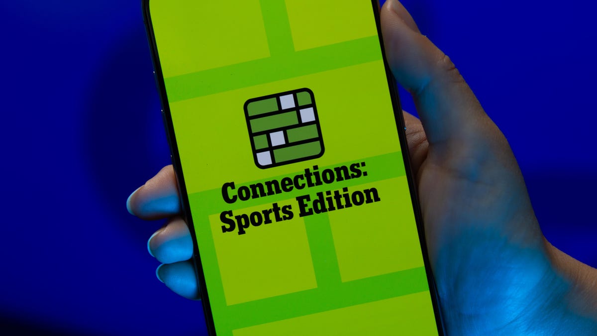
Today’s NYT Connections: Sports Edition Hints and Answers for April 8, #562
Here are hints and the answers for the NYT Connections: Sports Edition puzzle for April 8 No. 562.
Looking for the most recent regular Connections answers? Click here for today’s Connections hints, as well as our daily answers and hints for The New York Times Mini Crossword, Wordle and Strands puzzles.
Today’s Connections: Sports Edition is a tough one. If you’re struggling with today’s puzzle but still want to solve it, read on for hints and the answers.
Connections: Sports Edition is published by The Athletic, the subscription-based sports journalism site owned by The Times. It doesn’t appear in the NYT Games app, but it does in The Athletic’s own app. Or you can play it for free online.
Read more: NYT Connections: Sports Edition Puzzle Comes Out of Beta
Hints for today’s Connections: Sports Edition groups
Here are four hints for the groupings in today’s Connections: Sports Edition puzzle, ranked from the easiest yellow group to the tough (and sometimes bizarre) purple group.
Yellow group hint: Working out.
Green group hint: Cover your face.
Blue group hint: NFL players.
Purple group hint: Leap.
Answers for today’s Connections: Sports Edition groups
Yellow group: Exercises in singular form.
Green group: Sporting jobs that require masks.
Blue group: Hall of Fame defensive ends.
Purple group: ____ jump.
Read more: Wordle Cheat Sheet: Here Are the Most Popular Letters Used in English Words
What are today’s Connections: Sports Edition answers?
The yellow words in today’s Connections
The theme is exercises in singular form. The four answers are crunch, plank, situp and squat.
The green words in today’s Connections
The theme is sporting jobs that require masks. The four answers are catcher, fencer, football player and goaltender.
The blue words in today’s Connections
The theme is Hall of Fame defensive ends. The four answers are Dent, Peppers, Strahan and Youngblood.
The purple words in today’s Connections
The theme is ____ jump. The four answers are broad, high, long and triple.
Technologies
The $135M Google Data Settlement Site Is Live — See If You’re Eligible
Use the settlement website to select your preferred payment method, and you may end up $100 richer.
You can now file a claim in the $135 million Google data settlement. The case centers on claims that Android devices transmitted user data without consent. Specifically, the class action lawsuit Taylor v. Google LLC contends that Google’s Android devices passively transferred cellular data to Google without user permission, even when the devices were idle. While not admitting fault, Google reached a preliminary settlement in January, agreeing to pay $135 million to about 100 million US Android phone users.
The official settlement website for the lawsuit is now live. The final approval hearing won’t occur until June 23, when the court will consider whether Google’s settlement is fair and listen to objections. After that, the court will decide whether to approve the $135 million settlement.
In the meantime, if you qualify and want to be paid as part of the settlement, you can select your preferred payment method on the official website. There, you can find information on speaking at the June 23 court hearing and on how to exclude yourself or write to the court to object by May 29.
As part of the settlement, Google will update its Google Play terms of service to clarify that certain data transfers do occur passively even when you’re not using your Android device, and that cellular data may be relied upon when not connected to Wi-Fi. This can’t always be disabled, but users will be asked to consent to it when setting up their device.
Google will also fully stop collecting data when its «allow background data usage» option is toggled off.
Who can be part of the settlement?
In order to join the Taylor v. Google LLC settlement, you must meet four qualifications:
- Be a living, individual human being in the US.
- Have used an Android mobile device with a cellular data plan.
- Have used the aforementioned device at any time from Nov. 12, 2017, to the date when the settlement receives final approval.
- You’re not a class member in the Csupo v. Google LLC lawsuit, which is similar but specifically for California residents.
The final approval hearing is on June 23, so you can add your payment method until then. The hearing’s date and time may change, and any updates will be posted on the settlement website.
If you choose to do nothing, you will still be issued a settlement payment, but you may not receive it if you don’t select a payment method.
How much will I get paid?
It’s not currently known exactly how much each settlement class member will receive, but the cap is $100. Payments will be distributed after final court approval and after any appeals are resolved.
After all administrative, tax and attorney costs are paid, the settlement administrator will attempt to pay each member an equal amount. If any funds remain after payments are sent, and it’s economically feasible, they will be redistributed to members who were previously and successfully paid. If it’s not economically feasible, the funds will go to an organization approved by the court.
-
 Technologies3 года ago
Tech Companies Need to Be Held Accountable for Security, Experts Say
-
 Technologies3 года ago
Best Handheld Game Console in 2023
-
 Technologies3 года ago
Tighten Up Your VR Game With the Best Head Straps for Quest 2
-
 Technologies4 года ago
Black Friday 2021: The best deals on TVs, headphones, kitchenware, and more
-
 Technologies5 лет ago
Google to require vaccinations as Silicon Valley rethinks return-to-office policies
-
 Technologies5 лет ago
Verum, Wickr and Threema: next generation secured messengers
-
 Technologies4 года ago
Olivia Harlan Dekker for Verum Messenger
-
 Technologies4 года ago
The number of Сrypto Bank customers increased by 10% in five days