Technologies
Google Pixel 7A: 3 Months Later, It’s Still a Great Affordable Pick
The Pixel 7A still shines for its design and camera. But if you can wait, it’s worth seeing what the Pixel 8 has to offer.
When I reviewed the Pixel 7A back in May, I praised it for its sleek design, great cameras and resemblance to the pricier Pixel 7. Revisiting the phone three months later has only reinforced those impressions — along with reiterating other pros and cons about the device.
Google has a strong track record for updating the software on its Pixel phones years after their release with new features and functionality, which keeps its devices feeling fresh. And the same should hold true for the Pixel 7A. But since we’re likely just a couple of months away from Google announcing its Pixel 8 lineup, the big question is whether it’s worth buying the Pixel 7A now or whether you should wait for the Pixel 8.
Read more: Pixel 8: All the Major Rumors About Google’s Next Phone
While we don’t know what to expect from Google’s next-generation phone, the answer will largely depend on the Pixel 8’s price, and whether it comes with any compelling new features. Google typically announces its next Pixel line in October, and may drastically markdown the Pixel 7 series in the lead up which could make it a better buy than the 7A.
I generally recommend waiting until Google holds its next major product launch before making a purchasing decision. But if you need a new Android phone now and are eyeballing the Pixel 7A, rest assured that you’ll get a great camera and useful software features in a package that feels just right: Not too big and not too small.
Screen is just the right size, but too dim
The Pixel 7A’s 6.1-inch size feels like the perfect balance between portability and spaciousness. It’s big enough to comfortably read news stories, make video calls and scroll through social media, but doesn’t feel like a burden when I hold it.
Samsung does a better job at cramming a giant screen into a compact design. Take the Galaxy S23 as an example which has the same-sized screen but feels smaller to hold — although at $800 it’s significantly more expensive than the Pixel 7A.
While I appreciate the Pixel 7A’s size, the screen looks too dim outdoors. When I used the Pixel 7A outside, even on an overcast day, I had to boost the screen’s brightness all the way up to comfortably view it. The $449 Galaxy A54 5G has a 6.4-inch display that can get brighter than the Pixel 7A’s, but it’s worth noting that my colleague Andrew Lanxon found the Samsung phone compared less favorably to Google’s Pixel phones in most other respects.
Three months later, I still enjoy the Pixel 7A’s sharp design. I’ve courageously been using it without a case, and the «snow» white model has stayed surprisingly clean. After years of experimenting with the Pixel’s design language, I think Google finally found the right look for its phones. Google introduced the Pixel’s current aesthetic, which is sleek and minimalist but draws attention to the camera, with the Pixel 6, and I hope it sticks with this direction.
Battery life is OK
The Pixel 7A’s battery life is adequate but not noteworthy, although it’s about on par with the more expensive Galaxy S23 series. On a full charge, the Pixel 7A was able to get me through a full day with some breathing room in the evening. On a typical work day, which for me involves taking my phone off its charger at around 8 or 8:30 a.m. and going to bed between 11 and 11:30 p.m., the Pixel 7A had 46 to 56% of its battery left by the time I turned out the lights.
That’s enough to make me feel at ease if I was going out after work and didn’t have time to plug in my phone at my desk. But like most phones, you wouldn’t want to forget to charge it overnight.
The Pixel 7A also performed better than the entire Galaxy S23 lineup on CNET’s three-hour battery test, which involves streaming the same video on YouTube continuously and measuring the battery level at each hour. The Pixel 7A had 85% of its battery left after the third hour, while the Galaxy S23 had 81%, the S23 Plus had 84% and the S23 Ultra had 82%.
That may sound impressive for a phone that’s so much cheaper than Samsung’s flagship lineup. But there are a few important caveats to consider. Samsung’s phones have brighter displays with higher refresh rates compared to the Pixel 7A.
Google’s phone also performed slightly worse than the Galaxy S23 Plus and Ultra, and about the same as the Galaxy S23, on a separate battery test meant to simulate real-world usage. After this 45-minute test, which involves playing games, streaming video, browsing social media and making a video call for 10 minutes, the Pixel 7A had 92% of its battery left. The Galaxy S23 had 91%, while the Plus model had 95% and the Ultra had 94%.
All told, the Pixel 7A has about average battery life, which more or less lines up with my findings when I reviewed it in May.
The camera takes great photos for the price
The Pixel 7A’s 64-megapixel main camera takes sharp and colorful photos, as I noted in my original review. There’s also a 13-megapixel ultrawide camera for capturing shots from a broader field of view.
It doesn’t compare to the camera you’d get on a high-end phone like the Pixel 7 Pro or Galaxy S23 Ultra, and it shouldn’t since those phones are significantly more expensive. But the Pixel 7A’s photos still included an impressive amount of detail and contrast. In the photo below, you can even spot grains of salt on the shishito peppers.

And in the photo below, the shadows visible in the flower petals really makes the image pop.

Still, the Pixel 7A struggled with sharpness and clarity when photographing groups of people in a dim indoor setting. Take a look at the photo below, which was taken in Barcade in New York. The glowing neon sign and Ninja Turtles logo on the screen of an arcade cabinet are impressively sharp, but all the people in the scene look blurry.

Software updates bring new features
I’ve come to appreciate Google’s tendency to release new features for its Pixel phones over time. Google calls these updates Feature Drops, and the Pixel 7A (along with Google’s other phones) received one in June, about a month after its launch. The update brought new cinematic and emoji-themed wallpapers, the ability to use safety features through the Google Assistant, real-time location sharing with emergency contacts, and a new timer feature for the camera app that lets you start a countdown by raising your palm. The Recorder app also received some updates, including support for exporting transcripts to Google Drive and the ability to create speaker-labeled video clips.
Thankfully, I haven’t had to use any of the safety features, although it’s nice to see Google expanding those capabilities. The new cinematic wallpaper option, which applies an effect to your photos that emphasizes the subject in the foreground, is fun to play around with. However, I noticed it sometimes crops in on subjects too closely. It turned a selfie of my husband and I in Seoul into a close-up photo of just his face.
These features aren’t as impactful as what you might expect from a full Android update, or even Samsung’s One UI upgrades for its Galaxy phones. But it shows that Google is thinking about how to keep its phones feeling fresh and relevant over time. I’m hoping to see even more in this regard as Google’s in-house Tensor processors grow more advanced.
When Google announced its Tensor chip in 2021 with the Pixel 6 series, it talked about how the processor would improve features that rely on machine learning. That includes tasks such as photo editing and voice-powered features like language translation and dictation. Continuing to add new features like this over time would be another way for Google to make good on that pledge.
Is it worth buying the Pixel 7A right now?
That answer depends on a few things. First, it might be worth waiting to see what Google has in store for the Pixel 8. That answer all depends on the Pixel 8. Google usually announces new Pixel phones in the fall, and the new model will likely have a new Tensor processor, some camera upgrades and a larger screen than the Pixel 7A.
However, the gap between Google’s A-series phones and standard flagships is getting slimmer, as the Pixel 7A proved. It feels like Google is targeting the same audience with its Pixel 7A and its standard non-Pro Pixels: Shoppers who want an affordable Android phone with a great camera. If the Pixel 8 ends up being an iterative update to the Pixel 7, the cheaper Pixel 7A could end up being the better choice.
If you need a phone right now, the Pixel 7 is also currently on sale for $449 making it roughly the same price as the Pixel 7A which is discounted to $444. The Pixel 7 has a larger screen and a more advanced camera (although truthfully I couldn’t see much of a difference between photos taken on the Pixel 7 and 7A). There’s a chance Google could be clearing out inventory of the Pixel 7 in advance of the Pixel 8, but we’ll have to wait to know for sure.
Technologies
Nintendo Dropped a Switch 2 Update With a New Mode You’ll Want to Turn On Immediately
This new feature is one of the best yet.
A new firmware update hit the Nintendo Switch 2 last week. Among the multitude of small changes is a new feature that will give Switch 1 games a notable upgrade.
Version 22.0.0 for the Switch 2 went live on March 16 and is available for download to the console. The big new feature in the update was Handheld Mode Boost, which will give Switch 1 games a visual upgrade when played on the Switch 2 in handheld mode.
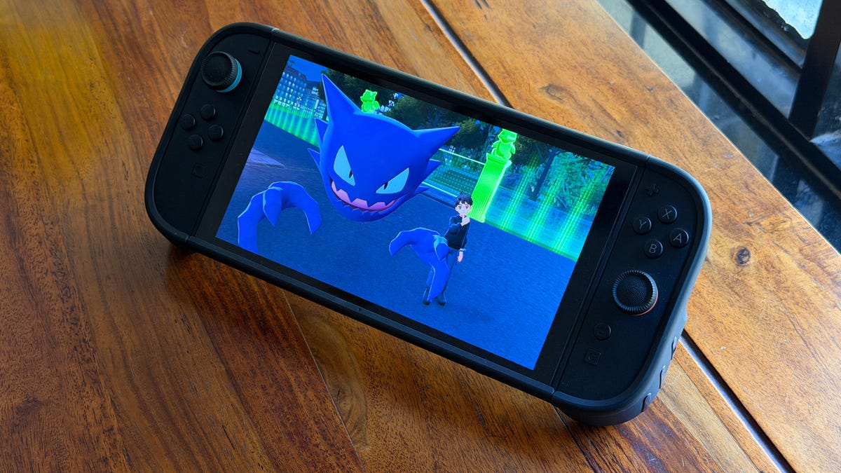
[Nintendo Switch 2 System Update]
Version 22.0.0 adds «Handheld Mode Boost». This will make Switch 1 games think that they are in TV mode even when in handheld.
Games can run at higher resolutions in TV mode, taking better advantage of the Switch 2’s 1080p screen. pic.twitter.com/aXOKWosFAw— OatmealDome (@OatmealDome) March 17, 2026
What does Handheld Mode Boost do?
Even though the Switch 2 supports backward compatibility with almost all Switch 1 games, there was an issue. The Switch 2 has a higher resolution screen: 1080p versus the older hardware’s 720p. When playing a Switch 1 game on a Switch 2 in handheld mode, the graphics looked blurry and jagged.
When enabled, Handheld Mode Boost makes a Switch 1 game act as if it’s docked, so it displays 1080p at 60 frames per second. This will give the visuals an immediate upgrade.
How do you enable Handheld Mode Boost?
Handheld Mode Boost has to be turned on to see the effect, and it takes a few steps:
- Select Systems Settings from the Home menu
- Select System
- Select Nintendo Switch Software Handling
- Enable Handheld Mode Boost
Is there a downside to enabling Handheld Mode Boost?
A user on Reddit tested the mode to see how it affects the Switch 2’s battery life. The test used Doom Eternal for the Switch 1 with and without Handheld Mode Boost. The test showed that the battery life decreased from 5 hours, 5 minutes to 3 hours, 43 minutes. That’s a 27% drop and should be taken into account when using Handheld Mode Boost.
How do I upgrade my Nintendo Switch 2?
If you have Software Auto-Updates enabled on your Switch 2, a pop-up window should come up whenever you start a game. If not, head to System Settings and choose to update the console from the menu.
What other features were added in version 22.0.0?
Handheld Mode Boost was the main star of the new firmware update, but there were a slew of other changes.
- Changed the on-screen text and animations when you load a virtual game card in the HOME Menu.
- Added the ability to save notes about friends on your Friend List. The note content is not displayed to friends.
- Added the ability to invite friends to GameChat rooms you’re participating in. Some friends may not be able to be invited, such as supervised accounts.
- Friends who haven’t finished GameChat’s initial setup can now be invited to GameChat. Some friends may not be able to be invited, such as supervised accounts or those who haven’t used a Nintendo Switch 2.
- Added the ability to rewind 10 seconds/advance 10 seconds with the ZL and ZR Buttons when watching a full-screen video in News or Nintendo eShop.
- Added the option to add the following data to «Automatic Uploads» from Album.
- Text-to-Speech, under Accessibility, can now read the text in Album and during first-time setup.
- Added the ability to see the breakdown of storage capacity by data type for the system memory and microSD Express card.
- Added the ability to perform an audio test when «Linear PCM 5.1 Surround» is selected for TV Sound in Audio.
- When Airplane Mode is activated, the previously set preferences for Bluetooth, Wi-Fi or NFC while in airplane mode will be saved and applied.
- Added the ability to individually enable or disable Bluetooth, Wi-Fi or NFC during Airplane Mode from the Quick Settings.
- Added the ability to see a notification in the Nintendo Switch Parental Controls smart device application when the Parental Controls PIN is input successfully on the console. This can also be set up to be a push notification to your smart device.
- General system stability improvements to enhance the user’s experience.
Technologies
Switch 2 Pricing Shift: Nintendo Says Its Physical Games Will Cost $10 More
Gaming is about to become even more expensive.

Nintendo made an unprecedented move Wednesday by changing up its pricing scheme for its digital and physical Switch 2 games. Starting in May, it’s going to cost more to buy a physical game instead of a digital copy, and the current memory shortage could be the culprit.
Yoshi and the Mysterious Book, set to release on May 21, will be the first Nintendo Switch 2 game that will have two separate MSRPs, Nintendo said in a statement on Wednesday. The digital version will cost $60 while the physical copy will retail for $70 at Nintendo’s online store, and Switch 2 exclusive games that follow will have a similar pricing scheme to the digital format, costing less than the physical.
Nintendo did not give a reason as to why the prices will be different. It did say that its games «offer the same experiences whether in packaged or digital format, and this change simply reflects the different costs associated with producing and distributing each format and offers players more choice in how they can buy and play Nintendo games.»
It’s unclear how retailers will respond to this change. Nintendo says retailers can set the prices as they see fit for either version.
Which Switch 2 game will have the new pricing scheme?
Yoshi and the Mysterious Book will be out on May 21.
What will be the price difference between physical and digital?
As of right now, physical copies will cost $10 more. It’s unclear whether this will be the same across the board for different games, but it will be the norm for Nintendo’s Switch 2 exclusive games.
Why did Nintendo make this change?
The most likely reason is that the storage for the games themselves was costing Nintendo too much money. In its statement, Nintendo says the change «reflects the different costs associated with producing and distributing each format.» Nintendo already broke pricing norms for games with Mario Kart World and its retail price of $80, the highest price for a new game.
In the case of Switch 2 games, since the newer console is more powerful and can produce better visuals, that means the Switch cartridges require more storage. Switch 1 games ranged from 2GB to 32GB, while Switch 2 games can start as low as 4GB, but they have double the file size of the older Switch games, with Split Fiction taking up 73GB. Cartridges with large storage sizes are more expensive to produce, especially during the current global shortage of memory happening across the globe. It would that Nintendo wants to pass along those extra production costs to gamers as it did with Mario Kart World.
What will retailers do about the Switch 2 game price change?
Retailers were arguably the biggest reason publishers like Sony, Microsoft and Nintendo didn’t price their digital versions of games lower than the physical copies. It’s been rumored that when the Big Three game companies began offering digital sales of games via their respective platforms, it was retailers who advised that if digital copies undercut physical versions, they would stop stocking those physical versions on store shelves. This rumor hasn’t been verified, but over the year, it does appear that there is an agreement to keep both versions of a game at the same price regardless of its physical or digital format.
The thing is, digital sales of games have been increasing over the years while physical sales have dropped tremendously. In January 2025, Matt Piscatella, senior director and video game industry advisor at Circana, posted on Blue Sky that sales of physical games media have dropped by more than 50% since 2021 and more than 85% since its peak in 2008. Part of that reason is how retailers such as Walmart, Best Buy and Amazon also sell digital codes for a game, which gives consumers more outlets to purchase from.
As retail stores are allowing less space for physical media, it’s likely that they will not oppose this change by Nintendo. If there is one store that could feel the effects the most, it would be GameStop and other video games-focused retailers, but it’s not doom and gloom for them. While most of the gaming public will continue to purchase digital versions of games, especially when prices are lower, a growing number of game collectors have shown a willingness to pay a premium for physical copies. There’s also a push by some gamers to avoid digital media out of fear that publishers could turn off servers, making digital copies obsolete.
What will other game publishers do about the Switch 2 game price change?
Publishers of Switch 2 games, such as EA, Ubisoft and Bandai Namco will be the ones who have the toughest decision on this matter of pricing. Lowering the price of digital versions of their games is an immediate revenue hit for them, especially since many of the games they publish and develop have large budgets surpassing those of many Nintendo games. If they don’t change the pricing for games across the board, these publishers might make changes to their midrange titles, where it would be an easier pill to swallow.
It’s also unlikely that Sony and Microsoft will follow suit, as both have been adjusting their plans to deal with the current downward trend in gaming.
Technologies
Fitbit’s Kid-Friendly Smartwatch Gets a Sizable Amazon Spring Sale Discount
The now-$100 cellular connected smartwatch provides many phonelike benefits without handing over a full-fledged iPhone or Android.
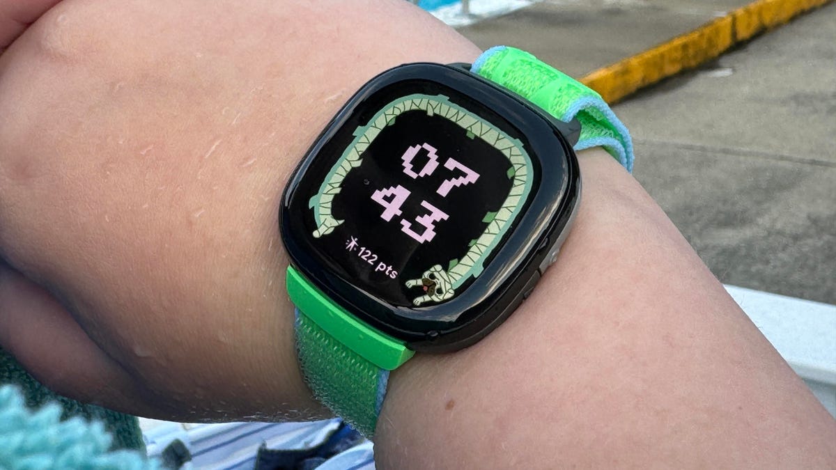
Google’s Fitbit Ace LTE is a cellular-connected smartwatch meant for kids, and with a discount from Amazon’s Big Spring Sale, the watch could be a lower-cost way for calling or texting your child without handing over a full-fledged phone.
The Fitbit Ace LTE is normally $180 but is discounted down to $100 during Amazon’s shopping event. That’s back down to the all-time low price we saw during Black Friday. CNET’s Scott Stein reviewed the watch when it was first released in 2024, noting that his 11-year-old son used it constantly for playing games and making phone calls.
The Ace gives parents a lot of control over who can call or text your child with the watch, for better and for worse. The watch does have a required cellular plan in order to work — at a cost of $10 a month, or $120 annually — and was updated to allow for siblings to call each other if they both have the watch. However, most communication controls are handled on Fitbit’s Ace app, and primarily allow a parent to call or text their child using the watch.
The Ace LTE does have its own health-related features as well, but doesn’t have access to app marketplaces in the way that the Apple Watch does or watches that run on Google’s Wear OS. This could be a selling point, or it could be limiting, depending on how much digital freedom is appropriate for your child.
Why this deal matters
If your kid isn’t ready to graduate to a phone yet, the Fitbit Ace LTE is a good stepping stone with decent parental controls. This is back down to the lowest price we’ve seen on this smartwatch, so if you’re looking for a convenient communications device for your child, this is a great opportunity.
-
 Technologies3 года ago
Tech Companies Need to Be Held Accountable for Security, Experts Say
-
 Technologies3 года ago
Best Handheld Game Console in 2023
-
 Technologies3 года ago
Tighten Up Your VR Game With the Best Head Straps for Quest 2
-
 Technologies4 года ago
Black Friday 2021: The best deals on TVs, headphones, kitchenware, and more
-
 Technologies5 лет ago
Google to require vaccinations as Silicon Valley rethinks return-to-office policies
-
 Technologies5 лет ago
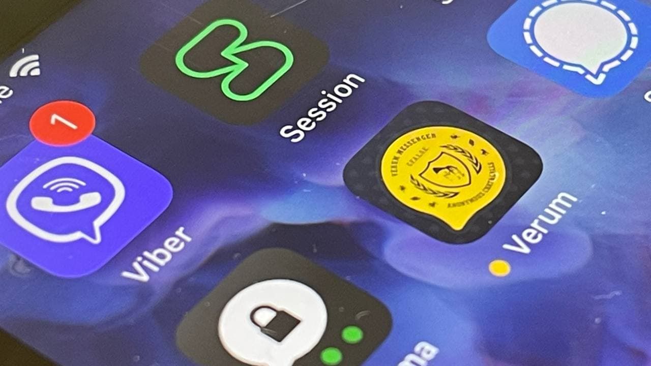
Verum, Wickr and Threema: next generation secured messengers
-
 Technologies4 года ago
Olivia Harlan Dekker for Verum Messenger
-
 Technologies4 года ago
The number of Сrypto Bank customers increased by 10% in five days