Technologies
Samsung Galaxy Z Flip 5 Review: It’s All About the Cover Screen
Samsung’s flip phone finally gets a bigger cover screen, making that $1,000 price easier to swallow.

A month ago, I was convinced that Motorola’s Razr Plus was the best flip phone money could buy. But after two weeks using the new Samsung’s Galaxy Z Flip 5, which also starts at $1,000 (£1,049, AU$1,649), I changed my mind.
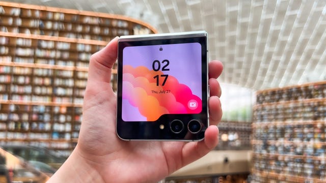
Samsung’s new flip phone, which goes on sale Friday, now has a bigger cover screen that nearly occupies the entire front of the device when closed. That might not sound like a big deal, but it goes a long way in making the Z Flip more useful without having to open it.
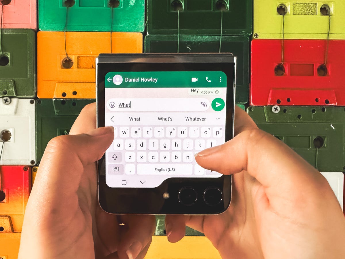
Foldable phones have previously felt like an answer to a nonexistent problem. That still may be true, but having the option to send messages, snap photos and respond to notifications on a device that fits in the palm of my hand adds a degree of convenience that’s hard to understand unless you’ve tried it.
Motorola’s new Razr Plus raised the bar for what a flip phone should be in 2023, and it deserves credit for that. But there are a few factors that make the Z Flip 5 the superior choice for most shoppers interested in a flip phone. The design and build quality feel sturdier, the software is more polished and the phone gets an additional year of Android version support compared to what Motorola offers.
That doesn’t mean Samsung gets everything right. At $1,000, the Z Flip 5 still demands a high price for a phone that doesn’t have a telephoto camera. Like previous Z Flips, you’re paying for the convenience of having a device that can fit in your pocket more easily. While portability is still the driving factor behind the Z Flip’s appeal, the Flip 5 represents Samsung’s attempt at giving users another reason to consider giving foldables a chance. And it’s off to a great start.
Galaxy Z Flip 5’s smaller screen gets a big upgrade
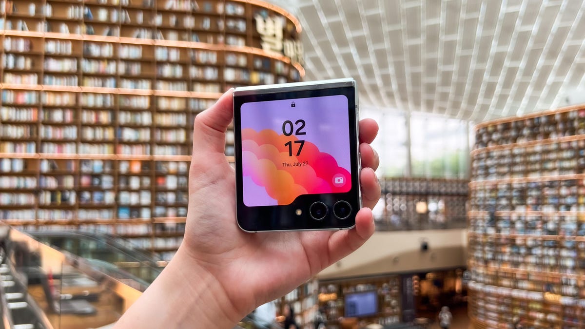
The Galaxy Z Flip 5’s larger new front screen, which Samsung calls the Flex Window, is hard to miss. It measures 3.4 inches, making it much bigger than the miniscule 1.9-inch screen on the front of the Galaxy Z Flip 4, but smaller than the Razr Plus. 3.6-inch cover display.
That more spacious front screen means there’s a lot more I was able to do with the Z Flip 5 closed. As I wrote in my first impressions story, the small screen’s interface is primarily designed to run widgets rather than full apps. Widgets provide the type of information you’d expect to see on a small screen, such as the weather, your calendar, alarms and pinned apps and contacts.
From the main lock screen, I can swipe from right to left to cycle through various widgets, while swiping from left to right will show my notifications. There’s a small dot located on the left side of the screen to indicate whether you have any unchecked notifications, which feels very smartwatch-esque.

The Z Flip 5 also has a clever pinching gesture for showing thumbnails of all my widgets on screen at once, which can be helpful for quickly jumping to a specific screen without swiping multiple times. It feels very Apple-like, and it’s a good example of how Samsung is thinking about navigation and user interface design differently on a display this small.
But Samsung only allows certain apps on the cover screen natively, whereas almost every app I’ve used on the Razr Plus was supported on its outer display without much extra fuss. On the Z Flip 5, I had to install the Good Lock app from the Galaxy Store to gain access to a broader selection of apps on the cover screen.
Still, the Z Flip 5 natively supports many of the apps that make sense for the cover screen, such as Google Maps, the camera app, and messaging apps like WhatsApp. Even though Spotify doesn’t show up as a compatible app, I was able to access album art and playback controls from the Z Flip 5’s front screen when I played music with the phone open.
I spent most of my time using the Galaxy Z Flip 5 while vacationing in South Korea, and there were a few apps that would have been very useful on the front display while traveling around Seoul. Google Translate is a big one that comes to mind. Being able to quickly pull up the app from the cover screen could have made some of my interactions go a bit smoother. Quickly browsing through news headlines or social media feeds with the device closed while riding the Seoul Metro also would have been nice considering I was usually using one hand to grip the subway handles.

It wasn’t until I returned from my trip that I used the Good Lock app to bring apps like Google, Google Translate and Slack to the cover screen. Even though these apps technically aren’t optimized for the cover screen, they ran surprisingly well. My only gripe is that they appear on a separate widget, meaning I have to swipe between two separate widgets on the cover screen to access my apps.
It’s also worth mentioning that apps on the Z Flip 5’s main screen also don’t seamlessly transition to the cover screen when closing the phone as they do on the Razr Plus. Instead, it only works the other way around, with apps moving from the cover screen to the main screen after opening the device.
Regardless, Samsung’s execution of the Flex Window is a promising start. It’s clean and intuitive, and there’s a lot of potential for Samsung to expand its capabilities.
Galaxy Z Flip 5 gets a new hinge
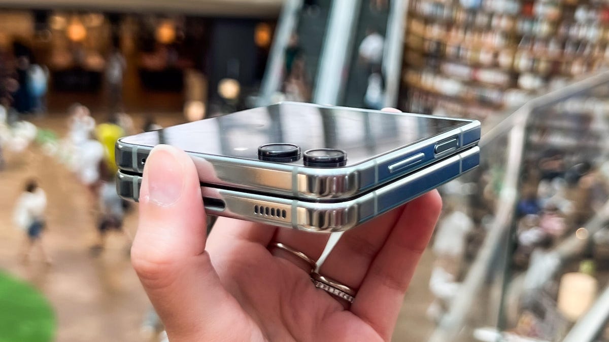
Samsung’s new foldable phone also has an upgraded hinge that allows the device to close completely with no gap when shut. This is another area where Samsung is playing catch-up; Motorola and Google both launched foldable phones in June that have no gap when closed.
Samsung also says the new hinge should make the Z Flip 5 more durable since it has fewer moving parts, and the hinge’s structure should also improve shock absorption. There’s still a visible crease running across the phone’s 6.7-inch main display, but it feels a slightly flatter to the touch compared to the Z Flip 4.
Motorola’s Razr Plus looks thinner than the Z Flip 5, but Samsung’s phone has a sturdier feel. I’ve only used the Razr Plus for a couple of weeks, but I already notice that it doesn’t always unfold completely straight. I haven’t used the Z Flip 5 for very long yet, so it’s impossible to know how it will hold up over time.
That also raises a larger question about long-term durability for foldable phones. Although foldable phone designs have improved over the last four years, it’s worth remembering that these devices come with a higher risk of damage compared to traditional smartphones. They’re also not dust-resistant like standard, non-folding devices. Both the Z Flip 5 and Z Flip 4 have an IPX8 ingress protection rating, meaning they’re water-resistant but not dust-resistant.
Galaxy Z Flip 5’s camera is slightly better than the Z Flip 4

It’s clear that Samsung focused most of its resources on the Z Flip 5’s cover screen and hinge. The Galaxy Z Flip 5’s camera is largely the same as last year’s model, except it has a new coating that should reduce lens flare. That means the Z Flip 5 has 12-megapixel wide and ultrawide cameras, and a 10-megapixel selfie camera.
Instead of upgrading the camera sensor, Samsung is relying on the device’s new Qualcomm Snapdragon 8 Gen 2 for Galaxy chip to do the heavy lifting when it comes to improving image quality. It’s somewhat disappointing not to see an upgrade in camera hardware considering Samsung has been positioning the Z Flip as being ideal for snapping photos thanks to its flexibility. But photos taken on the Z Flip 5 are sharp and colorful enough to satisfy most people.
And you can certainly tell the difference when comparing photos alongside those taken on the Z Flip 4. I observed that colors look bolder and details are crisper in photos taken with the Z Flip 5 versus the Z Flip 4.
When it comes to the Razr Plus and Galaxy Z Flip 5, results differ depending on the situation. There were times when the Razr’s photos felt drab and lacking in color compared to the Z Flip 5’s.
Take a look at the photos below to see how the Z Flip 5’s camera compares to the Razr’s and Z Flip 4’s below. The differences may be hard to spot, but they’re more prominent when viewing these photos at their full size on a laptop-sized screen.
Galaxy Z Flip 5

Galaxy Z Flip 4

Motorola Razr Plus

Galaxy Z Flip 5

Galaxy Z Flip 4

Motorola Razr Plus

Galaxy Z Flip 5

Galaxy Z Flip 4

Motorola Razr Plus

But there were also times when Motorola’s phone succeeded in certain areas over Samsung’s. In the photo below of a delicious boiling pan of tteokbokki, a Korean street food staple that usually consists of soft chewy rice cakes and other ingredients soaked in red pepper sauce, Samsung did a better job at capturing the bubbling sauce’s orange color more accurately. But Motorola’s photo is noticeably sharper.
Galaxy Z Flip 5

Motorola Razr Plus

As was the case with previous generations of the Z Flip, you shouldn’t expect to get the same top-notch camera quality you’d find on a phone like the Galaxy S23 Ultra or Google Pixel 7 Pro. But I’m impressed with the improvements I’ve seen so far. While the Z Flip 5 doesn’t support the same zoom range or the offer option to capture super high-resolution photos like S23 Ultra, its cameras are plenty capable of documenting food and travel for Instagram. And that’s exactly what I did while testing it in Seoul.
Check out the gallery below to see the photos I took all over the city, from cultural landmarks like Gyeongbokgung Palace, incredible views from the base of Namsan Seoul Tower and nightlife hotspots like Hongdae. And of course, I’ve included photos of the delicious food I ate while in Seoul, too.
On a phone like the Z Flip 5, it’s not just about image quality. The device’s foldable design also lets you capture photos in different ways. I can, for example, open the phone halfway and rest it on a surface to capture a photo hands-free.
The cover screen also allows you to capture selfies with the main rear cameras rather than the lower resolution internal selfie camera. The front screen can show previews of photos being captured with the main cameras before hitting the shutter button, allowing the subject to see a live preview. However, this requires pressing a specific button within Samsung’s camera app while shooting, whereas Motorola’s phone does this automatically. And I liked having a much larger viewfinder for capturing selfies on the Z Flip 5 compared to the Z Flip 4.
Galaxy Z Flip 5: Main 12MP camera

Galaxy Z Flip 5: Inner 10MP camera

Galaxy Z Flip 5 software, performance and battery life
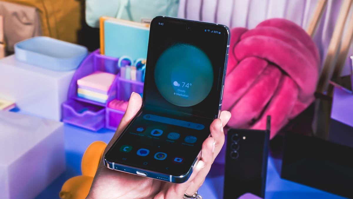
A foldable design doesn’t mean much without useful software features. Samsung’s answer to this is Flex Mode, which shifts apps to the top portion of the display when the device is positioned half open like a laptop.
There isn’t much new with Flex Mode this year, but it’s still more functional than Motorola’s equivalent feature for the Razr Plus, which only worked in the camera app for me.
Performance on the Galaxy Z Flip 5 is what’s expected from a phone at this price. Apps launch quickly, I didn’t notice any lag or stuttering, and supported apps seamlessly switch from the cover screen to the main display.
I also ran benchmark tests meant to evaluate general computing performance and graphics power. Geekbench 6, the general computing test, assesses how the Qualcomm Snapdragon 8 Gen 2 chip inside the Z Flip 5 performs at both the single-core and multicore level. 3DMark Wild Life Extreme tests graphics by simulating gaming environments.
Take a look at the chart below to see how the Galaxy Z Flip 5 compares against last year’s Z Flip 4 and the Motorola Razr Plus in these tests.
Galaxy Z Flip 5 Performance Comparison
- Geekbench 6 (Single Core)
- Geekbench 6 (Multicore)
- 3DMark Wild Life
Battery life on the Z Flip 5 is long enough to make it through a busy day of wandering around Seoul snapping photos, looking up directions and discovering nearby points of interest. I typically took my phone off its charger in the late morning, between 9:30 and 10:30 a.m., and still had 25 to 30% of my battery left between midnight and 1:30 a.m.
During CNET’s 45-minute battery endurance test, which involves performing everyday tasks like streaming YouTube, making a video call, playing games and scrolling through social media, the Z Flip 5’s battery dropped from 100% to 90%. That’s better than last year’s Z Flip 4 and about on par with the Galaxy S23. The Galaxy Z Flip 5 also performed about the same as the Galaxy S23 in a three-hour battery test that involved continuously streaming YouTube with the brightness cranked to the max. The Z Flip 5 had 80% of its battery left after three hours of streaming, whereas the S23 had 81%.
These improvements are largely thanks to the Z Flip 5’s new processor. It has the same battery capacity as last year’s Z Flip 4 but there’s more local storage at the base level.
The $1,000 Galaxy Z Flip 5 comes with 256GB of storage, meaning you get double the space for same starting price as its predecessor.
Galaxy Z Flip 5 shows foldables are improving
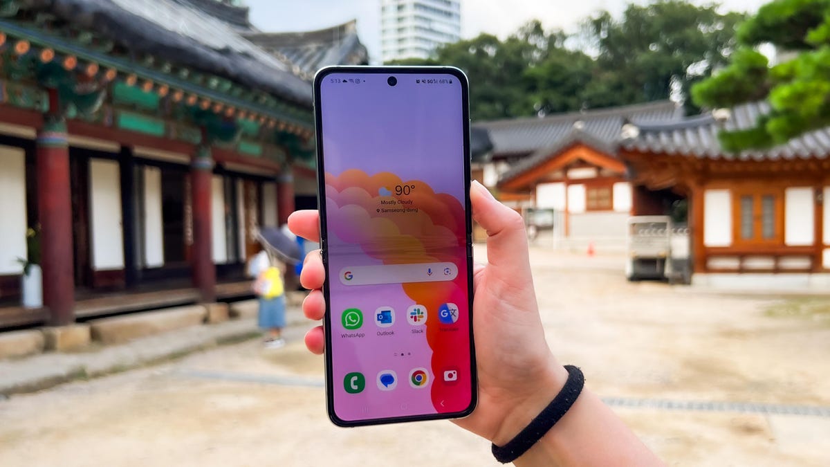
The Galaxy Z Flip 5 further proves that phone-makers are getting closer to answering the question of why foldable phones are useful in the first place. The new cover screen goes a long way in reaching that goal.
As I wrote when reviewing the Motorola Razr Plus, the bigger external display shows that flip phones are about more than just portability. Having a device that’s easy to navigate with one hand and can also unfold to a full-sized phone makes the Z Flip 5 and other similar phones more versatile than the phones most people carry today. Companies like Samsung and Motorola are starting to realize that the so-called «killer app» for foldables may come down to the benefits of having two screens that work together, rather than focusing primarily on how the main screen behaves when folded and unfolded.
Galaxy Z Flip 5 Specs Compared
| Samsung Galaxy Z Flip 5 | Motorola Razr Plus | Samsung Galaxy Z Flip 4 5G | |
|---|---|---|---|
| Display size, tech, resolution, refresh rate, brightness | Cover: 3.4-inch AMOLED (728 x 720 pixels); internal: 6.7-inch AMOLED (2,640 x 1,080 pixels), 1-120Hz | Cover: 3.6-inch OLED (1,066 x 1,056 pixels); internal: 6.9-inch (2,640 pixels x 1,080) | Cover: 1.9-inch AMOLED (512 x 260 pixels); internal: 6.7-inch (2,640 x 1,080 pixels) |
| Pixel density | Cover: 306 ppi, Internal: 425 ppi | Cover: 413 ppi, internal: 413ppi | Cover: 302 ppi, internal: 425 ppi |
| Dimensions (inches) | Open: 6.5 x 2.83 x 0.27 in; closed: 3.35 x 2.83 x 0.59 in | Open: 2.91 x 6.73 x 0.28 in; closed: 2.91 x 3.48 x 0.59 in | Open: 2.83 x 3.3 x 0.67 in; closed: 2.83 x 6.5 x 0.27 in; hinge: 0.59 in (sagging) |
| Dimensions (millimeters) | Open: 71.88 x 165.1 x 6.89 mm; closed: 71.88 x 85.09 x 14.99 mm | Open: 73.95 x 170.83 x 6.99 mm; closed: 73.95 x 88.42 x 15.1 mm | Open: 71.9 x 165.2 x 6.9 mm; closed: 71.9 x 84.9 x 17.1 mm; hinge: 15.9 mm (sagging); |
| Weight (grams, ounces) | 187 g (6.6 oz) | 189 g (6.64 oz) | 187 g (6.59 oz) |
| Mobile software (at launch) | Android 13 | Android 13 | Android 12 |
| Camera | 12-megapixel (main), 12-megapixel (ultrawide) | 12-megapixel (main), 13-megapixel (ultrawide) | 12-megapixel (main), 12-megapixel (ultrawide) |
| Front-facing camera | 10-megapixel | 32-megapixel | 10-megapixel |
| Video capture | 4K | 4K | 4K |
| Processor | Snapdragon 8 Gen 2 | Snapdragon 8 Plus Gen 1 | Snapdragon 8 Plus Gen 1 |
| RAM/storage | 8GB + 256GB/512GB | 8GB + 256GB | 8GB+ 128GB/256GB/512GB |
| Expandable storage | None | None | None |
| Battery | 3,700 mAh (dual-battery) | 3,800 mAh | 3,700 mAh |
| Fingerprint sensor | Side | Side | Side |
| Connector | USB-C | USB-C | USB-C |
| Headphone jack | None | None | None |
| Special features | 5G-enabled, IPX8 water resistance, 25W wired charging, wireless charging, wireless power share, dual SIM | IP52, 5G-enabled, foldable display, 30W wired charging, wireless charging | IPX8, 5G enabled, foldable display, wireless charging, 25W fast charging |
| US price off-contract | $1,000 | $1,000 | $1,000 |
| UK price | £1,049 | Converts to £780 | £1,000 |
| Australia price | AU$1,649 | Converts to AU$1,475 | AU$1,499 |
Technologies
Today’s NYT Connections: Sports Edition Hints and Answers for March 26, #549
Here are hints and the answers for the NYT Connections: Sports Edition puzzle No. 549 for Thursday, March 26.
Looking for the most recent regular Connections answers? Click here for today’s Connections hints, as well as our daily answers and hints for The New York Times Mini Crossword, Wordle and Strands puzzles.
How good are you at unscrambling letters to make a new word out of an old one? Today’s Connections: Sports Edition requires you to do just that — for the purple category, naturally. If you’re struggling with today’s puzzle but still want to solve it, read on for hints and the answers.
Connections: Sports Edition is published by The Athletic, the subscription-based sports journalism site owned by The Times. It doesn’t appear in the NYT Games app, but it does in The Athletic’s own app. Or you can play it for free online.
Read more: NYT Connections: Sports Edition Puzzle Comes Out of Beta
Hints for today’s Connections: Sports Edition groups
Here are four hints for the groupings in today’s Connections: Sports Edition puzzle, ranked from the easiest yellow group to the tough (and sometimes bizarre) purple group.
Yellow group hint: Touch ’em all!
Green group hint: It’s outta here!
Blue group hint: Working one’s way up to the majors.
Purple group hint: Unscramble these words.
Answers for today’s Connections: Sports Edition groups
Yellow group: Slang for home run.
Green group: MLB home run leaders in 2025.
Blue group: Minor league baseball leagues.
Purple group: Anagrams of MLB teams.
Read more: Wordle Cheat Sheet: Here Are the Most Popular Letters Used in English Words
What are today’s Connections: Sports Edition answers?
The yellow words in today’s Connections
The theme is slang for home run. The four answers are dinger, homer, jack and round-tripper.
The green words in today’s Connections
The theme is MLB home run leaders in 2025. The four answers are Judge, Ohtani, Raleigh and Schwarber.
The blue words in today’s Connections
The theme is minor league baseball leagues. The four answers are Carolina, International, Pacific Coast and Texas.
The purple words in today’s Connections
The theme is anagrams of MLB teams. The four answers are Bucs (Cubs), parties (Pirates), spread (Padres) and stem (Mets).
Toughest Connections: Sports Edition categories
The Connections: Sports Edition puzzle can be tough, but it really depends on which sports you know the most about. My husband aces anything having to do with Formula 1, my best friend is a hockey buff, and I can answer any question about Minnesota teams.
That said, it’s hard to pick the toughest Connections categories, but here are some I found exceptionally mind-blowing.
#1: Serie A Clubs. Answers: Atalanta, Juventus, Lazio, Roma.
#2: WNBA MVPs. Answers: Catchings, Delle Donne, Fowles and Stewart.
#3: Premier League team nicknames. Answers: Bees, Cherries, Foxes and Hammers.
#4: Homophones of NBA player names. Answers: Barns, Connect, Heart and Hero.
Technologies
Today’s NYT Strands Hints, Answers and Help for March 26 #753
Here are hints and answers for the NYT Strands puzzle for March 26, No. 753.
Looking for the most recent Strands answer? Click here for our daily Strands hints, as well as our daily answers and hints for The New York Times Mini Crossword, Wordle, Connections and Connections: Sports Edition puzzles.
Today’s NYT Strands puzzle should appeal to musicians of all kinds. Some of the answers are difficult to unscramble, so if you need hints and answers, read on.
I go into depth about the rules for Strands in this story.
If you’re looking for today’s Wordle, Connections and Mini Crossword answers, you can visit CNET’s NYT puzzle hints page.
Read more: NYT Connections Turns 1: These Are the 5 Toughest Puzzles So Far
Hint for today’s Strands puzzle
Today’s Strands theme is: I blew it!
If that doesn’t help you, here’s a clue: I’m in the band.
Clue words to unlock in-game hints
Your goal is to find hidden words that fit the puzzle’s theme. If you’re stuck, find any words you can. Every time you find three words of four letters or more, Strands will reveal one of the theme words. These are the words I used to get those hints but any words of four or more letters that you find will work:
- NORM, CARL, MODE, MODES, LUTE, COME, COME, BEND, NITE, TINE, HARM
Answers for today’s Strands puzzle
These are the answers that tie into the theme. The goal of the puzzle is to find them all, including the spangram, a theme word that reaches from one side of the puzzle to the other. When you have all of them (I originally thought there were always eight but learned that the number can vary), every letter on the board will be used. Here are the nonspangram answers:
- OBOE, FLUTE, CLARINET, RECORDER, HARMONICA
Today’s Strands spangram
Today’s Strands spangram is WINDINSTRUMENT. To find it, start with the W that is at the bottom of the far-left vertical row, and wind up and across.
Toughest Strands puzzles
Here are some of the Strands topics I’ve found to be the toughest.
#1: Dated slang. Maybe you didn’t even use this lingo when it was cool. Toughest word: PHAT.
#2: Thar she blows! I guess marine biologists might ace this one. Toughest word: BALEEN or RIGHT.
#3: Off the hook. Again, it helps to know a lot about sea creatures. Sorry, Charlie. Toughest word: BIGEYE or SKIPJACK.
Technologies
Ring Finally Goes Wire-Free for Its Latest 4K Video Doorbells
The launch of battery-powered versions of the company’s powerful AI doorbells has been highly anticipated.
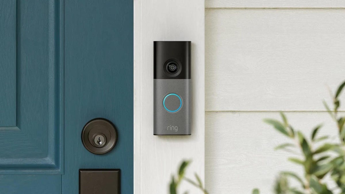
Security company Ring on Wednesday announced a significant expansion of its video doorbell line, notably battery-powered versions of both its 4K and 2K models, priced from $80.
Both Amazon’s Ring and Google Nest debuted high-resolution video doorbells with new AI features in the fall of 2025. But they were wired only, and in my tests, I kept thinking, «I sure wish there were battery models available.»
Wireless video doorbells are far better for most front doors than models that require connecting to your existing doorbell wiring, which is often poorly positioned for a security camera. Mine, for example, is located on a wall beside my door that’s useless for any kind of video views, no matter how you angle a lens.
«Enhancing image quality in battery-powered doorbells means customers can enjoy reliable performance with the flexibility to install devices in a way that suits their space, whether renting or living in homes without existing wiring,» a Ring spokesperson said.
At first, I wondered whether the higher 4K resolutions and more advanced AI features would use too much power to support batteries. If so, Ring is the first to fix that issue with this suite of doorbells, including these models available for preorder right now:
- Ring Battery Doorbell Pro — $250: This model offers up to 4K resolution and 10x zoom, and Ring says it features a redesigned internal architecture to support battery power.
- Ring Battery Doorbell Plus (2nd-gen) — $180: This model includes a quick-release battery pack along with 2K video.
- Ring Battery Doorbell (2nd-gen) — $100: This video doorbell includes 2K video, a 6x zoom and what Ring calls a «streamlined, rechargeable design,» which means you take the entire video doorbell to charge it, not just the battery — a design I greatly prefer, since Ring’s battery packs can get fiddly.
There’s also a new version of a Ring wired doorbell with 2K resolution, starting at $80. It wouldn’t be Ring without a plethora of doorbell devices to confuse newcomers, which is why I have a guide specifically for Ring video doorbells that will need some updating once I finish testing these new models.
Resolution plus an intelligence upgrade
Ring’s ordinary subscriptions of the Ring Protect plan give you cloud video storage and intelligent alerts for people, packages and vehicles, which are important but not really advanced AI. But spring for the $20-per-month Ring AI Pro cam, and this new generation of cameras opens up other capabilities.
Ring’s AI features include AI video descriptions, so if you get an alert, you can also get a summary of what the doorbell saw, including people and activities. A similar feature lets you search your video history with specific terms, such as «bike,» «truck» and so on. You also get the beta version of Ring’s Familiar Faces feature, which can ID logged faces of people who approach.
If these AI features make you uneasy and you’d rather protect your privacy, the best option is to avoid a subscription altogether or choose a lower-tier plan that gives you cloud storage without AI.
I also have a guide on how to turn off Ring’s detection and data-sharing features that might make you nervous, so you can keep what you like while ditching what you don’t.
-

 Technologies3 года ago
Tech Companies Need to Be Held Accountable for Security, Experts Say
-

 Technologies3 года ago
Best Handheld Game Console in 2023
-

 Technologies3 года ago
Tighten Up Your VR Game With the Best Head Straps for Quest 2
-
 Technologies4 года ago
Black Friday 2021: The best deals on TVs, headphones, kitchenware, and more
-

 Technologies5 лет ago
Google to require vaccinations as Silicon Valley rethinks return-to-office policies
-
 Technologies5 лет ago
Verum, Wickr and Threema: next generation secured messengers
-

 Technologies4 года ago
Olivia Harlan Dekker for Verum Messenger
-

 Technologies4 года ago
The number of Сrypto Bank customers increased by 10% in five days

