
Technologies
Samsung Galaxy S26 vs. Google Pixel 10: The Big Differences Between Each Flagship
The most affordable Samsung and Google flagship models are closer than ever, but the $100 price difference does make for a few key differences. Here’s how they stack up.

Samsung announced the Galaxy S26 at its Unpacked event in February. It gave the base model a battery boost but hiked its starting price by $100 over the Galaxy S25. This comes at a time when Samsung’s closest Android rival, Google, is bridging the gap between its base and Pro models. The company added a dedicated telephoto camera to its latest-generation Pixel 10, which helps the Pixel 10 reach the Galaxy S26‘s camera versatility.
Both phones have a 6.3-inch screen, three cameras on the back and exclusive software features — all while sharing the latest Android perks, like Quick Share’s new ability to send photos and files over AirDrop to Apple devices. However, the Google Pixel 10 undercuts its Samsung rival by $100, but it comes with half the storage, starting with 128GB. Is it worth saving $100, or does the new Galaxy S26 deserve its new price tag? I compared both phones to find out. Here’s how the Samsung Galaxy S26 compares to the Google Pixel 10.
Design and build
Both Samsung and Google phones have the same display size but offer a different experience. The Galaxy S26 feels more immersive due to its thinner bezels, whereas the Pixel 10 gets brighter in direct sunlight. Both phones are IP68-rated for dust and water resistance, and they both have Gorilla Glass 2 Victus cover glass. So, durability shouldn’t be a concern on either device.
Samsung’s $899 flagship phone has a 6.3-inch AMOLED screen with a resolution of 2,340 by 1,080 pixels (at 411ppi), while the Pixel 10 packs a 6.3-inch OLED display with a resolution of 2,424 by 1,080 pixels (at 422ppi). The latter has a higher pixel density but the difference is negligible, and you’ll have trouble noticing it in day-to-day use. However, you’ll notice the Pixel 10 being more legible outdoors, thanks to its 3,000 nits peak brightness as compared to the S26’s 2,600 nits of brightness.
I’m disappointed with the fact that Samsung is limiting its new Privacy Display feature to the top-of-the-line Galaxy S26 Ultra. The S26 could’ve been a stronger value with this capability, but it being a hardware-related improvement, that likely would have added to the price.
Both phones support a 120Hz high refresh rate. However, the S26 automatically dials that down to 1Hz to be more efficient during mundane activity. The Google Pixel 10, in comparison, can only go down to 60Hz, which isn’t a deal-breaker, but its screen is less battery efficient than Samsung’s.
Both the Galaxy S26 and Pixel 10 are compact phones by today’s standards. However, the S26 is more pleasing to hold and comfortable to use, thanks to its lightweight design. At 167 grams, it weighs considerably less than the 204-gram Pixel 10. For context, Samsung’s big S26 Ultra is just 10 grams more than Google’s small phone. The Korean company did a fantastic job when designing its new models to keep the weight in check. Google’s Pixel 10 does include built-in magnets for attaching to wireless chargers and wallet accessories, while a case with magnets is needed to do the same with the Galaxy S26.
The cameras
Both the Galaxy S26 and Pixel 10 have three cameras on the back, accompanied by a plethora of AI tricks in the software.
Samsung’s new model has a 50-megapixel wide, a 12-megapixel ultrawide and a 10-megapixel 3x telephoto. The Pixel 10, on the other hand, comes with a 48-megapixel wide, 13-megapixel ultrawide and a 10.8-megapixel 5x telephoto camera.
You can expect reliable performance from both devices. In daylight, the shots are sharp with plenty of details and a good dynamic range. CNET’s David Lumb put it best in his S26 review: «For no apparent hardware improvements, the shots I took were still pretty stellar.»
The Pixel 10’s 5x telephoto camera lacks details in comparison, but its camera system delivers a solid performance overall. In her review, CNET’s Abrar Al-Heeti noted, «The Pixel preserved details like the ombre pink petals of roses and the ridges of hydrangea leaves. The focus was nice and sharp.»
This year, Samsung added gimbal-like stabilization with Horizontal Lock on its Galaxy S26 series. This is a unique feature that’s like autostabilization on steroids. Once turned on, you get remarkably steady videos in hectic environments. Other AI features include the ability to edit via prompts, tools for object removal and the ability to change your outfit in a photo, among other things.
The Pixel 10 has a similar suite of AI features. However, I’ve noticed most of them to be fun party tricks, apart from the AI-assisted Magic Eraser for removing unwanted objects. I, otherwise, never use these features in daily life.
Battery and performance
Samsung and Google gave their small flagship models a battery boost on their latest iterations. The Galaxy S26 has a 4,300-mAh battery (versus 4,000-mAh on the S25), while the Pixel 10 packs a 4,970-mAh cell (versus 4,700-mAh on the Pixel 9).
Both of them will last you an entire day on moderate use. The S26 performs slightly better due to a more efficient chipset. This was reflected in CNET’s 3-hour YouTube streaming test, in which the Pixel 10 depleted from 100% to 82% while the S26 depleted to 85%.
YouTube streaming test
| YouTube streaming drain test starting at 100% | |
|---|---|
| Samsung Galaxy S26 | 1 hr: 95%; 2 hr: 90%; 3 hr: 85% |
| Google Pixel 10 | 1 hr: 96%; 2 hr: 89%; 3 hr: 82% |
The Samsung Galaxy S26 is powered by Qualcomm’s Snapdragon 8 Elite Gen 5 (a «for Galaxy» version optimized for Galaxy AI), whereas the Pixel 10 has Google’s in-house Tensor G5 chipset. The S26 scores higher on the Geekbench 6.0 and 3DMark Wild Life Extreme benchmark apps, but both phones are powerful enough for most day to day tasks. That said, the Galaxy S26 will likely be a better choice if you regularly use your phone for 3D gaming.
Geekbench 6.0
- Single-core
- Multicore
3DMark Wild Life Extreme
The $100 difference between these two phones is apparent when you look at the storage variants. While the Pixel 10 is more affordable than Samsung’s base model, that’s only if you are OK with 128GB of storage. Increasing to 256GB will cost you the same $899 that the Galaxy S26 starts with while already including that amount of base storage. In my opinion, 256GB of storage is a nonnegotiable in 2026, especially when you consider how these phones can take higher-quality photos and videos, which could quickly clog up 128GB.
One UI or Pixel UI?
Both Samsung and Google have a similar software policy, and their phones come with Android 16. You get support for seven years of OS and security updates. The Galaxy S26 runs a highly customizable One UI, whereas the Pixel 10 will give you the core Android experience with negligible third-party preloaded apps.
I prefer Samsung’s One UI for a few reasons. And first among many is installing the Good Lock app. It allows for additional functionalities.
For instance, I installed One Hand Operation+, which lets me add up to six shortcuts with Short swipe and Long swipe gestures (including Straight, Diagonal up, and Diagonal down swipes) on Android’s back gesture. So, instead of swiping back, I can swipe diagonally downwards to access Quick Tools like Scanner and Bluetooth connections, among other functions. These shortcuts improved my day-to-day experience.
The second reason I love One UI is Samsung’s transparent widgets. It might seem like a nitpick, but most Android phones treat widgets like an afterthought. I like having a full calendar on the home screen because I need that information at a glance for scheduling without the screen looking overwhelming.
But most phones, including the Pixel 10, don’t offer fully transparent widgets (albeit a couple). It can be translucent or color-matched with the system UI colors, which isn’t the same thing.
On the other hand, I love the Pixel 10’s Magic Cue feature, which shows contextual information when I need it. For example, I called a hotel to check for my booking, and it surfaced my booking details on the screen. Samsung has a similar feature (Now Nudge) on its Galaxy S26 series, but it hasn’t worked for me yet.
While I like One UI’s fluidity better, the Pixel UI has its own vanilla look and feel. However, the Pixel UI has always felt a bit slower than One UI to me. It is not a janky experience, but those party trick AI features take more time to process on the Pixel 10 than my Galaxy S26. The Samsung phone is faster overall.
If you want the vanilla Android experience without a ton of preinstalled Microsoft apps and other bloatware, you’ll feel right at home with the Pixel 10. If you like personalizing your experience with additional functionalities, the Galaxy S26 is a better buy; while the S26 does come with bloatware, it can be uninstalled.
Both phones come with Android 16 and support seven years of OS and security updates. I like One UI better than Pixel UI for its customizations and apps like Good Lock and Expert RAW. (I like getting more out of my device.) But some might prefer the straightforward user interface of the Pixel UI.
Samsung Galaxy S26 vs. Google Pixel 10: Specs
| Samsung Galaxy S26 | Google Pixel 10 | |
|---|---|---|
|
Display size, tech, resolution, refresh rate |
6.3-inch AMOLED; 2,340×1,080 pixels; 1-120Hz adaptive refresh rate |
6.3-inch OLED; 2,424×1,080 pixels; 60-120Hz variable refresh rate |
|
Pixel density |
411ppi |
422ppi |
|
Dimensions (inches) |
5.89×2.82×0.28 inches |
6×2.8×0.3 inches |
|
Dimensions (millimeters) |
149.6×71.7×7.2 mm |
152.8x72x8.5 mm |
|
Weight (grams, ounces) |
16g (5.89oz) |
204g (7.2oz) |
|
Mobile software |
Android 16 with One UI |
Android 16 with Pixel UI |
|
Camera |
50-megapixel (wide), 12-megapixel (ultrawide), 10-megapixel (3x telephoto) |
48-megapixel (wide), 13-megapixel (ultrawide), 10.8-megapixel (5x telephoto) |
|
Front-facing camera |
12-megapixel |
10.5-megapixel |
|
Video capture |
8K |
4K |
|
Processor |
Qualcomm Snapdragon 8 Elite Gen 5 for Galaxy |
Google Tensor G5 |
|
RAM + storage |
12GB RAM + 256GB, 512GB |
12GB RAM + 128GB, 256GB |
|
Expandable storage |
None |
None |
|
Battery |
4,300 mAh |
4,970 mAh |
|
Fingerprint sensor |
Under display |
Under display |
|
Connector |
USB-C |
USB-C |
|
Headphone jack |
None |
None |
|
Special features |
2,600-nit peak brightness; 7 years of OS and security updates; IP68 water and dust resistance; wireless PowerShare to charge other devices; 25W wired charging (charger not included); 15W wireless charging; lacks built-in magnets; Gorilla Glass Victus 2 cover screen; Galaxy AI |
Gorilla Glass 2 Victus cover glass; 3,000 nits peak brightness; Satellite SOS; Dual-eSIM; Wi-Fi 6E; NFC; Bluetooth 6; 30W fast charging (wall charger not included); Qi2 15W wireless charging; support for PixelSnap magnetic accessories; Google VPN; Super Res Zoom up to 20x; Camera Coach; Add Me; Macro mode; Face Unblur; Auto Best Take; IP68 rating for dust and water resistance; 7 years of OS, security, and Pixel Drop updates; Corning Gorilla Glass Victus 2 polished back with satin finish aluminum frame |
|
US price starts at |
$899 (256GB) |
$799 (128GB) |
Editors’ note: The author’s travel costs related to the launch of the Galaxy S26 were covered by Samsung. The judgments and opinions of CNET are our own.
Technologies
Anthropic Reins In Subscribers’ Unlimited AI Use for OpenClaw
It may be the year of the AI agent but Claude’s «all-you-can-eat buffet» is over.
Anthropic over the weekend told subscribers they’d have to pay up for heavy use of its Claude AI models to power third-party agents like OpenClaw.
Users with monthly subscriptions can still use Claude models, including Opus, Sonnet and Haiku, through these third-party agents. But you’ll have to pay via Anthropic’s API or use a «pay-as-you-go option» that will be billed separately from your Claude subscription payment.
«The $20/month all-you-can-eat buffet just closed,» wrote AI product manager Aakash Gupta on X.
At the same time, Anthropic recently announced new features that bring some of the things that made OpenClaw so popular into Claude itself. Claude can use your computer, even if you’re not at it, for example.
Why this policy matters
There has been growing tension between OpenAI and Anthropic, recently inflamed by the controversies involving contracts with the US Defense Department. But there is also tension between users who want to run autonomous AI agents constantly and the AI labs that are trying to control costs by managing the tasks their models are used for.
Claude is a chatbot that was created to be prompted by humans, not for millions of AI agents to use it for workflows. These agent tools, like Manis and OpenClaw, require much more power to run and burn through tokens faster than regular human chatting. Anthropic has already taken steps to address the demand that heavy agent users bring, like a five-hour session cap during peak periods for the models.
«We’ve been working to manage demand across the board, but these tools put an outsized strain on our systems,» Anthropic wrote in its email to customers.
OpenAI has been all-in on agentic tools. Early this year, the AI company hired Peter Steinberger, the creator of OpenClaw, with the aim of bringing AI agents to a broad audience. Steinberger was vocal about his critiques of Anthropic’s new policy, taking to X over the weekend.
«Funny how timings match up, first they copy some popular features into their closed harness, then they lock out open source,» he wrote.
(Disclosure: Ziff Davis, CNET’s parent company, in 2025 filed a lawsuit against OpenAI, alleging it infringed Ziff Davis copyrights in training and operating its AI systems.)
The future of agent compute power
Friction between heavy agent users and AI companies is likely to get worse. These AI agent tools are extremely powerful: they can run for hours, take actions across apps like Gmail, Slack and iMessage, and work autonomously much longer and faster than a human could. Because of this power, they are far more costly and require far more power to run compared to a human prompting a bot. It’s likely that AI companies will increasingly push these compute costs onto heavy users through price increases or steps like those taken by Anthropic.
Technologies
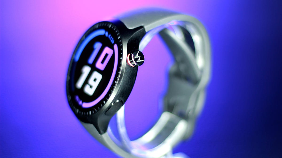
My Running Tests Left Me Feeling Like the Moto Watch Is Low-Key Catfishing
The Polar partnership and $150 price tag had me sold. Then I actually lived with it.
The Moto Watch feels like a kid trying their hardest to stand out in a sport, only to walk away with a participation trophy. Having spent years reviewing pricey fitness trackers and smartwatches, I know how rare it is for a relatively affordable $150 device to arrive with real fitness credibility, so I was genuinely rooting for this one. When Motorola announced a partnership with Polar, along with dual-band GPS and week-long battery life at this price, it sounded like a breakthrough moment. I thought this could be Motorola’s big return to relevance in wearables.
Then I actually used it for a few weeks and reality set in.
Motorola isn’t a stranger to this space. The Moto 360 helped define early Android wearables back in 2014, and made a strong impression doing so. But the years since have been relatively slow on its wearables front. This new Moto Watch is its most serious attempt at breaking through the space in a while, and the Polar partnership gives it a level of fitness-tracking street cred that’s rare at this price.
But theory and execution don’t quite align here. At $150, the Moto Watch isn’t trying to compete directly with higher-end wearables from Samsung or Google; rather, it’s trying to carve out a league of its own with this big-screen 47mm watch. And it’s no home run — yet.
The Polar partnership, tested
The Polar integration is the headline feature that had me excited to put it through the paces. The brand is synonymous with accuracy among serious endurance athletes, and its H10 chest strap is the gold standard we reach for at CNET for heart rate benchmarking on other devices.
So I took both to a college track — three miles (12 laps) — with the watch unpaired from my phone and the chest strap recording simultaneously for comparison. The watch consistently kept up, but I noticed it struggled to keep pace during my sprints.
The workout summaries showed similar numbers, which is why I prefer exporting the raw, second-by-second heart rate data to get more granular. The Polar app makes it easy to export a spreadsheet of your HR data, but the Moto Watch is running it’s own app, and there was no export option. I had to settle for comparing the snapshot of metrics that I got from the workout summary.
The graphs looked similar at first glance, with matching peaks and valleys during the laps when I picked up my pace. The average heart rate was only one beat off from the chest strap. But the watch seemed to smooth out the spikes, and the max heart rate was off by seven beats (173 bpm on the watch versus 180 bpm on the chest strap). That kind of gap is pretty standard for wrist-based tracking, which measures blood flow rather than the heart’s electrical signals. Still, you may not be getting full credit for your effort if you plan to use this as a serious training tool.
Distance tracking was another reality check. Dual-band GPS is usually reserved for higher-end sports watches, so I had high hopes that the Moto Watch would be right on track. It took a while to lock onto a satellite and dropped connection more than once during my 30-minute run. By the end, it had given me 0.15 miles of extra credit. That’s about a 5% error rate, which sounds small until you’re training for a half-marathon and your long runs keep coming back inflated. It’s fine for casual activity tracking, but this is no Garmin replacement.
Health features
Away from the track, the Polar integration holds up better. The watch monitors heart rate, blood oxygen and stress levels throughout the day, though it lacks more advanced features such as ECG or temperature tracking. Wear it to bed (if you can) and you’ll get sleep stages plus a Nightly Recharge Status, Polar’s version of a recovery or readiness score that can help guide training intensity.
But it’s just too bulky to wear comfortably while sleeping. I only wore it to bed once during my month-long testing journey because I felt like the larger size got in the way of my sleep quality. Admittedly, I’m averse to sleeping with accessories on; I don’t even wear my wedding ring to bed. Testing wearables always means making a few concessions, but the Moto Watch just didn’t make the cut for what I’m willing to put up with. It’s definitely more Garmin Fēnix 8 Pro level bulk than Pixel Watch, which I’m ok wearing to bed.
Design: It screams ‘bro’
Motorola positioned this watch as the Clark Kent of smartwatches: a fitness watch cloaked in a polished suit that can go from sweat session to the boardroom. That was the pitch. What landed on my desk, was a different picture with much less polish than I had envisioned. Strapping it on only made matters worse, because it’s 47mm watch looked (and felt) as if it had swallowed my 6.5-inch wrist.
The 1.43-inch OLED touchscreen wasn’t the problem — that was the bright spot. It’s more responsive and more vivid than you’d expect at this price, with slim bezels thanks to a cleverly positioned dial.
You also get a rotating crown for scrolling or clicks, plus a programmable side button. The aluminum case looks polished, too, but it’s easy to miss. The oversized black silicone straps run straight into the frame with no visual break, making the whole thing look like one continuous slab.
Turns out all it needed was a stylist. The desperation of having to wear this thing for weeks put me in problem-solving mode, and I realized the straps were standard width (22mm) and easily swappable with third-party bands you can buy anywhere. Once I switched them, it finally looked like the watch Motorola had sold me. It still screamed «bro,» but it was board room bro.
A battery that just won’t quit
After a three-mile outdoor run with GPS active and no phone, plus a full day of notifications popping up on its always-on display, most flagships would be down to their last breath, but not the Moto Watch. This smartwatch barely broke a sweat and finished the day at 85% battery.
With the always-on display (and no sleep tracking), I made it a full week on a full charge. Switch the screen activation from always-on to raise to wake and Motorola promises it will last 13 days, which I didn’t test, but it seems totally feasible. This is impressive even by sports watch standards.
For the right person, battery life alone could be the reason to buy this.
App, setup and smartwatch functionality
Out of the box, the watch has notifications turned off and set to raise to wake (probably to help get you to the promised 13 days of battery life). And while that might work for some people, I spent most of my first day wondering why nothing was happening on my wrist. If you like to get a heads-up on what’s going on in your phone, I suggest you dig into settings before you start wearing it.
I was skeptical because the watch runs on Motorola’s proprietary software rather than Android’s Wear OS, though it seems like a very bare-bones knockoff. Text previews come through, call notifications work and basic alert handling is fine. But there are a lot of trade-offs that left me wondering why they went rogue in the first place, especially because it still only works with Android phones. It doesn’t support message replies from the wrist, Google Assistant, NFC payments or much of a third-party app ecosystem. For replacing quick glances at your phone notifications, it works. For anyone hoping to actually interact with their phone from their wrist or use their smartwatch to pay for riding a train, it falls short.
The phone app combines health and technical features into one interface, which takes some getting used to, but it ultimately works. It’s a hybrid of Fitbit’s health widget layout and Apple’s activity ring system — almost a blatant borrow, but an effective one for visualizing daily steps, active minutes and calories.
A pricing identity crisis
The Moto Watch is priced to feel like a deal: stellar battery life, dual-band GPS, Polar-backed tracking, blood oxygen, sleep stages and a screen that outperforms its price. On a spec sheet, it punches above its weight.
But $150 is a tricky number. It’s not cheap enough to be an obvious budget pick, and it’s not capable enough to compete at Polar-level performance. The sensor limitations and lack of data export put a ceiling on what that partnership can actually deliver.
Instead, it sits at an awkward intersection, more of a first attempt at carving out something in between. The bones are good. The execution needs work.
Who is this for?
If you’re an Android phone owner who wants sportswatch-level battery life in a sleeker package, this one might be worth a second glance. It’s best suited for casual fitness trackers who want a watch that covers the basics. Serious athletes will want something more precise.
But deal-seekers could be better off with the $160 Fitbit Charge 6 for its additional features or one of the truly budget watches made by Amazfit such as the Bip 6 and Active 2. Style options are limited, and there’s no cycle tracking, so it’s also less appealing for women looking for those features.
Technologies
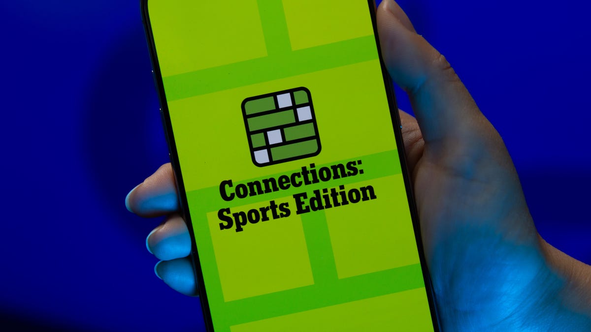
Today’s NYT Connections: Sports Edition Hints and Answers for April 6, #560
Here are hints and the answers for the NYT Connections: Sports Edition puzzle for April 6 No. 560.
Looking for the most recent regular Connections answers? Click here for today’s Connections hints, as well as our daily answers and hints for The New York Times Mini Crossword, Wordle and Strands puzzles.
Today’s Connections: Sports Edition is a tough one. If you’re struggling with today’s puzzle but still want to solve it, read on for hints and the answers.
Connections: Sports Edition is published by The Athletic, the subscription-based sports journalism site owned by The Times. It doesn’t appear in the NYT Games app, but it does in The Athletic’s own app. Or you can play it for free online.
Read more: NYT Connections: Sports Edition Puzzle Comes Out of Beta
Hints for today’s Connections: Sports Edition groups
Here are four hints for the groupings in today’s Connections: Sports Edition puzzle, ranked from the easiest yellow group to the tough (and sometimes bizarre) purple group.
Yellow group hint: City of Angels.
Green group hint: Winter football.
Blue group hint: Like Hemsworth, but in hoops.
Purple group hint: Cinderellas.
Answers for today’s Connections: Sports Edition groups
Yellow group: A Los Angeles athlete.
Green group: College football bowl games.
Blue group: Basketball Chrises.
Purple group: Men’s NCAA tournament 16-seeds.
Read more: Wordle Cheat Sheet: Here Are the Most Popular Letters Used in English Words
What are today’s Connections: Sports Edition answers?
The yellow words in today’s Connections
The theme is a Los Angeles athlete. The four answers are Clipper, King, Ram and Spark.
The green words in today’s Connections
The theme is college football bowl games. The four answers are Fiesta, Orange, Rose and Sugar.
The blue words in today’s Connections
The theme is basketball Chrises. The four answers are Bosh, Mullin, Paul and Webber.
The purple words in today’s Connections
The theme is men’s NCAA tournament 16-seeds. The four answers are Howard, Long Island, Prairie View A&M and Siena.
-
 Technologies3 года ago
Tech Companies Need to Be Held Accountable for Security, Experts Say
-
 Technologies3 года ago
Best Handheld Game Console in 2023
-
 Technologies3 года ago
Tighten Up Your VR Game With the Best Head Straps for Quest 2
-
 Technologies4 года ago
Black Friday 2021: The best deals on TVs, headphones, kitchenware, and more
-
 Technologies5 лет ago
Google to require vaccinations as Silicon Valley rethinks return-to-office policies
-
 Technologies5 лет ago
Verum, Wickr and Threema: next generation secured messengers
-
 Technologies4 года ago
Olivia Harlan Dekker for Verum Messenger
-
 Technologies4 года ago
The number of Сrypto Bank customers increased by 10% in five days


